Редактирование временных рядов - разложенных графиков
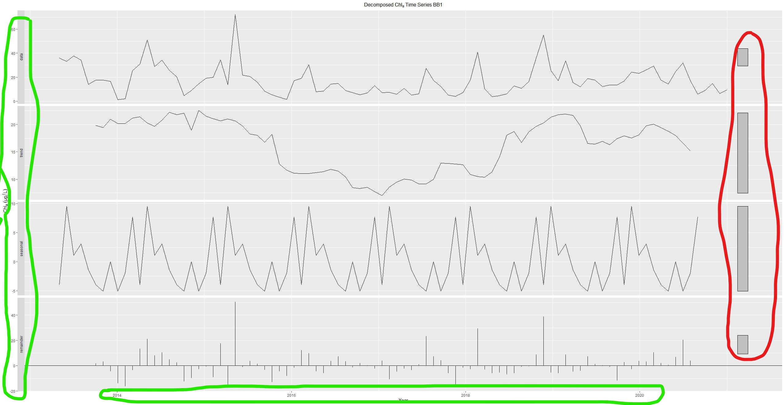
Можно ли удалить пустые серые поля (выделенные красным кружком) справа от разложенных графиков (прилагаются)?
Кроме того, можно ли изменить шрифт заголовка (выделенный внутри зеленого круга) человека на Times New Roman или любой другой шрифт по выбору?
Код r, используемый для создания графика, приведен ниже.
autoplot(decompose(x, type = "additive"))+labs(y=expression(Chl[a]~(µg/L)), x="Year") + ggtitle(expression(Decomposed~Chl[a]~Time~Series~BB1)) + theme(plot.title=element_text(hjust=0.5))
временные ряды - разложенные графики
1 ответ
In the forecast package it is not possible to position the scale bars on the left. You would have to remove the scale bars and add them to the left yourself manually. This can be done by setting
autoplot(x, range.bars = FALSE).
You can specify the font family in ggplot2 by setting the appropriate
theme() text field to
element_text(family = ***).
I have used
USAccDeaths as an example dataset here:
      library(fpp2)
#> Registered S3 method overwritten by 'quantmod':
#>   method            from
#>   as.zoo.data.frame zoo
#> ── Attaching packages ────────────────────────────────────────────── fpp2 2.4 ──
#> ✓ ggplot2   3.3.5.9000     ✓ fma       2.4
#> ✓ forecast  8.15           ✓ expsmooth 2.3
#>
autoplot(decompose(USAccDeaths, type = "additive"))+
  labs(y=expression(Chl[a]~(µg/L)), x="Year") +
  ggtitle(expression(Decomposed~Chl[a]~Time~Series~BB1)) +
  theme(
    plot.title=element_text(hjust=0.5),
    text = element_text(family = "Times New Roman", size = 15)
  )

Created on 2021-08-26 by the reprex package (v2.0.0)