Настройте highlight.sector() ширину и расположение - диаграмма аккордов (круговой пакет) в R
Мне нужна помощь с настройкой выделенных секторов chordDiagram() из круглого пакета.
Я работаю с данными рыболовства. Рыболовные суда начинают свое плавание в одном порту PORT_DE), и выгрузить свой улов в другом порту PORT_LA). Я работаю с морским гребешком живым весом в тоннах SCALLOP_W). Вот простой пример кадра данных:
        PORT_DE  PORT_LA SCALLOP_W
1      Aberdeen Aberdeen       116
2        Barrow   Barrow        98
3       Douglas   Barrow       127
4 Kirkcudbright   Barrow       113
5       Brixham  Brixham        69
6        Buckie   Buckie       180
Каждый порт (Name_short) помечен по регионам (Region_lb) и по стране (Country_lb). Пример ниже.
   Name_short Country_lb      Region_lb
1   Scalloway   Scotland Shetland Isles
2   Scrabster   Scotland    North Coast
3      Buckie   Scotland    Moray Firth
4 Fraserburgh   Scotland    Moray Firth
5    Aberdeen   Scotland     North East
С использованием circilze пакет, я создал индивидуальный chordDiagram визуализировать поток выгрузок между портами. Я отрегулировал большинство настроек, включая группировку портов одной и той же страны, отрегулировав расстояние между секторами (см. gap.after установка). Это текущая форма моей диаграммы аккордов,
 выгрузок между портами")
Я почти создал то, что хочу, за исключением последнего касания выделения секторов по странам. Я пытаюсь использовать highlight.sector() чтобы выделить порты той же страны, но я не могу отрегулировать ни ширину, ни расположение выделенного сектора. В настоящее время секторы страны пересекаются со всеми другими метками. Пример ниже:

Обратите внимание, что между двумя фигурами есть разные цвета, так как цвета генерируются случайным образом.
Не могли бы вы помочь мне с окончательными настройками?
Код для изготовления рисунков показан ниже:
# calculate gaps by country;
# 1 degree between ports, 10 degree between countries
gaps <- rep(1, nrow(port_coords))
gaps[cumsum(as.numeric(tapply(port_coords$Name_short, port_coords$Country_lb, length)))] <- 10

# edit initialising parameters
circos.par(canvas.ylim=c(-1.5,1.5), # edit  canvas size
           gap.after = gaps, # adjust gaps between regions
           track.margin = c(0.01, 0)) # adjust bottom and top margin
                                      # (blank area out of the plotting regio)

# Plot chord diagram
chordDiagram(m,

             # manual order of sectors
             order = port_coords$Name_short,

             # plot only grid (no labels, no axis)
             annotationTrack = "grid",
             preAllocateTracks = 1,

             # adjust grid width and spacing
             annotationTrackHeight = c(0.03, 0.01),

             # add directionality
             directional=1,
             direction.type = c("diffHeight", "arrows"),
             link.arr.type = "big.arrow",

             # adjust the starting end of the link
             diffHeight = -uh(1, "mm"),

             # adjust height of all links
             h.ratio = 0.8,

             # add link border
             link.lwd = 1, link.lty = 1, link.border="gray35"

             )

# add labels and axis manually
circos.trackPlotRegion(track.index = 1, panel.fun = function(x, y) {
  xlim = get.cell.meta.data("xlim")
  ylim = get.cell.meta.data("ylim")
  sector.name = get.cell.meta.data("sector.index")

  # print labels & text size (cex)
  circos.text(mean(xlim), ylim[1] + .7, sector.name,
              facing = "clockwise", niceFacing = TRUE, adj = c(0, 0.5), cex=0.6)

  # print axis
  circos.axis(h = "top", labels.cex = 0.5, major.tick.percentage = 0.2,
              sector.index = sector.name, track.index = 2)
}, bg.border = NA)

# add additional track to enhance the visual effect of different groups
# Scotland
highlight.sector(port_coords$Name_short[which(port_coords$Country_lb == "Scotland")],
                 track.index = 1, col = "blue",
                 text = "Scotland", cex = 0.8, text.col = "white", niceFacing = TRUE)
# England
highlight.sector(port_coords$Name_short[which(port_coords$Country_lb == "England")],
                 track.index = 1, col = "red",
                 text = "England", cex = 0.8, text.col = "white", niceFacing = TRUE)
# Wales
highlight.sector(port_coords$Name_short[which(port_coords$Country_lb == "Wales")],
                 track.index = 1, col = "forestgreen",
                 text = "Wales", cex = 0.8, text.col = "white", niceFacing = TRUE)
# Isle of Man
highlight.sector(port_coords$Name_short[which(port_coords$Country_lb == "Isle of Man")],
                 track.index = 1, col = "darkred",
                 text = "Isle of Man", cex = 0.8, text.col = "white", niceFacing = TRUE)
# Rep. Ireland
highlight.sector(port_coords$Name_short[which(port_coords$Country_lb == "Rep. Ireland")],
                 track.index = 1, col = "darkorange2",
                 text = "Ireland", cex = 0.8, text.col = "white", niceFacing = TRUE)
# N.Ireland
highlight.sector(port_coords$Name_short[which(port_coords$Country_lb == "N.Ireland")],
                 track.index = 1, col = "magenta4",
                 text = "N. Ireland", cex = 0.8, text.col = "white", niceFacing = TRUE)

# re-set circos parameters
circos.clear()
1 ответ
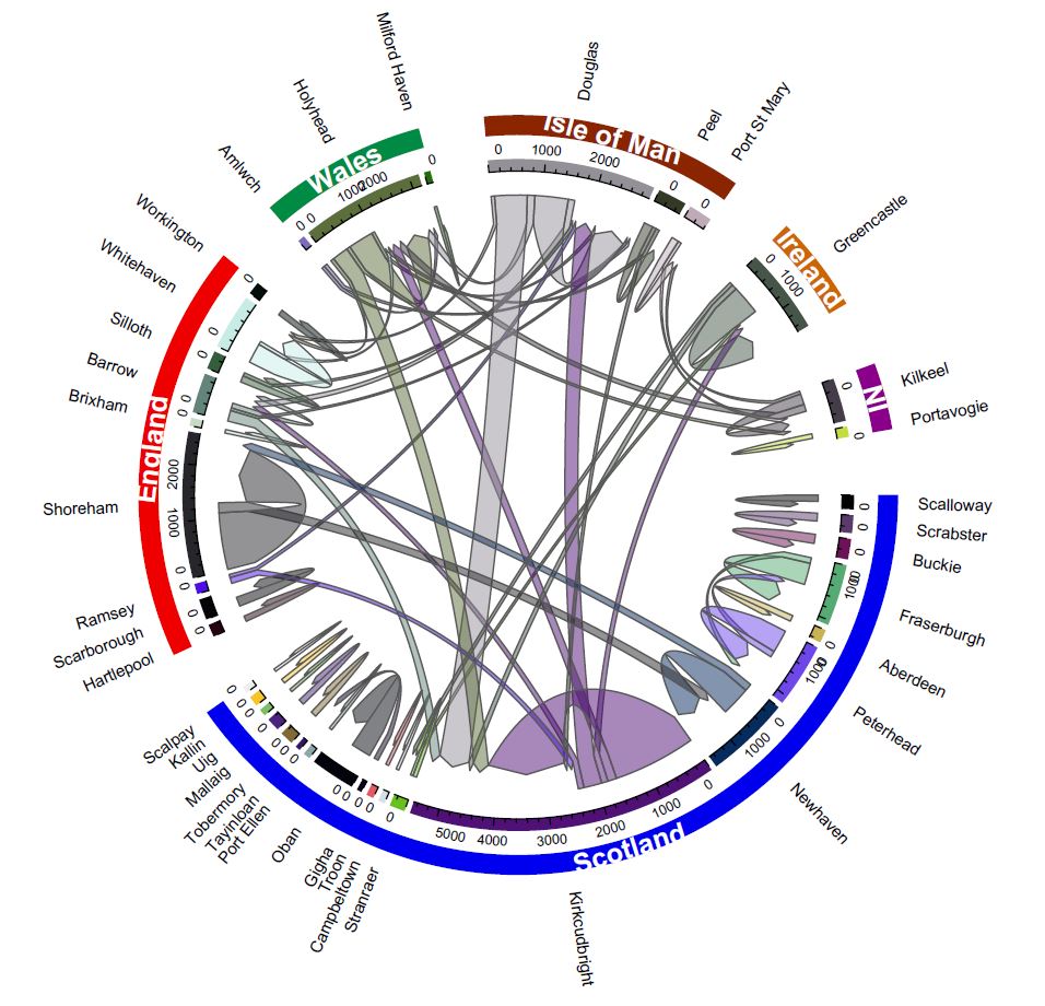
Я уже некоторое время пытаюсь найти решение. Теперь мне удалось отрегулировать размещение и ширину highlight.sector() путем настройки полей дорожки по умолчанию и высоты дорожки по умолчанию.
Я сделал это, указав track.margin а также track.height параметры в инициализации circos.par() шаг.
Конечный продукт выглядит ниже. Код в конце ответа.
# calculate gaps by country;
# 1 degree between ports, 10 degree between countries
gaps <- rep(1, nrow(port_coords))
gaps[cumsum(as.numeric(tapply(port_coords$Name_short, port_coords$Country_lb, length)))] <- 10

# edit initialising parameters
circos.par(canvas.ylim=c(-1.5,1.5), # edit  canvas size
           gap.after = gaps, # adjust gaps between regions
           track.margin = c(0.01, 0.05), # adjust bottom and top margin
           # track.margin = c(0.01, 0.1)
           track.height = 0.05)

# Plot chord diagram
chordDiagram(m,

             # manual order of sectors
             order = port_coords$Name_short,

             # plot only grid (no labels, no axis)
             annotationTrack = "grid",
             # annotationTrack = NULL,
             preAllocateTracks = 1,

             # adjust grid width and spacing
             annotationTrackHeight = c(0.03, 0.01),

             # add directionality
             directional=1,
             direction.type = c("diffHeight", "arrows"),
             link.arr.type = "big.arrow",

             # adjust the starting end of the link
             diffHeight = -uh(1, "mm"),

             # adjust height of all links
             h.ratio = 0.8,

             # add link border
             link.lwd = 1, link.lty = 1, link.border="gray35"

             # track.margin = c(0.01, 0.1)

             )

# Scotland
highlight.sector(port_coords$Name_short[which(port_coords$Country_lb == "Scotland")],
                 track.index = 1, col = "blue2",
                 text = "Scotland", cex = 1, text.col = "white",
                 niceFacing = TRUE, font=2)
# England
highlight.sector(port_coords$Name_short[which(port_coords$Country_lb == "England")],
                 track.index = 1, col = "red2",
                 text = "England", cex = 1, text.col = "white",
                 niceFacing = TRUE, font=2)
# Wales
highlight.sector(port_coords$Name_short[which(port_coords$Country_lb == "Wales")],
                 track.index = 1, col = "springgreen4",
                 text = "Wales", cex = 1, text.col = "white",
                 niceFacing = TRUE, font=2)
# Isle of Man
highlight.sector(port_coords$Name_short[which(port_coords$Country_lb == "Isle of Man")],
                 track.index = 1, col = "orangered4",
                 text = "Isle of Man", cex = 1, text.col = "white",
                 niceFacing = TRUE, font=2)
# Rep. Ireland
highlight.sector(port_coords$Name_short[which(port_coords$Country_lb == "Rep. Ireland")],
                 track.index = 1, col = "darkorange3",
                 text = "Ireland", cex = 1, text.col = "white",
                 niceFacing = TRUE, font=2)
# N.Ireland
highlight.sector(port_coords$Name_short[which(port_coords$Country_lb == "N.Ireland")],
                 track.index = 1, col = "magenta4",
                 text = "NI", cex = 1, text.col = "white",
                 niceFacing = TRUE, font=2)

# add labels and axis manually
circos.trackPlotRegion(track.index = 1, panel.fun = function(x, y) {
  xlim = get.cell.meta.data("xlim")
  ylim = get.cell.meta.data("ylim")
  sector.name = get.cell.meta.data("sector.index")

  # print labels & text size (cex)
  # circos.text(mean(xlim), ylim[1] + .7, sector.name,
  #             facing = "clockwise", niceFacing = TRUE, adj = c(0, 0.5), cex=0.6)

  circos.text(mean(xlim), ylim[1] + 2, sector.name,
              facing = "clockwise", niceFacing = TRUE, adj = c(0, 0.5), cex=0.6)

  # print axis
  circos.axis(h = "bottom", labels.cex = 0.5,
              # major.tick.percentage = 0.05,
              major.tick.length = 0.6,
              sector.index = sector.name, track.index = 2)
}, bg.border = NA)

# re-set circos parameters
circos.clear()
Если вы немного похожи на меня, вы также можете добавить sector.numeric.index в сектора и добавить легенду сбоку, чтобы она выглядела чуть лучше, просто мои 2 цента!