Непараметрическая регрессия ggplot
Я пытаюсь построить некоторые непараметрические кривые регрессии с ggplot2. Я добился этого с помощью базы plot()функция:
library(KernSmooth)
set.seed(1995)
X <- runif(100, -1, 1)
G <- X[which (X > 0)]
L <- X[which (X < 0)]
u <- rnorm(100, 0 , 0.02)
Y <- -exp(-20*L^2)-exp(-20*G^2)/(X+1)+u
m <- lm(Y~X)
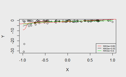
plot(Y~X)
abline(m, col="red")
m2 <- locpoly(X, Y, bandwidth = 0.05, degree = 0)
lines(m2$x, m2$y, col = "red")
m3 <- locpoly(X, Y, bandwidth = 0.15, degree = 0)
lines(m3$x, m3$y, col = "black")
m4 <- locpoly(X, Y, bandwidth = 0.3, degree = 0)
lines(m4$x, m4$y, col = "green")
legend("bottomright", legend = c("NW(bw=0.05)", "NW(bw=0.15)", "NW(bw=0.3)"),
lty = 1, col = c("red", "black", "green"), cex = 0.5)
С ggplot2 добились построения линейной регрессии:
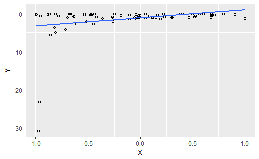
С этим кодом:
ggplot(m, aes(x = X, y = Y)) +
  geom_point(shape = 1) +
  geom_smooth(method = lm,  se = FALSE) +
  theme(axis.line = element_line(colour = "black", size = 0.25))
Но я не знаю, как добавить другие линии к этому графику, как в базовом графике R. Какие-либо предложения? Заранее спасибо.
1 ответ
Решение
Решение
Самое короткое решение (хотя и не самое красивое) - добавить строки, используя data= аргумент geom_line функция:
ggplot(m, aes(x = X, y = Y)) +
     geom_point(shape = 1) +
     geom_smooth(method = lm,  se = FALSE) +
     theme(axis.line = element_line(colour = "black", size = 0.25)) +
     geom_line(data = as.data.frame(m2), mapping  = aes(x=x,y=y))
Красивое решение
Чтобы получить красивые цвета и легенды, используйте
# Need to convert lists to data.frames, ggplot2 needs data.frames
m2 <- as.data.frame(m2)
m3 <- as.data.frame(m3)
m4 <- as.data.frame(m4)
# Colnames are used as names in ggplot legend. Theres nothing wrong in using
# column names which contain symbols or whitespace, you just have to use
# backticks, e.g. m2$`NW(bw=0.05)` if you want to work with them
colnames(m2) <- c("x","NW(bw=0.05)")
colnames(m3) <- c("x","NW(bw=0.15)")
colnames(m4) <- c("x","NW(bw=0.3)")
# To give the different kernel density estimates different colors, they must all be in one data frame.
# For merging to work, all x columns of m2-m4 must be the same!
# the merge function will automatically detec columns of same name
# (that is, x) in m2-m4 and use it to identify y values which belong
# together (to the same x value)
mm <- Reduce(x=list(m2,m3,m4), f=function(a,b) merge(a,b))
# The above line is the same as:
#  mm <- merge(m2,m3)
#  mm <- merge(mm,m4)

# ggplot needs data in long (tidy) format
mm <- tidyr::gather(mm, kernel, y, -x)

ggplot(m, aes(x = X, y = Y)) +
         geom_point(shape = 1) +
         geom_smooth(method = lm,  se = FALSE) +
         theme(axis.line = element_line(colour = "black", size = 0.25)) +
         geom_line(data = mm, mapping  = aes(x=x,y=y,color=kernel))

Решение, которое решит это для всех и для вечности
Однако самым красивым и воспроизводимым способом будет создание собственной статистики в ggplot2 ( см. Включенную статистику в ggplot).
Вот эта виньетка команды ggplot2: Расширение ggplot2. Я никогда не предпринимал такого героического усилия, хотя.