Как сделать диаграмму Парето в Python?
Парето является очень популярным diagarm в Excel и Tableu. В Excel мы можем легко нарисовать диаграмму Парето, но я не нашел простого способа нарисовать диаграмму в Python.
У меня есть пандас dataframe, как это:
import numpy as np
import pandas as pd
import seaborn as sns
import matplotlib.pyplot as plt

df = pd.DataFrame({'country': [177.0, 7.0, 4.0, 2.0, 2.0, 1.0, 1.0, 1.0]})
df.index = ['USA', 'Canada', 'Russia', 'UK', 'Belgium', 'Mexico', 'Germany', 'Denmark']
print(df)

         country
USA        177.0
Canada       7.0
Russia       4.0
UK           2.0
Belgium      2.0
Mexico       1.0
Germany      1.0
Denmark      1.0
Как нарисовать диаграмму Парето? Может быть, вы используете панд, морских зайцев, матплотлиб и т. Д.?
До сих пор я смог сделать нисходящую гистограмму. Но все еще остается поставить кумулятивный линейный сюжет поверх них.
Моя попытка: df.sort_values(by='country',ascending=False).plot.bar()
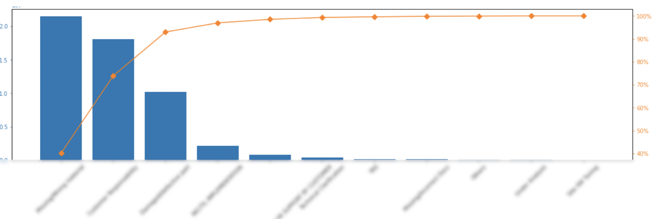
Требуемый участок: 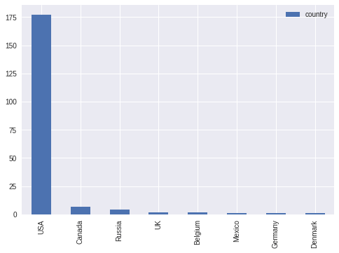
6 ответов
Возможно, вы захотите создать новый столбец с процентом в нем и построить один столбец в виде гистограммы, а другой - в виде линейной диаграммы по сдвоенным осям.
import pandas as pd
import matplotlib.pyplot as plt
from matplotlib.ticker import PercentFormatter

df = pd.DataFrame({'country': [177.0, 7.0, 4.0, 2.0, 2.0, 1.0, 1.0, 1.0]})
df.index = ['USA', 'Canada', 'Russia', 'UK', 'Belgium', 'Mexico', 'Germany', 'Denmark']
df = df.sort_values(by='country',ascending=False)
df["cumpercentage"] = df["country"].cumsum()/df["country"].sum()*100


fig, ax = plt.subplots()
ax.bar(df.index, df["country"], color="C0")
ax2 = ax.twinx()
ax2.plot(df.index, df["cumpercentage"], color="C1", marker="D", ms=7)
ax2.yaxis.set_major_formatter(PercentFormatter())

ax.tick_params(axis="y", colors="C0")
ax2.tick_params(axis="y", colors="C1")
plt.show()
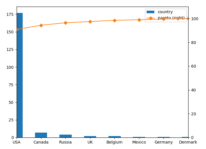
h ttps://stackru.com/images/2a989bb4f358944bd3ccbc3b6f6c025f122f1a06.png
Диаграмма Парето для pandas.dataframe
import pandas as pd
import matplotlib.pyplot as plt
from matplotlib.ticker import PercentFormatter


def _plot_pareto_by(df_, group_by, column):

    df = df_.groupby(group_by)[column].sum().reset_index()
    df = df.sort_values(by=column,ascending=False)

    df["cumpercentage"] = df[column].cumsum()/df[column].sum()*100


    fig, ax = plt.subplots(figsize=(20,5))
    ax.bar(df[group_by], df[column], color="C0")
    ax2 = ax.twinx()
    ax2.plot(df[group_by], df["cumpercentage"], color="C1", marker="D", ms=7)
    ax2.yaxis.set_major_formatter(PercentFormatter())

    ax.tick_params(axis="y", colors="C0")
    ax2.tick_params(axis="y", colors="C1")

    for tick in ax.get_xticklabels():
        tick.set_rotation(45)
    plt.show()
Другой способ - использовать secondary_y параметр без использования twinx():
df['pareto'] = 100 *df.country.cumsum() / df.country.sum()
fig, axes = plt.subplots()
ax1 = df.plot(use_index=True, y='country',  kind='bar', ax=axes)
ax2 = df.plot(use_index=True, y='pareto', marker='D', color="C1", kind='line', ax=axes, secondary_y=True)
ax2.set_ylim([0,110])
Параметр use_index=True необходимо, потому что ваш index твой xось в этом случае. В противном случае вы могли бы использоватьx='x_Variable'.
Более обобщенная версия кода ImportanceOfBeingErnest:
def create_pareto_chart(df, by_variable, quant_variable):
    df.index = by_variable
    df["cumpercentage"] = quant_variable.cumsum()/quant_variable.sum()*100

    fig, ax = plt.subplots()
    ax.bar(df.index, quant_variable, color="C0")
    ax2 = ax.twinx()
    ax2.plot(df.index, df["cumpercentage"], color="C1", marker="D", ms=7)
    ax2.yaxis.set_major_formatter(PercentFormatter())

    ax.tick_params(axis="y", colors="C0")
    ax2.tick_params(axis="y", colors="C1")
    plt.show()
И этот включает Парето, группируя по порогу тоже. Например: если вы установите значение 70, оно объединит меньшинства старше 70 лет в одну группу под названием "Другие".
def create_pareto_chart(by_variable, quant_variable, threshold):

total=quant_variable.sum()
df = pd.DataFrame({'by_var':by_variable, 'quant_var':quant_variable})
df["cumpercentage"] = quant_variable.cumsum()/quant_variable.sum()*100
df = df.sort_values(by='quant_var',ascending=False)
df_above_threshold = df[df['cumpercentage'] < threshold]
df=df_above_threshold
df_below_threshold = df[df['cumpercentage'] >= threshold]
sum = total - df['quant_var'].sum()
restbarcumsum = 100 - df_above_threshold['cumpercentage'].max()
rest = pd.Series(['OTHERS', sum, restbarcumsum],index=['by_var','quant_var', 'cumpercentage'])
df = df.append(rest,ignore_index=True)
df.index = df['by_var']
df = df.sort_values(by='cumpercentage',ascending=True)


fig, ax = plt.subplots()
ax.bar(df.index, df["quant_var"], color="C0")
ax2 = ax.twinx()
ax2.plot(df.index, df["cumpercentage"], color="C1", marker="D", ms=7)
ax2.yaxis.set_major_formatter(PercentFormatter())

ax.tick_params(axis="x", colors="C0", labelrotation=70)
ax.tick_params(axis="y", colors="C0")
ax2.tick_params(axis="y", colors="C1")

plt.show()
Вот моя версия диаграммы Парето с использованием pandas и plotly. Вы можете использовать любую коллекцию с разгруппированными данными. Начнем с данных для этого примера:
      import numpy as np

data = np.random.choice(['USA', 'Canada', 'Russia', 'UK', 'Belgium',
                                'Mexico', 'Germany', 'Denmark'], size=500,
                                 p=[0.43, 0.14, 0.23, 0.07, 0.04, 0.01, 0.03, 0.05])
Создание диаграммы:
      import pandas as pd
import plotly.graph_objects as go


def pareto_chart(collection):
    collection = pd.Series(collection)
    counts = (collection.value_counts().to_frame('counts')
              .join(collection.value_counts(normalize=True).cumsum().to_frame('ratio')))

    fig = go.Figure([go.Bar(x=counts.index, y=counts['counts'], yaxis='y1', name='count'),
                     go.Scatter(x=counts.index, y=counts['ratio'], yaxis='y2', name='cumulative ratio',
                                hovertemplate='%{y:.1%}', marker={'color': '#000000'})])

    fig.update_layout(template='plotly_white', showlegend=False, hovermode='x', bargap=.3,
                      title={'text': 'Pareto Chart', 'x': .5},
                      yaxis={'title': 'count'},
                      yaxis2={'rangemode': "tozero", 'overlaying': 'y',
                              'position': 1, 'side': 'right',
                              'title': 'ratio',
                              'tickvals': np.arange(0, 1.1, .2),
                              'tickmode': 'array',
                              'ticktext': [str(i) + '%' for i in range(0, 101, 20)]})

    fig.show()
Результат: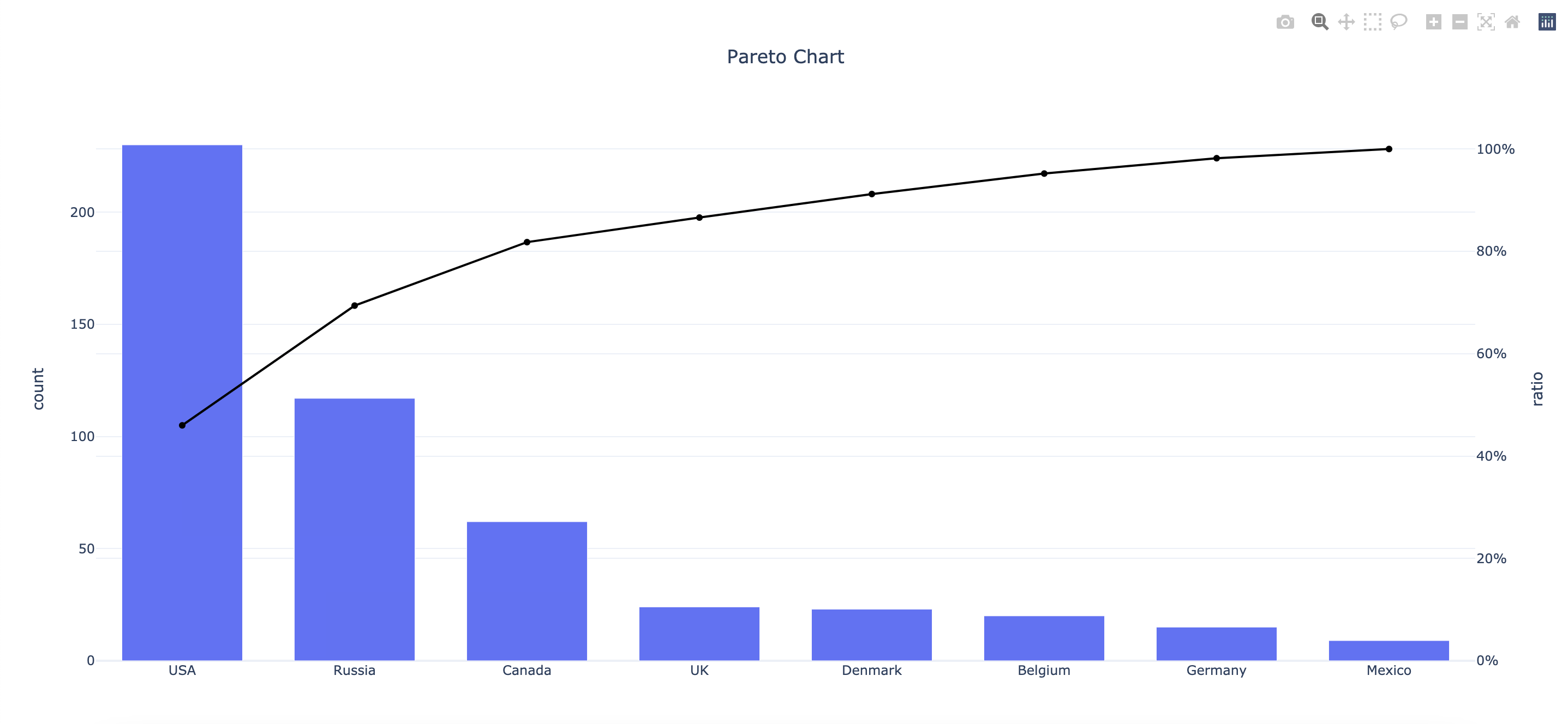
Вот версия, которая работает на кумулятивных частотах. Я добавил функцию горизонтальных линий, так как это может помочь в принятии решений.
    import pandas as pd
    import matplotlib.pyplot as plt
    from matplotlib.ticker import PercentFormatter

    def plot_pareto_by(df, x, y, hlines=[80]):

        df['Cumulative Percentage'] = df[y].cumsum()/df[y].sum()*100

        fig, ax = plt.subplots(figsize=(10,5))
        ax.bar(df[x], df[y], color='C0')
        ax2 = ax.twinx()
        ax2.plot(df[x], df['Cumulative Percentage'], color='C1', ms=7)
        ax2.yaxis.set_major_formatter(PercentFormatter())
        ax.tick_params(axis='y', colors='C0')
        ax2.tick_params(axis='y', colors='C1')

        for tick in ax.get_xticklabels():
            tick.set_rotation(45)

        plt.title(f'Pareto Chart for {x} by {y}')
        ax.set_xlabel(x)
        ax.set_ylabel(y)
        ax2.set_ylabel('Cumulative Percentage')

        for hline_at in hlines:
            ax2.axhline(y=hline_at, color='red', linestyle='-.')

        plt.show()