Изменить существующую функцию для радиолокационного графика в
Я хотел бы сделать радиолокационный график, используя R, и нашел функцию ниже в сети. Ссылка на сайт выглядит неплохо, однако я бы хотел передать фрейм данных со значениями от 0 до 1 и вместо этого масштабировать график с процентами. Мне нужна помощь, чтобы это произошло, хотя...
Вот данные и функция, которую я нашел на странице.
CreateRadialPlot <- function(plot.data,
                             axis.labels=colnames(plot.data)[-1],
                             grid.min=-0.5,  #10,
                             grid.mid=0,  #50,
                             grid.max=0.5,  #100,
                             centre.y=grid.min - ((1/9)*(grid.max-grid.min)),
                             plot.extent.x.sf=1.2,
                             plot.extent.y.sf=1.2,
                             x.centre.range=0.02*(grid.max-centre.y),
                             label.centre.y=FALSE,
                             grid.line.width=0.5,
                             gridline.min.linetype="longdash",
                             gridline.mid.linetype="longdash",
                             gridline.max.linetype="longdash",
                             gridline.min.colour="grey",
                             gridline.mid.colour="blue",
                             gridline.max.colour="grey",
                             grid.label.size=4,
                             gridline.label.offset=-0.02*(grid.max-centre.y),
                             label.gridline.min=TRUE,
                             axis.label.offset=1.15,
                             axis.label.size=3,
                             axis.line.colour="grey",
                             group.line.width=1,
                             group.point.size=4,
                             background.circle.colour="yellow",
                             background.circle.transparency=0.2,
                             plot.legend=if (nrow(plot.data)>1) TRUE else FALSE,
                             legend.title="Cluster",
                             legend.text.size=grid.label.size ) {

  var.names <- colnames(plot.data)[-1]  #'Short version of variable names
  #axis.labels [if supplied] is designed to hold 'long version' of variable names
  #with line-breaks indicated using \n

  #caclulate total plot extent as radius of outer circle x a user-specifiable scaling factor
  plot.extent.x=(grid.max+abs(centre.y))*plot.extent.x.sf
  plot.extent.y=(grid.max+abs(centre.y))*plot.extent.y.sf

  #Check supplied data makes sense
  if (length(axis.labels) != ncol(plot.data)-1)
    return("Error: 'axis.labels' contains the wrong number of axis labels")
  if(min(plot.data[,-1])<centre.y)
    return("Error: plot.data' contains value(s) < centre.y")
  if(max(plot.data[,-1])>grid.max)
    return("Error: 'plot.data' contains value(s) > grid.max")

  #Declare required internal functions

  CalculateGroupPath <- function(df) {
    #Converts variable values into a set of radial x-y coordinates
    #Code adapted from a solution posted by Tony M to
    #http://stackru.com/questions/9614433/creating-radar-chart-a-k-a-star-plot-spider-plot-using-ggplot2-in-r

    #Args:
    #  df: Col 1 -  group ('unique' cluster / group ID of entity)
    #      Col 2-n:  v1.value to vn.value - values (e.g. group/cluser mean or median) of variables v1 to v.n

    path <- as.factor(as.character(df[,1]))

    ##find increment
    angles = seq(from=0, to=2*pi, by=(2*pi)/(ncol(df)-1))

    ##create graph data frame
    graphData= data.frame(seg="", x=0,y=0)
    graphData=graphData[-1,]

    for(i in levels(path)){

      pathData = subset(df, df[,1]==i)

      for(j in c(2:ncol(df))){

        #pathData[,j]= pathData[,j]

        graphData=rbind(graphData, data.frame(group=i,
                                              x=pathData[,j]*sin(angles[j-1]),
                                              y=pathData[,j]*cos(angles[j-1])))
      }
      ##complete the path by repeating first pair of coords in the path
      graphData=rbind(graphData, data.frame(group=i,
                                            x=pathData[,2]*sin(angles[1]),
                                            y=pathData[,2]*cos(angles[1])))

    }

    #Make sure that name of first column matches that of input data (in case !="group")
    colnames(graphData)[1] <- colnames(df)[1]

    graphData #data frame returned by function

  }

  CaclulateAxisPath = function(var.names,min,max) {
    #Caculates x-y coordinates for a set of radial axes (one per variable being plotted in radar plot)

    #Args:
    #var.names - list of variables to be plotted on radar plot
    #min - MININUM value required for the plotted axes (same value will be applied to all axes)
    #max - MAXIMUM value required for the plotted axes (same value will be applied to all axes)

    #var.names <- c("v1","v2","v3","v4","v5")
    n.vars <- length(var.names) # number of vars (axes) required

    #Cacluate required number of angles (in radians)
    angles <- seq(from=0, to=2*pi, by=(2*pi)/n.vars)

    #calculate vectors of min and max x+y coords
    min.x <- min*sin(angles)
    min.y <- min*cos(angles)
    max.x <- max*sin(angles)
    max.y <- max*cos(angles)

    #Combine into a set of uniquely numbered paths (one per variable)
    axisData <- NULL
    for (i in 1:n.vars) {
      a <- c(i,min.x[i],min.y[i])
      b <- c(i,max.x[i],max.y[i])
      axisData <- rbind(axisData,a,b)
    }

    #Add column names + set row names = row no. to allow conversion into a data frame
    colnames(axisData) <- c("axis.no","x","y")
    rownames(axisData) <- seq(1:nrow(axisData))

    #Return calculated axis paths
    as.data.frame(axisData)
  }


  funcCircleCoords <- function(center = c(0,0), r = 1, npoints = 100){
    #Adapted from Joran's response to http://stackru.com/questions/6862742/draw-a-circle-with-ggplot2
    tt <- seq(0,2*pi,length.out = npoints)
    xx <- center[1] + r * cos(tt)
    yy <- center[2] + r * sin(tt)
    return(data.frame(x = xx, y = yy))
  }

  ### Convert supplied data into plottable format

  # (a) add abs(centre.y) to supplied plot data
  #[creates plot centroid of 0,0 for internal use, regardless of min. value of y
  # in user-supplied data]
  plot.data.offset <- plot.data
  plot.data.offset[,2:ncol(plot.data)]<- plot.data[,2:ncol(plot.data)]+abs(centre.y)
  #print(plot.data.offset)

  # (b) convert into radial coords
  group <-NULL
  group$path <- CalculateGroupPath(plot.data.offset)
  #print(group$path)

  # (c) Calculate coordinates required to plot radial variable axes
  axis <- NULL
  axis$path <- CaclulateAxisPath(var.names,grid.min+abs(centre.y),grid.max+abs(centre.y))
  #print(axis$path)

  # (d) Create file containing axis labels + associated plotting coordinates

  #Labels
  axis$label <- data.frame(
    text=axis.labels,
    x=NA,
    y=NA )
  #print(axis$label)

  #axis label coordinates
  n.vars <- length(var.names)
  angles = seq(from=0, to=2*pi, by=(2*pi)/n.vars)
  axis$label$x <- sapply(1:n.vars, function(i, x) {((grid.max+abs(centre.y))*axis.label.offset)*sin(angles[i])})
  axis$label$y <- sapply(1:n.vars, function(i, x) {((grid.max+abs(centre.y))*axis.label.offset)*cos(angles[i])})
  #print(axis$label)

  # (e) Create Circular grid-lines + labels

  #caclulate the cooridinates required to plot circular grid-lines for three user-specified
  #y-axis values: min, mid and max [grid.min; grid.mid; grid.max]
  gridline <- NULL
  gridline$min$path <- funcCircleCoords(c(0,0),grid.min+abs(centre.y),npoints = 360)
  gridline$mid$path <- funcCircleCoords(c(0,0),grid.mid+abs(centre.y),npoints = 360)
  gridline$max$path <- funcCircleCoords(c(0,0),grid.max+abs(centre.y),npoints = 360)
  #print(head(gridline$max$path))

  #gridline labels
  gridline$min$label <- data.frame(x=gridline.label.offset,y=grid.min+abs(centre.y),
                                   text=as.character(grid.min))
  gridline$max$label <- data.frame(x=gridline.label.offset,y=grid.max+abs(centre.y),
                                   text=as.character(grid.max))
  gridline$mid$label <- data.frame(x=gridline.label.offset,y=grid.mid+abs(centre.y),
                                   text=as.character(grid.mid))
  #print(gridline$min$label)
  #print(gridline$max$label)
  #print(gridline$mid$label)


  ### Start building up the radar plot

  # Delcare 'theme_clear', with or without a plot legend as required by user
  #[default = no legend if only 1 group [path] being plotted]
  theme_clear <- theme_bw() +
    theme(axis.text.y=element_blank(),
          axis.text.x=element_blank(),
          axis.ticks=element_blank(),
          panel.grid.major=element_blank(),
          panel.grid.minor=element_blank(),
          panel.border=element_blank(),
          legend.key=element_rect(linetype="blank"))

  if (plot.legend==FALSE) theme_clear <- theme_clear + theme(legend.position="none")

  #Base-layer = axis labels + plot extent
  # [need to declare plot extent as well, since the axis labels don't always
  # fit within the plot area automatically calculated by ggplot, even if all
  # included in first plot; and in any case the strategy followed here is to first
  # plot right-justified labels for axis labels to left of Y axis for x< (-x.centre.range)],
  # then centred labels for axis labels almost immediately above/below x= 0
  # [abs(x) < x.centre.range]; then left-justified axis labels to right of Y axis [x>0].
  # This building up the plot in layers doesn't allow ggplot to correctly
  # identify plot extent when plotting first (base) layer]

  #base layer = axis labels for axes to left of central y-axis [x< -(x.centre.range)]
  base <- ggplot(axis$label) + xlab(NULL) + ylab(NULL) + coord_equal() +
    geom_text(data=subset(axis$label,axis$label$x < (-x.centre.range)),
              aes(x=x,y=y,label=text),size=axis.label.size,hjust=1) +
    scale_x_continuous(limits=c(-plot.extent.x,plot.extent.x)) +
    scale_y_continuous(limits=c(-plot.extent.y,plot.extent.y))

  # + axis labels for any vertical axes [abs(x)<=x.centre.range]
  base <- base + geom_text(data=subset(axis$label,abs(axis$label$x)<=x.centre.range),
                           aes(x=x,y=y,label=text),size=axis.label.size,hjust=0.5)

  # + axis labels for any vertical axes [x>x.centre.range]
  base <- base + geom_text(data=subset(axis$label,axis$label$x>x.centre.range),
                           aes(x=x,y=y,label=text),size=axis.label.size,hjust=0)

  # + theme_clear [to remove grey plot background, grid lines, axis tick marks and axis text]
  base <- base + theme_clear

  #  + background circle against which to plot radar data
  base <- base + geom_polygon(data=gridline$max$path,aes(x,y),
                              fill=background.circle.colour,
                              alpha=background.circle.transparency)

  # + radial axes
  base <- base + geom_path(data=axis$path,aes(x=x,y=y,group=axis.no),
                           colour=axis.line.colour)

  # ... + group (cluster) 'paths'
  base <- base + geom_path(data=group$path,aes(x=x,y=y,group=group,colour=group),
                           size=group.line.width)

  # ... + group points (cluster data)
  base <- base + geom_point(data=group$path,aes(x=x,y=y,group=group,colour=group),size=group.point.size)

  #... + amend Legend title
  if (plot.legend==TRUE) base  <- base + labs(colour=legend.title,size=legend.text.size)

  # ... + circular grid-lines at 'min', 'mid' and 'max' y-axis values
  base <- base +  geom_path(data=gridline$min$path,aes(x=x,y=y),
                            lty=gridline.min.linetype,colour=gridline.min.colour,size=grid.line.width)
  base <- base +  geom_path(data=gridline$mid$path,aes(x=x,y=y),
                            lty=gridline.mid.linetype,colour=gridline.mid.colour,size=grid.line.width)
  base <- base +  geom_path(data=gridline$max$path,aes(x=x,y=y),
                            lty=gridline.max.linetype,colour=gridline.max.colour,size=grid.line.width)

  # ... + grid-line labels (max; ave; min) [only add min. gridline label if required]
  if (label.gridline.min==TRUE) {
    base <- base + geom_text(aes(x=x,y=y,label=text),data=gridline$min$label,face="bold",size=grid.label.size, hjust=1) }
  base <- base + geom_text(aes(x=x,y=y,label=text),data=gridline$mid$label,face="bold",size=grid.label.size, hjust=1)
  base <- base + geom_text(aes(x=x,y=y,label=text),data=gridline$max$label,face="bold",size=grid.label.size, hjust=1)

  # ... + centre.y label if required [i.e. value of y at centre of plot circle]
  if (label.centre.y==TRUE) {
    centre.y.label <- data.frame(x=0, y=0, text=as.character(centre.y))
    base <- base + geom_text(aes(x=x,y=y,label=text),data=centre.y.label,face="bold",size=grid.label.size, hjust=0.5) }

  return(base)

}


# (1) Define the data building blocks required for plotting purposes [uses
# a subset of the OAC results plotted above]

var.names <- c("All Flats", "No central heating", "Rooms per\nhousehold", "People per room",
               "HE Qualification", "Routine/Semi-Routine\nOccupation", "2+ Car household",
               "Public Transport\nto work", "Work from home")
var.order = seq(1:9)
values.a <- c(-0.1145725, -0.1824095, -0.01153078, -0.0202474, 0.05138737, -0.1557234,
              0.1099018, -0.05310315, 0.0182626)
values.b <- c(0.2808439, -0.2936949, -0.1925846, 0.08910815, -0.03468011, 0.07385727,
              -0.07228813, 0.1501105, -0.06800127)
values.c <- rep(0, 9)
group.names <- c("Blue Collar Communities", "Prospering Suburbs", "National Average")


# (2) Create df1: a plotting data frame in the format required for ggplot2

df1.a <- data.frame(matrix(c(rep(group.names[1], 9), var.names), nrow = 9, ncol = 2),
                    var.order = var.order, value = values.a)
df1.b <- data.frame(matrix(c(rep(group.names[2], 9), var.names), nrow = 9, ncol = 2),
                    var.order = var.order, value = values.b)
df1.c <- data.frame(matrix(c(rep(group.names[3], 9), var.names), nrow = 9, ncol = 2),
                    var.order = var.order, value = values.c)
df1 <- rbind(df1.a, df1.b, df1.c)
colnames(df1) <- c("group", "variable.name", "variable.order", "variable.value")
df1
#(4) Create df2: a plotting data frame in the format required for
# funcRadialPlot

m2 <- matrix(abs(c(values.a, values.b)), nrow = 2, ncol = 9, byrow = TRUE)
group.names <- c(group.names[1:2])
df22 <- data.frame(group = group.names, m2)
colnames(df22)[2:10] <- var.names
print(df22)

# (6) Create a radial plot using the function CreateRadialPlot, with min
# y-value in center of plot
CreateRadialPlot(df22, plot.extent.x = 1.5, grid.min = -0.4, centre.y = -0.5,
                 label.centre.y = TRUE, label.gridline.min = FALSE)
выход: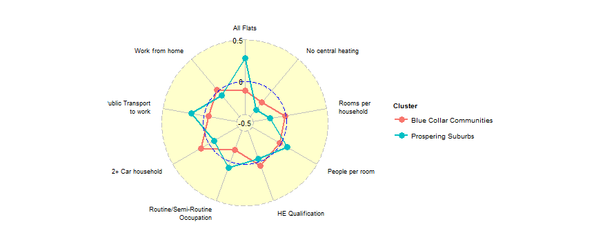
Я хотел бы передать фрейм данных, содержащий значения в столбцах от 0 до 1, в функцию и создать процентную шкалу на диаграмме. А также иметь сетку, показывающую процентную шкалу, если это возможно (0,10....90,100).
Вот абсолютные значения тех же данных, что и в примере в качестве примера:
m2 <- matrix(abs(c(values.a, values.b)), nrow = 2, ncol = 9, byrow = TRUE)
group.names <- c(group.names[1:2])
df22 <- data.frame(group = group.names, m2)
colnames(df22)[2:10] <- var.names
print(df22)
3 ответа
Вы также можете использовать rCharts пакет для создания такого рода сюжета. Есть много вариантов, и вы, вероятно, можете настроить его проще.
Если вы используете rCharts впервые, вам необходимо выполнить следующую настройку:
install.packages('devtools')
require(devtools)
install_github('rCharts', 'ramnathv')
Вот пример кода:
library(rCharts)
#create dummy dataframe with number ranging from 0 to 1
df<-data.frame(id=c("a","b","c","d","e"),val1=runif(5,0,1),val2=runif(5,0,1))
#muliply number by 100 to get percentage
df[,-1]<-df[,-1]*100

plot <- Highcharts$new()
plot$chart(polar = TRUE, type = "line",height=500)
plot$xAxis(categories=df$id, tickmarkPlacement= 'on', lineWidth= 0)
plot$yAxis(gridLineInterpolation= 'circle', lineWidth= 0, min= 0,max=100,endOnTick=T,tickInterval=10)
plot$series(data = df[,"val1"],name = "Series 1", pointPlacement="on")
plot$series(data = df[,"val2"],name = "Series 2", pointPlacement="on")
plot
Вывод будет выглядеть так: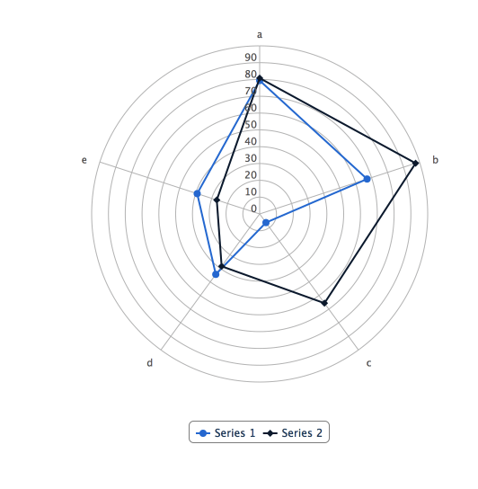
Похоже, вы хотите улучшить ggradar -package. Я так и сделал. Однако вместо одной функции я использую три из них, которые позволяют пользователю манипулировать каждым аспектом сюжета. Как правило, вы можете просто обобщить любой из моих примеров с одной большой функцией, такой как ggradar(),
Я также создал одну версию радара с plotly а также shiny: 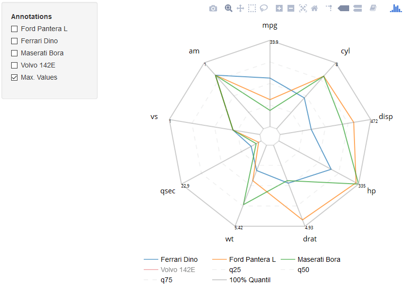
Полностью прокомментированный пример вы можете найти здесь. Повеселись;)
Вы также можете попробовать ggplot2, см. мой ответ на другой соответствующий вопрос здесь на /questions/43193150/zakryitie-linij-v-diagramme-radara-pauka-ggplot2/43193168#43193168