Bootstrap 4.5, отдельные полосы прокрутки и привязка Div к низу
Я пытаюсь организовать некоторые элементы в 3 столбца с помощью Bootstrap 4.5.
Центральная колонна будет иметь длинное тело.
Правый столбец с содержимым (2 блока) должен быть либо прикреплен к верхнему / нижнему краю. Мне очень трудно заставить нижний элемент приклеиться. Элемент автоматически расширяется, и я хочу, чтобы он автоматически расширялся снизу.
Я использую Tocify в качестве ToC в верхней части этого правого столбца.
В левом столбце есть несколько div. Верхний div - это баннер, который я бы хотел туда приклеить. Остальные div менее важны. В зависимости от размера области просмотра этот столбец может переполняться, и в этом случае мне нужна независимая полоса прокрутки для этого левого столбца. Должно быть 2 отдельных независимых полосы прокрутки (прокрутка веб-страницы и прокрутка левой панели).
Вот скрипт, загруженный при загрузке, с примером (с длинным телом для демонстрации проблемы): https://jsfiddle.net/x1nhrwtf/5/
<body>
  <div class="container-fluid">
    <main class="container py-3">
      <div class="row">

        <aside class="col-md-2">

          <div class="row banner sticky-top bg-white p-3">
            This will be some banner. Should always stick to the top.
          </div>
          <div class="scrollable-area hide-this-on-small-devices">
            <div class="row bg-white p-3">
              This column is <em>not</em> supposed to scroll along with the middle section, <em>unless</em> the elements are overflown (in which case, I want a separate scrollbar).
              <hr />
            </div>
            <div class="row bg-white p-3">
              This will have a search bar. Hide this on small devices.
            </div>
            <div class="row bg-white p-3">
              This will have announcements. Hide this on small devices.
            </div>
            <div class="row bg-white p-3">
              This will have BuiltWith. Hide this on small devices.
            </div>
          </div>
        </aside>

        <section class="content col-md-6">
          Lorem ipsum dolor sit amet...
        </section>

        <aside class="col-md-4">
          <div class="toc sticky-top bg-white p-3">
            <h3>ToC Section, sticky</h3>
            <hr />
            This is positioned correct, pretty much.
            Should stay at the top, even on small devices.
            This element auto-expands to 60% height.

            This is a Tocify style ToC:

            <div id="toc" class="pl-1"></div>
          </div>

          <div class="comments sticky-bottom bg-white p-3">
            <h3>Comment section</h3>
            <hr />
            This should stick to the bottom of the column (and page).
            This element auto-expands to 40% height.
          </div>

        </aside>
      </div>
    </main>
    <footer class="footer">Here is a footer. It should be stuck across the bottom. Why is it not there?</footer>

  </div>
</body>
Попытка CSS:
.row {
  background: #f8f9fa;
  margin-top: 20px;
}

.col {
  border: solid 1px #6c757d;
  padding: 10px;
}

.toc {
  max-height: 60%;
}

.comments {
  max-height: 40%;
}

.scrollable-area {
  overflow-y: auto;
}
2 ответа
Это решение, которое я разработал. Есть контейнер для трех столбцов с overflow: hidden и height: 100vh, чтобы избежать прокрутки страницы. И три столбца с прокруткой переполнения для параллельной прокрутки.
Остальные, думаю, выполнены. Верхние компоненты слева и справа отмечены серым, а сверху - голубым. Комментарий остается внизу страницы и в столбце. И нижний колонтитул виден.
html,
body {
  margin: 0;
  padding: 0;
}

.container {
  display: flex;
  flex-direction: row;
  justify-content: space-evenly;
  width: 100vw;
  height: 100vh;
  border: solid 1px red;
  overflow: hidden;
}

.col {
  display: flex;
  flex-direction: column;
  justify-content: flex-start;
  height: auto;
  overflow: auto;
  padding: 3px;
}

.col-md-2 {
  width: 16.6666666667%;
}

.col-md-4 {
  width: 33.3333333334%;
}

.col-md-6 {
  width: 50%;
}

.center {
  background-color: green;
  text-align: justify;
}

.sticky-top {
  position: fixed;
  width: inherit;
  top: 0;
  background-color: gray;
}

.sticky-bottom {
  position: sticky;
  bottom: 0;
}

.scrollable-area {
  position: relative;
  z-index: -1;
}

.toc {
  height: 60%;
  max-height: 60%;
}

.comments {
  position: fixed;
  bottom: 0;
  z-index: -1;
  height: 40%;
  max-height: 40%;
}

footer {
  position: fixed;
  bottom: 0;
  width: 100%;
  z-index: 100;
  background-color: black;
  color: white;
}
<div class="container">
<div class="col left col-md-2">
<div class="banner sticky-top">
This will be some banner. Should always stick to the top.
</div>
<div class="scrollable-area hide-this-on-small-devices">
<div class="row bg-white p-3">
This column is <em>not</em> supposed to scroll along with the middle section, <em>unless</em> the elements are overflown (in which case, I want a separate scrollbar).
<hr />
</div>
<div class="row bg-white p-3">
This will have a search bar. Hide this on small devices.
<hr />
</div>
<div class="row bg-white p-3">
This will have announcements. Hide this on small devices.
<hr />
</div>
<div class="row bg-white p-3">
This will have BuiltWith. Hide this on small devices.
<hr />
</div>
</div>
</div>
<div class="col center col-md-6">
Lorem ipsum dolor sit amet, consectetur adipiscing elit, sed do eiusmod tempor incididunt ut labore et dolore magna aliqua. Volutpat sed cras ornare arcu dui vivamus arcu. Iaculis eu non diam phasellus vestibulum lorem sed risus ultricies. Suscipit tellus
mauris a diam maecenas. Egestas maecenas pharetra convallis posuere morbi leo urna molestie. Augue neque gravida in fermentum et sollicitudin ac. Amet purus gravida quis blandit turpis cursus in hac. Aenean pharetra magna ac placerat vestibulum. Quis
ipsum suspendisse ultrices gravida dictum fusce ut placerat orci. Ut placerat orci nulla pellentesque dignissim enim sit amet venenatis. Lacus vestibulum sed arcu non odio euismod.<br> Amet venenatis urna cursus eget nunc scelerisque viverra.
Sodales ut eu sem integer vitae justo eget. Tempor orci eu lobortis elementum. Dictum at tempor commodo ullamcorper a lacus. Vel facilisis volutpat est velit egestas dui id ornare. Urna duis convallis convallis tellus. Blandit massa enim nec dui nunc
mattis enim ut. Quisque non tellus orci ac. Tempus egestas sed sed risus pretium quam vulputate dignissim suspendisse. Fermentum leo vel orci porta. Duis tristique sollicitudin nibh sit amet commodo nulla facilisi. Elementum facilisis leo vel fringilla
est ullamcorper eget. Condimentum lacinia quis vel eros donec ac. Felis eget velit aliquet sagittis id consectetur purus. Fringilla ut morbi tincidunt augue interdum velit euismod. Faucibus a pellentesque sit amet porttitor. Sapien eget mi proin sed
libero enim sed. Nulla porttitor massa id neque aliquam vestibulum morbi blandit cursus.<br> Mattis pellentesque id nibh tortor id aliquet lectus proin nibh. Elit duis tristique sollicitudin nibh sit. Risus commodo viverra maecenas accumsan lacus
vel. Elementum sagittis vitae et leo duis ut diam. Mauris vitae ultricies leo integer malesuada nunc vel. Adipiscing tristique risus nec feugiat in fermentum posuere. Orci sagittis eu volutpat odio. Aliquet bibendum enim facilisis gravida neque convallis
a. Eget lorem dolor sed viverra ipsum nunc. Orci eu lobortis elementum nibh tellus molestie nunc non. Nulla aliquet porttitor lacus luctus accumsan tortor posuere ac. Gravida arcu ac tortor dignissim convallis aenean et. Tincidunt tortor aliquam nulla
facilisi cras fermentum odio. Vel pretium lectus quam id leo in vitae turpis. Ullamcorper velit sed ullamcorper morbi tincidunt ornare. Sit amet commodo nulla facilisi nullam. Senectus et netus et malesuada. Id porta nibh venenatis cras sed felis
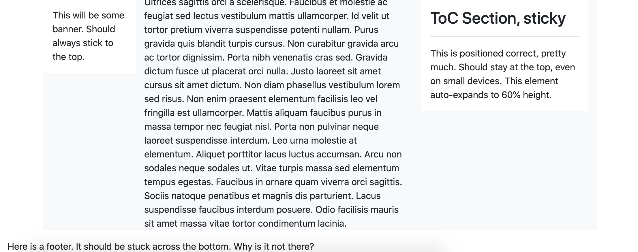
eget.<br> Ultrices sagittis orci a scelerisque. Faucibus et molestie ac feugiat sed lectus vestibulum mattis ullamcorper. Id velit ut tortor pretium viverra suspendisse potenti nullam. Purus gravida quis blandit turpis cursus. Non curabitur gravida
arcu ac tortor dignissim. Porta nibh venenatis cras sed. Gravida dictum fusce ut placerat orci nulla. Justo laoreet sit amet cursus sit amet dictum. Non diam phasellus vestibulum lorem sed risus. Non enim praesent elementum facilisis leo vel fringilla
est ullamcorper.<br> Mattis aliquam faucibus purus in massa tempor nec feugiat nisl. Porta non pulvinar neque laoreet suspendisse interdum. Leo urna molestie at elementum. Aliquet porttitor lacus luctus accumsan. Arcu non sodales neque sodales ut.
Vitae turpis massa sed elementum tempus egestas. Faucibus in ornare quam viverra orci sagittis. Sociis natoque penatibus et magnis dis parturient. Lacus suspendisse faucibus interdum posuere. Odio facilisis mauris sit amet massa vitae tortor condimentum
lacinia.
</div>
<div class="col right col-md-4">
<div class="toc sticky-top bg-white p-3">
<h3>ToC Section, sticky</h3>
<hr /> This is positioned correct, pretty much. Should stay at the top, even on small devices. This element auto-expands to 60% height.
</div>
<div class="comments sticky-bottom bg-white p-3">
<h3>Comment section</h3>
<hr /> This should stick to the bottom of the column (and page). This element auto-expands to 40% height.
</div>
</div>
</div>
<footer class="footer">Here is a footer. It should be stuck across the bottom. Why is it not there?</footer>Нижний колонтитул все еще здесь (внизу). Я думаю, вы этого не видели, потому что консоль jsfiddle закрыла это.