график ggpairs с тепловой картой значений корреляции со звездами значимости и настраиваемой темой
Я хотел бы создать график корреляции с ggPairs(), который должен содержать
- тепловая карта значений корреляции ( как в этом вопросе SO)
- звезды значимости для корреляции ( как в этом вопросе SO)
- тип шрифта и размер шрифта в соответствии с пользовательской темой.
Основываясь на отличных решениях, предоставленных @user20650 на вышеупомянутые вопросы SO, мне удалось создать функцию для создания тепловой карты значений корреляции со звездами значимости.
К сожалению, при добавлении (настраиваемой) темы цветные панели panel.backgrounds удаляются (MWE приведен ниже).
MWE
library(ggplot2)
library(GGally)
# fct. to create heatmap of correlation values with significance stars for upper triangle of ggpairs plot
cor_fun <- function(data, mapping, method="pearson", use="pairwise", ndp=2, sz=5, stars=TRUE, ...){
# grab data
x <- eval_data_col(data, mapping$x)
y <- eval_data_col(data, mapping$y)
# calculate correlation: for significance stars
corr <- cor.test(x, y, method=method)
est <- corr$estimate
lb.size <- sz* abs(est)
# get significance stars
if(stars){
stars <- c("***", "**", "*", "")[findInterval(corr$p.value, c(0, 0.001, 0.01, 0.05, 1))]
lbl <- paste0(round(est, ndp), stars)
}else{
lbl <- round(est, ndp)
}
# calculate correlation: for colored tiles
corr <- cor(x, y, method=method, use=use)
# calculate color based on correlation value
# corr = -1 => blue,
# corr = 0 => white,
# corr = +1 => red,
colFn <- colorRampPalette(c("blue", "white", "red"), interpolate ='spline')
fill <- colFn(100)[findInterval(corr, seq(-1, 1, length=100))]
ggplot(data = data, mapping = mapping, ...) +
theme_void() +
annotate("text",
x=mean(x, na.rm=TRUE),
y=mean(y, na.rm=TRUE),
label=lbl,
size=lb.size,
...) +
theme(panel.background = element_rect(fill=fill, # to fill background of panel with color
colour=NA), # to remove border of panel
panel.grid.major = element_blank())
}
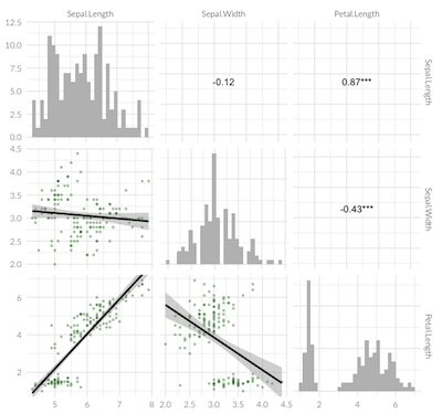
sample_df <- iris[,1:3]
ggpairs(sample_df,
# LOWER TRIANGLE ELEMENTS: add line with smoothing; make points transparent and smaller
lower=list(continuous=wrap("smooth", colour="darkgreen", alpha = 0.3, size=0.8)),
# DIAGONAL ELEMENTS: histograms instead of smooothed density
diag=list(continuous=wrap("barDiag", fill="grey")),
# UPPER TRIANGLE ELEMENTS: use new fct. to create heatmap of correlation values with significance stars
upper=list(continuous=cor_fun)
) + theme_minimal(base_size=12, base_family="Lato Light")
1 ответ
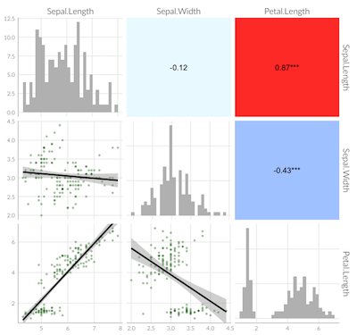
Основываясь на комментарии от @user20650, я смог найти решение, которым хотел бы поделиться с другими, испытывающими аналогичные трудности:
library(ggplot2)
library(GGally)
theme_lato <- theme_minimal(base_size=10, base_family="Lato Light")

ggpairs(sample_df,
        # LOWER TRIANGLE ELEMENTS: add line with smoothing; make points transparent and smaller
        lower = list(continuous = function(...)
          ggally_smooth(..., colour="darkgreen", alpha = 0.3, size=0.8) + theme_lato),
        # DIAGONAL ELEMENTS: histograms
        diag = list(continuous = function(...)
          ggally_barDiag(..., fill="grey") + theme_lato),
          # to plot smooth densities instead: use ggally_densityDiag() or better my_dens(), see comment below
        # UPPER TRIANGLE ELEMENTS: use new fct. to create heatmap of correlation values with significance stars
        upper = list(continuous = cor_fun)
        ) +
  theme(# adjust strip texts
        strip.background = element_blank(), # remove color
        strip.text = element_text(size=12, family="Lato Light"), # change font and font size
        axis.line = element_line(colour = "grey"),
        # remove grid
        panel.grid.minor = element_blank(),   # remove smaller gridlines
        # panel.grid.major = element_blank()    # remove larger gridlines
        )
Если интересно рисовать плотности вместо гистограмм по диагонали: ggally_densityDiag()может привести к тому, что плотность будет больше 1. Следующая fct. вместо этого можно использовать:
my_dens <- function(data, mapping, ...) {
  ggplot(data = data, mapping=mapping) +
    geom_density(..., aes(x=..., y=..scaled..), alpha = 0.7, color = NA)
}
Информация о сеансе: MacOs 10.13.6, R 3.6.3, ggplot2_3.3.1, GGally_1.5.0