Вторичная / двойная ось Matplotlib - маркировка с кружком и стрелкой - для черно-белой (черно-белой) публикации
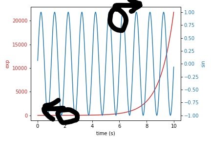
Обычно две оси Y разделены разными цветами, как показано в примере ниже.
Для публикаций часто необходимо сделать его различимым, даже если он напечатан в черно-белом варианте.
Обычно это делается путем построения кругов вокруг линии, к которой прикреплена стрелка в направлении соответствующей оси.
Как этого добиться с помощью matplotlib? Или есть лучший способ улучшить черно-белую читаемость без этих кругов?
Код от matplotlib.org:
import numpy as np
import matplotlib.pyplot as plt

# Create some mock data
t = np.arange(0.01, 10.0, 0.01)
data1 = np.exp(t)
data2 = np.sin(2 * np.pi * t)

fig, ax1 = plt.subplots()

color = 'tab:red'
ax1.set_xlabel('time (s)')
ax1.set_ylabel('exp', color=color)
ax1.plot(t, data1, color=color)
ax1.tick_params(axis='y', labelcolor=color)

ax2 = ax1.twinx()  # instantiate a second axes that shares the same x-axis

color = 'tab:blue'
ax2.set_ylabel('sin', color=color)  # we already handled the x-label with ax1
ax2.plot(t, data2, color=color)
ax2.tick_params(axis='y', labelcolor=color)

fig.tight_layout()  # otherwise the right y-label is slightly clipped
plt.show()
1 ответ
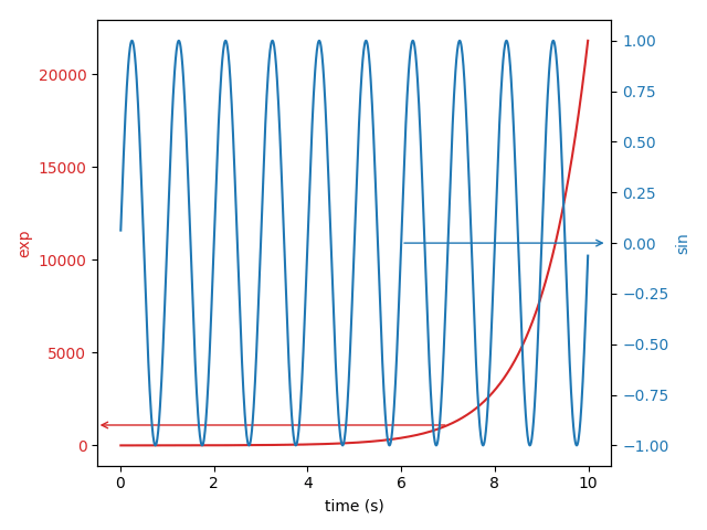
Вы можете использовать аннотацию осей matplotlib, чтобы нарисовать стрелки к осям Y. Вам нужно будет найти точки на графике, где должны начинаться стрелки. Тем не менее, это не строит круги вокруг линий. Если вы действительно хотите построить круг, вы можете использовать plt.scatter или plt.Circle, чтобы построить соответствующий круг, покрывающий соответствующую область.
import numpy as np
import matplotlib.pyplot as plt

# Create some mock data
t = np.arange(0.01, 10.0, 0.01)
data1 = np.exp(t)
data2 = np.sin(2 * np.pi * t)

fig, ax1 = plt.subplots()

color = 'tab:red'
ax1.set_xlabel('time (s)')
ax1.set_ylabel('exp', color=color)
ax1.plot(t, data1, color=color)
ax1.tick_params(axis='y', labelcolor=color)

ax1.annotate('', xy=(7, 1096), xytext=(-0.5, 1096), # start the arrow from x=7 and draw towards primary y-axis
            arrowprops=dict(arrowstyle="<-", color=color))

ax2 = ax1.twinx()  # instantiate a second axes that shares the same x-axis

color = 'tab:blue'
ax2.set_ylabel('sin', color=color)  # we already handled the x-label with ax1
ax2.plot(t, data2, color=color)
ax2.tick_params(axis='y', labelcolor=color)

# plt.arrow()
ax2.annotate('', xy=(6,0),  xytext=(10.4, 0), # start the arrow from x=6 and draw towards secondary y-axis
            arrowprops=dict(arrowstyle="<-", color=color))

fig.tight_layout()  # otherwise the right y-label is slightly clipped
plt.show()
Ниже приведен пример выходных данных.
РЕДАКТИРОВАТЬ: Ниже приведен фрагмент с кругами, которые вы просили. я использовал plt.scatter,
import numpy as np
import matplotlib.pyplot as plt
from matplotlib.patches import Circle
# Create some mock data
t = np.arange(0.01, 10.0, 0.01)
data1 = np.exp(t)
data2 = np.sin(2 * np.pi * t)

fig, ax1 = plt.subplots()

color = 'tab:red'
ax1.set_xlabel('time (s)')
ax1.set_ylabel('exp', color=color)
ax1.plot(t, data1, color=color)
ax1.tick_params(axis='y', labelcolor=color)

ax1.annotate('', xy=(7, 1096), xytext=(-0.5, 1096), # start the arrow from x=7 and draw towards primary y-axis
            arrowprops=dict(arrowstyle="<-", color=color))

# circle1 = Circle((5, 3000), color='r')
# ax1.add_artist(circle1)
plt.scatter(7, 1096, s=100, facecolors='none', edgecolors='r')

ax2 = ax1.twinx()  # instantiate a second axes that shares the same x-axis

color = 'tab:blue'
ax2.set_ylabel('sin', color=color)  # we already handled the x-label with ax1
ax2.plot(t, data2, color=color)
ax2.tick_params(axis='y', labelcolor=color)

# plt.arrow()
ax2.annotate('', xy=(6.7,0),  xytext=(10.5, 0), # start the arrow from x=6.7 and draw towards secondary y-axis
            arrowprops=dict(arrowstyle="<-", color=color))
plt.scatter(6,0, s=2000, facecolors='none', edgecolors=color)


fig.tight_layout()  # otherwise the right y-label is slightly clipped
plt.savefig('fig')
plt.show()
Вот пример вывода.
Этот подход основан на этом ответе. Он использует дугу, которую можно настроить следующим образом:

import matplotlib.pyplot as plt
from matplotlib.patches import Arc

# Generate example graph
fig = plt.figure(figsize=(5, 5))
ax = fig.add_subplot(1, 1, 1)
ax.plot([1,2,3,4,5,6], [2,4,6,8,10,12])

# Configure arc
center_x = 2            # x coordinate
center_y = 3.8          # y coordinate
radius_1 = 0.25         # radius 1
radius_2 = 1            # radius 2 >> for cicle: radius_2 = 2 x radius_1
angle = 180             # orientation
theta_1 = 70            # arc starts at this angle
theta_2 = 290           # arc finishes at this angle
arc = Arc([center_x, center_y],
          radius_1,
          radius_2,
          angle = angle,
          theta1 = theta_1,
          theta2=theta_2,
          capstyle = 'round',
          linestyle='-',
          lw=1,
          color = 'black')

# Add arc
ax.add_patch(arc)

# Add arrow
x1 = 1.9            # x coordinate
y1 = 4              # y coordinate
length_x = -0.5     # length on the x axis (negative so the arrow points to the left)
length_y = 0        # length on the y axis
ax.arrow(x1,
         y1,
         length_x,
         length_y,
         head_width=0.1,
         head_length=0.05,
         fc='k',
         ec='k',
         linewidth = 0.6)
Результат показан ниже:
