CSS: применить свойство mix-blend-mode только к определенным элементам
Я хочу использовать свойство mix-blend-mode, чтобы некоторые конкретные пути SVG делали фоновое изображение обводки так, чтобы путь выглядел так, как если бы это был стираемый путь. Следующий код - это то, чего я достиг. Однако, как вы можете видеть, свойство mix-blend влияет на другие контуры, которые необходимы для отображения без фонового изображения на обводке. Поэтому я прошу способ применить свойство mix-blend-mode только к отдельным группам элементов и не затрагивать другие элементы.
g.erasing image{
mix-blend-mode:  lighten;
}
<html>
<body>
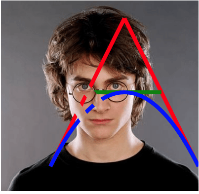
<svg height="400" width="450">
<!-- this is the background image -->
<image id="background" xlink:href="https://s3-us-west-2.amazonaws.com/s.cdpn.io/3/Harry-Potter-1-.jpg" width="400" height="450"></image>
<g class="drawing">
<!-- these are the drawing paths -->
<path d="M 100 350 l 150 -300" stroke="red" stroke-width="8" fill="none" />
<path d="M 250 50 l 150 300" stroke="red" stroke-width="8" fill="none" />
<path d="M 175 200 l 150 0" stroke="green" stroke-width="8" fill="none" />
<path d="M 100 350 q 150 -300 300 0" stroke="blue" stroke-width="8" fill="none" />
</g>
<g class="erasing">
<!-- these are the erasing paths -->
<path d="M 0 0 L 400 450" stroke="black" stroke-width="20" />
<path d="M 0 0 L 200 300" stroke="black" stroke-width="20" />
<image xlink:href="https://s3-us-west-2.amazonaws.com/s.cdpn.io/3/Harry-Potter-1-.jpg" width="400" height="450"></image>
</g>
</svg>
</body>
</html>Вот что я ищу.
Примечание. Я могу сделать это с помощью маскировки, но в некоторых браузерах это происходит очень медленно.
1 ответ
Ты можешь использовать g элемент с isolation: isolate; указать элементы под действием mix-blend-mode,
circle{
  mix-blend-mode: lighten;
}
g{
  isolation: isolate;
}
<svg width="200px" height="200px">
<rect width="100%" height="100%" fill="pink"/>
<circle cx="100" cy="80" r="60" fill="red"/>
<circle cx="70" cy="130" r="60" fill="green"/>
<circle cx="130" cy="130" r="60" fill="blue"/>
</svg>
<svg width="200px" height="200px">
<rect width="100%" height="100%" fill="pink"/>
<g>
<circle cx="100" cy="80" r="60" fill="red"/>
<circle cx="70" cy="130" r="60" fill="#0f0"/>
<circle cx="130" cy="130" r="60" fill="blue"/>
</g>
</svg>Но в этом случае, я думаю, вы должны использовать mask элемент.
g.drawing{
  mask: url(#erasing);
}
<svg height="400" width="450">
<!-- this is the background image -->
<image id="background" xlink:href="https://s3-us-west-2.amazonaws.com/s.cdpn.io/3/Harry-Potter-1-.jpg" width="400" height="450"></image>
<g class="drawing">
<!-- these are the drawing paths -->
<path d="M 100 350 l 150 -300" stroke="red" stroke-width="8" fill="none" />
<path d="M 250 50 l 150 300" stroke="red" stroke-width="8" fill="none" />
<path d="M 175 200 l 150 0" stroke="green" stroke-width="8" fill="none" />
<path d="M 100 350 q 150 -300 300 0" stroke="blue" stroke-width="8" fill="none" />
</g>
<defs>
<mask id="erasing">
<rect width="100%" height="100%" fill="white"/>
<!-- these are the erasing paths -->
<path d="M 0 0 L 400 450" stroke="black" stroke-width="20" />
<path d="M 0 0 L 200 300" stroke="black" stroke-width="20" />
</mask>
</defs>
</svg>