Скрыть корневой узел при огранке в ggraph с помощью circlepack
У меня есть таблица виджетов; Каждый виджет имеет уникальный идентификатор, цвет и категорию. Я хочу сделать circlepack график этой таблицы в ggraph с гранями категории, цветом> идентификатором виджета:
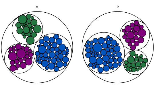
Проблема в корневом узле. В этом MWE корневой узел не имеет категории, поэтому он получает свой собственный аспект.
library(igraph)
library(ggraph)

# Toy dataset.  Each widget has a unique ID, a fill color, a category, and a
# count.  Most widgets are blue.
widgets.df = data.frame(
  id = seq(1:200),
  fill.hex = sample(c("#0055BF", "#237841", "#81007B"), 200, replace = T,
                    prob = c(0.6, 0.2, 0.2)),
  category = c(rep("a", 100), rep("b", 100)),
  num.widgets = ceiling(rexp(200, 0.3)),
  stringsAsFactors = F
)

# Edges of the graph.
widget.edges = bind_rows(
  # One edge from each color/category to each related widget.
  widgets.df %>%
    mutate(from = paste(fill.hex, category, sep = ""),
           to = paste(id, fill.hex, category, sep = "")) %>%
    select(from, to) %>%
    distinct(),
  # One edge from each category to each related color.
  widgets.df %>%
    mutate(from = category,
           to = paste(fill.hex, category, sep = "")) %>%
    select(from, to) %>%
    distinct(),
  # One edge from the root node to each category.
  widgets.df %>%
    mutate(from = "root",
           to = category)
)

# Vertices of the graph.
widget.vertices = bind_rows(
  # One vertex for each widget.
  widgets.df %>%
    mutate(name = paste(id, fill.hex, category, sep = ""),
           fill.to.plot = fill.hex,
           color.to.plot = "#000000") %>%
    select(name, category, fill.to.plot, color.to.plot, num.widgets) %>%
    distinct(),
  # One vertex for each color/category.
  widgets.df %>%
    mutate(name = paste(fill.hex, category, sep = ""),
           fill.to.plot = "#FFFFFF",
           color.to.plot = "#000000",
           num.widgets = 1) %>%
    select(name, category, fill.to.plot, color.to.plot, num.widgets) %>%
    distinct(),
  # One vertex for each category.
  widgets.df %>%
    mutate(name = category,
           fill.to.plot = "#FFFFFF",
           color.to.plot = "#000000",
           num.widgets = 1) %>%
    select(name, category, fill.to.plot, color.to.plot, num.widgets) %>%
    distinct(),
  # One root vertex.
  data.frame(name = "root",
             category = "",
             fill.to.plot = "#FFFFFF",
             color.to.plot = "#BBBBBB",
             num.widgets = 1,
             stringsAsFactors = F)
)

# Make the graph.
widget.igraph = graph_from_data_frame(widget.edges, vertices = widget.vertices)
widget.ggraph = ggraph(widget.igraph,
                       layout = "circlepack", weight = "num.widgets") +
  geom_node_circle(aes(fill = fill.to.plot, color = color.to.plot)) +
  scale_fill_manual(values = sort(unique(widget.vertices$fill.to.plot))) +
  scale_color_manual(values = sort(unique(widget.vertices$color.to.plot))) +
  theme_void() +
  guides(fill = F, color = F, size = F) +
  theme(aspect.ratio = 1) +
  facet_nodes(~ category, scales = "free")
widget.ggraph
Если я опущу корневой узел полностью, ggraph выдает предупреждение о том, что график имеет несколько компонентов и отображает только первую категорию.
Если я назначу корневой узел первой категории, график этой первой категории будет сокращен (поскольку весь корневой узел тоже отображается scales="free" отображает все остальные категории по желанию).
Я также попытался добавить filter = !is.na(category) к aes из geom_node_circle а также drop = T в facet_nodes, но это, похоже, не имело никакого эффекта.
В качестве последнего средства я могу сохранить фасет для корневого узла, но сделать его полностью пустым (сделать имя категории пустой строкой, изменить цвет круга на белый). Если фасет корневого узла всегда последний, будет менее очевидно, что здесь есть что-то постороннее. Но я бы хотел найти лучшее решение.
Я открыт для использования чего-то другого, кроме ggraph, но у меня есть следующие технические ограничения:
Мне нужно заполнить круг каждого виджета фактическим цветом виджета. Я считаю, что это исключает
circlepackeR,Мне нужно два уровня в каждом графике (цвет и идентификатор виджета); Я считаю, что это исключает
packcircles+ggiraph, как описано здесь.Графики являются частью приложения Shiny, где я использую это решение для добавления всплывающих подсказок (идентификатор для каждого виджета; это должна быть подсказка, а не метка, потому что в реальном наборе данных круги маленькие, а идентификаторы очень долго). Я считаю, что это несовместимо с созданием отдельных графиков для каждой категории и построением их с
grid.arrange, Я никогда не использовалd3, поэтому я не знаю, можно ли изменить этот подход, чтобы приспособить фасетку и всплывающие подсказки.
Редактировать: еще один MWE, который включает в себя блестящую часть:
library(dplyr)
library(shiny)
library(igraph)
library(ggraph)

# Toy dataset.  Each widget has a unique ID, a fill color, a category, and a
# count.  Most widgets are blue.
widgets.df = data.frame(
  id = seq(1:200),
  fill.hex = sample(c("#0055BF", "#237841", "#81007B"), 200, replace = T,
                    prob = c(0.6, 0.2, 0.2)),
  category = c(rep("a", 100), rep("b", 100)),
  num.widgets = ceiling(rexp(200, 0.3)),
  stringsAsFactors = F
)

# Edges of the graph.
widget.edges = bind_rows(
  # One edge from each color/category to each related widget.
  widgets.df %>%
    mutate(from = paste(fill.hex, category, sep = ""),
           to = paste(id, fill.hex, category, sep = "")) %>%
    select(from, to) %>%
    distinct(),
  # One edge from each category to each related color.
  widgets.df %>%
    mutate(from = category,
           to = paste(fill.hex, category, sep = "")) %>%
    select(from, to) %>%
    distinct(),
  # One edge from the root node to each category.
  widgets.df %>%
    mutate(from = "root",
           to = category)
)

# Vertices of the graph.
widget.vertices = bind_rows(
  # One vertex for each widget.
  widgets.df %>%
    mutate(name = paste(id, fill.hex, category, sep = ""),
           fill.to.plot = fill.hex,
           color.to.plot = "#000000") %>%
    select(name, category, fill.to.plot, color.to.plot, num.widgets) %>%
    distinct(),
  # One vertex for each color/category.
  widgets.df %>%
    mutate(name = paste(fill.hex, category, sep = ""),
           fill.to.plot = "#FFFFFF",
           color.to.plot = "#000000",
           num.widgets = 1) %>%
    select(name, category, fill.to.plot, color.to.plot, num.widgets) %>%
    distinct(),
  # One vertex for each category.
  widgets.df %>%
    mutate(name = category,
           fill.to.plot = "#FFFFFF",
           color.to.plot = "#000000",
           num.widgets = 1) %>%
    select(name, category, fill.to.plot, color.to.plot, num.widgets) %>%
    distinct(),
  # One root vertex.
  data.frame(name = "root",
             fill.to.plot = "#FFFFFF",
             color.to.plot = "#BBBBBB",
             num.widgets = 1,
             stringsAsFactors = F)
)

# UI logic.
ui <- fluidPage(

   # Application title
   titlePanel("Widget Data"),

   # Make sure the cursor has the default shape, even when using tooltips
   tags$head(tags$style(HTML("#widgetPlot { cursor: default; }"))),

   # Main panel for plot.
   mainPanel(
     # Circle-packing plot.
     div(
       style = "position:relative",
       plotOutput(
         "widgetPlot",
         width = "700px",
         height = "400px",
         hover = hoverOpts("widget_plot_hover", delay = 20, delayType = "debounce")
       ),
       uiOutput("widgetHover")
     )
   )

)

# Server logic.
server <- function(input, output) {

  # Create the graph.
  widget.ggraph = reactive({
    widget.igraph = graph_from_data_frame(widget.edges, vertices = widget.vertices)
    widget.ggraph = ggraph(widget.igraph,
                           layout = "circlepack", weight = "num.widgets") +
      geom_node_circle(aes(fill = fill.to.plot, color = color.to.plot)) +
      scale_fill_manual(values = sort(unique(widget.vertices$fill.to.plot))) +
      scale_color_manual(values = sort(unique(widget.vertices$color.to.plot))) +
      theme_void() +
      guides(fill = F, color = F, size = F) +
      theme(aspect.ratio = 1) +
      facet_nodes(~ category, scales = "free")
    widget.ggraph
  })

  # Render the graph.
  output$widgetPlot = renderPlot({
    widget.ggraph()
  })

  # Tooltip for the widget graph.
  # https://gitlab.com/snippets/16220
  output$widgetHover = renderUI({
    # Get the hover options.
    hover = input$widget_plot_hover
    # Find the data point that corresponds to the circle the mouse is hovering
    # over.
    if(!is.null(hover)) {
      point = widget.ggraph()$data %>%
        filter(leaf) %>%
        filter(r >= (((x - hover$x) ^ 2) + ((y - hover$y) ^ 2)) ^ .5)
    } else {
      return(NULL)
    }
    if(nrow(point) != 1) {
      return(NULL)
    }
    # Calculate how far from the left and top the center of the circle is, as a
    # percent of the total graph size.
    left_pct = (point$x - hover$domain$left) / (hover$domain$right - hover$domain$left)
    top_pct <- (hover$domain$top - point$y) / (hover$domain$top - hover$domain$bottom)
    # Convert the percents into pixels.
    left_px <- hover$range$left + left_pct * (hover$range$right - hover$range$left)
    top_px <- hover$range$top + top_pct * (hover$range$bottom - hover$range$top)
    # Set the style of the tooltip.
    style = paste0("position:absolute; z-index:100; background-color: rgba(245, 245, 245, 0.85); ",
                   "left:", left_px, "px; top:", top_px, "px;")
    # Create the actual tooltip as a wellPanel.
    wellPanel(
      style = style,
      p(HTML(paste("Widget id and color:", point$name)))
    )
  })

}

# Run the application
shinyApp(ui = ui, server = server)
2 ответа
Вот одно из решений, хотя, возможно, и не лучшее. Давайте начнем с
gb <- ggplot_build(widget.ggraph)
gb$layout$layout <- gb$layout$layout[-1, ]
gb$layout$layout$COL <- gb$layout$layout$COL - 1
где таким образом мы как бы удаляем первый фасет. Однако нам все еще нужно исправить данные внутри gb, В частности, мы используем
library(scales)
gb$data[[1]] <- within(gb$data[[1]], {
  x[PANEL == 3] <- rescale(x[PANEL == 3], to = range(x[PANEL == 2]))
  x[PANEL == 2] <- rescale(x[PANEL == 2], to = range(x[PANEL == 1]))
  y[PANEL == 3] <- rescale(y[PANEL == 3], to = range(y[PANEL == 2]))
  y[PANEL == 2] <- rescale(y[PANEL == 2], to = range(y[PANEL == 1]))
})
масштабировать x а также y на панелях 3 и 2 - на панелях 2 и 1 соответственно. И, наконец,
gb$data[[1]] <- gb$data[[1]][gb$data[[1]]$PANEL %in% 2:3, ]
gb$data[[1]]$PANEL <- factor(as.numeric(as.character(gb$data[[1]]$PANEL)) - 1)
удаляет первую панель и соответственно меняет названия панелей. Это дает
library(grid)
grid.draw(ggplot_gtable(gb))
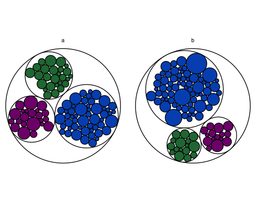
Вот еще один подход. использование ggraph создавать widget.ggraphНо не замышляй это. Вместо этого вытащите widget.ggraph$data, который содержит x0, y0, а также r для каждого круга. Отфильтруйте корневой узел и измените масштаб так, чтобы круги для каждого фасета были центрированы в (0, 0) и в том же масштабе. Верните это обратно в ggplot и построить круги с geom_circle,
Это решение является неоптимальным, поскольку включает в себя отображение данных дважды, но, по крайней мере, оно совместимо с подсказками Shiny.
library(dplyr)
library(shiny)
library(ggplot2)
library(igraph)
library(ggraph)

# Toy dataset.  Each widget has a unique ID, a fill color, a category, and a
# count.  Most widgets are blue.
widgets.df = data.frame(
  id = seq(1:200),
  fill.hex = sample(c("#0055BF", "#237841", "#81007B"), 200, replace = T,
                    prob = c(0.6, 0.2, 0.2)),
  category = c(rep("a", 100), rep("b", 100)),
  num.widgets = ceiling(rexp(200, 0.3)),
  stringsAsFactors = F
)

# Edges of the graph.
widget.edges = bind_rows(
  # One edge from each color/category to each related widget.
  widgets.df %>%
    mutate(from = paste(fill.hex, category, sep = ""),
           to = paste(id, fill.hex, category, sep = "")) %>%
    select(from, to) %>%
    distinct(),
  # One edge from each category to each related color.
  widgets.df %>%
    mutate(from = category,
           to = paste(fill.hex, category, sep = "")) %>%
    select(from, to) %>%
    distinct(),
  # One edge from the root node to each category.
  widgets.df %>%
    mutate(from = "root",
           to = category)
)

# Vertices of the graph.
widget.vertices = bind_rows(
  # One vertex for each widget.
  widgets.df %>%
    mutate(name = paste(id, fill.hex, category, sep = ""),
           fill.to.plot = fill.hex,
           color.to.plot = "#000000") %>%
    select(name, category, fill.to.plot, color.to.plot, num.widgets) %>%
    distinct(),
  # One vertex for each color/category.
  widgets.df %>%
    mutate(name = paste(fill.hex, category, sep = ""),
           fill.to.plot = "#FFFFFF",
           color.to.plot = "#000000",
           num.widgets = 1) %>%
    select(name, category, fill.to.plot, color.to.plot, num.widgets) %>%
    distinct(),
  # One vertex for each category.
  widgets.df %>%
    mutate(name = category,
           fill.to.plot = "#FFFFFF",
           color.to.plot = "#000000",
           num.widgets = 1) %>%
    select(name, category, fill.to.plot, color.to.plot, num.widgets) %>%
    distinct(),
  # One root vertex.
  data.frame(name = "root",
             fill.to.plot = "#FFFFFF",
             color.to.plot = "#BBBBBB",
             num.widgets = 1,
             stringsAsFactors = F)
)

# UI logic.
ui <- fluidPage(

   # Application title
   titlePanel("Widget Data"),

   # Make sure the cursor has the default shape, even when using tooltips
   tags$head(tags$style(HTML("#widgetPlot { cursor: default; }"))),

   # Main panel for plot.
   mainPanel(
     # Circle-packing plot.
     div(
       style = "position:relative",
       plotOutput(
         "widgetPlot",
         width = "700px",
         height = "400px",
         hover = hoverOpts("widget_plot_hover", delay = 20, delayType = "debounce")
       ),
       uiOutput("widgetHover")
     )
   )

)

# Server logic.
server <- function(input, output) {

  # Create the graph.
  widget.graph = reactive({
    # Use ggraph to create the circlepack plot.
    widget.igraph = graph_from_data_frame(widget.edges, vertices = widget.vertices)
    widget.ggraph = ggraph(widget.igraph,
                           layout = "circlepack", weight = "num.widgets") +
      geom_node_circle()
    # Pull out x, y, and r for each category.
    facet.centers = widget.ggraph$data %>%
      filter(as.character(name) == as.character(category)) %>%
      mutate(x.center = x, y.center = y, r.center = r) %>%
      dplyr::select(x.center, y.center, r.center, category)
    # Rescale x, y, and r for each non-root so that each category (facet) is
    # centered at (0, 0) and on the same scale.
    faceted.data = widget.ggraph$data %>%
      filter(!is.na(category)) %>%
      group_by(category) %>%
      left_join(facet.centers, by = c("category")) %>%
      mutate(x.faceted = (x - x.center) / r.center,
             y.faceted = (y - y.center) / r.center,
             r.faceted = r / r.center)
    # Feed the rescaled dataset into geom_circle.
    widget.facet.graph = ggplot(faceted.data,
                                aes(x0 = x.faceted,
                                    y0 = y.faceted,
                                    r = r.faceted,
                                    fill = fill.to.plot,
                                    color = color.to.plot)) +
      geom_circle() +
      scale_fill_manual(values = sort(unique(as.character(faceted.data$fill.to.plot)))) +
      scale_color_manual(values = sort(unique(as.character(faceted.data$color.to.plot)))) +
      facet_grid(~ category) +
      coord_equal() +
      guides(fill = F, color = F, size = F) +
      theme_void()
    widget.facet.graph
  })

  # Render the graph.
  output$widgetPlot = renderPlot({
    widget.graph()
  })

  # Tooltip for the widget graph.
  # https://gitlab.com/snippets/16220
  output$widgetHover = renderUI({
    # Get the hover options.
    hover = input$widget_plot_hover
    # Find the data point that corresponds to the circle the mouse is hovering
    # over.
    if(!is.null(hover)) {
      point = widget.graph()$data %>%
        filter(leaf) %>%
        filter(r.faceted >= (((x.faceted - hover$x) ^ 2) + ((y.faceted - hover$y) ^ 2)) ^ .5 &
                 as.character(category) ==  hover$panelvar1)
    } else {
      return(NULL)
    }
    if(nrow(point) != 1) {
      return(NULL)
    }
    # Calculate how far from the left and top the center of the circle is, as a
    # percent of the total graph size.
    left_pct = (point$x.faceted - hover$domain$left) / (hover$domain$right - hover$domain$left)
    top_pct <- (hover$domain$top - point$y.faceted) / (hover$domain$top - hover$domain$bottom)
    # Convert the percents into pixels.
    left_px <- hover$range$left + left_pct * (hover$range$right - hover$range$left)
    top_px <- hover$range$top + top_pct * (hover$range$bottom - hover$range$top)
    # Set the style of the tooltip.
    style = paste0("position:absolute; z-index:100; background-color: rgba(245, 245, 245, 0.85); ",
                   "left:", left_px, "px; top:", top_px, "px;")
    # Create the actual tooltip as a wellPanel.
    wellPanel(
      style = style,
      p(HTML(paste("Widget id and color:", point$name)))
    )
  })

}

# Run the application
shinyApp(ui = ui, server = server)