Липкое наложение с переходом
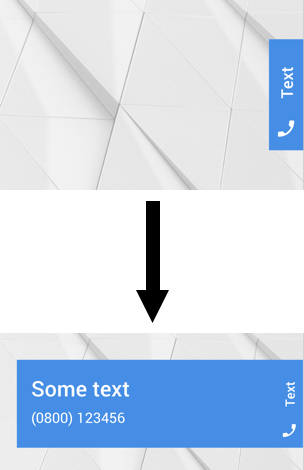
Я хочу использовать оверлей с переходом, как на следующем скриншоте
А вот мой текущий код:
.someclass {
  padding: 5px 5px 5px 5px;
  border-radius: 5px 0px 0px 5px;
  height: 100px;
  width: 30px;
  top: 50% !important;
  right: 0 !important;
  float: right;
  position: fixed !important;
  transition: width 0.5s;
  -webkit-transition: width 0.5s;
  text-align: center;
  overflow: hidden;
  z-index: 100 !important;
  color: white;
}

.someclass:hover {
  width: 400px;
}
<div class="someclass" style="background-color: #4A90E2;">
<h4 style="transform:rotate(-90deg)" ;>Text</h4>
<h2> Some Text</h2>
<p>much more text</p>
</div>1 ответ
Решение
Разделите ваш элемент на две части, затем используйте float влево и вправо, используя background, position и z-index, чтобы сделать наложение при его свертывании
.someclass {
  border-radius: 5px 0px 0px 5px;
  height: 100px;
  width: 30px;
  top: 50% !important;
  right: 0 !important;
  float: right;
  position: fixed !important;
  transition: width 0.5s;
  -webkit-transition: width 0.5s;
  text-align: center;
  overflow: hidden;
  z-index: 100 !important;
  color: white;
}

.someclass .right {
    float: right;
    background: #4A90E2;
    width: 30px;
    height: 100%;
    position: relative;
    z-index: 10;
}

.someclass .left {
    position: absolute;
    left: 0;
    float: left;
}

.someclass:hover {
  width: 400px;
}
<div class="someclass" style="background-color: #4A90E2;">
<div class="right">
<h4 style="transform:rotate(-90deg)" ;>Text</h4>
</div>
<div class="left">
<h2> Some Text</h2>
<p>much more text</p>
</div>
</div>Спасибо за тонну. Мой последний вопрос: как можно переместить текст с правой стороны вниз?
.someclass {
  border-radius: 5px 0px 0px 5px;
  height: 100px;
  width: 30px;
  top: 50% !important;
  right: 0 !important;
  float: right;
  position: fixed !important;
  transition: width 0.5s;
  -webkit-transition: width 0.5s;
  text-align: center;
  overflow: hidden;
  z-index: 100 !important;
  color: white;
}

.someclass .right {
    float: right;
    background: #4A90E2;
    width: 30px;
    height: 100%;
    position: relative;
    z-index: 10;
}

.someclass .left {
    position: absolute;
    left: 0;
    float: left;
}

.someclass:hover {
  width: 400px;
}
<div class="someclass" style="background-color: #4A90E2;">
<div class="right">
<h4 style="transform:rotate(-90deg)" ;>Text</h4>
</div>
<div class="left">
<h2> Some Text</h2>
<p>much more text</p>
</div>
</div>