Используйте изображения вместо переключателей
Если у меня есть радиогруппа с кнопками:

... как я могу показать только изображения в опции выбора вместо кнопок, например
10 ответов
- Оберните радио и изображение в
<label> - Скрыть радио кнопку (Не использовать
display:noneили жеvisibility:hiddenтак как это повлияет на доступность) - Наведите курсор на изображение рядом со скрытой радиостанцией, используя селектор смежного брата
+
/* HIDE RADIO */
[type=radio] {
  position: absolute;
  opacity: 0;
  width: 0;
  height: 0;
}

/* IMAGE STYLES */
[type=radio] + img {
  cursor: pointer;
}

/* CHECKED STYLES */
[type=radio]:checked + img {
  outline: 2px solid #f00;
}
<label>
<input type="radio" name="test" value="small" checked>
<img src="http://placehold.it/40x60/0bf/fff&text=A">
</label>
<label>
<input type="radio" name="test" value="big">
<img src="http://placehold.it/40x60/b0f/fff&text=B">
</label>Не забудьте добавить класс к вашим ярлыкам и использовать его вместо CSS.
Пользовательские стили и анимация
Вот расширенная версия с использованием <i> элемент и :after псевдо:

body{color:#444;font:100%/1.4 sans-serif;}
/* CUSTOM RADIO & CHECKBOXES
http://stackru.com/a/17541916/383904 */
.rad,
.ckb{
cursor: pointer;
user-select: none;
-webkit-user-select: none;
-webkit-touch-callout: none;
}
.rad > input,
.ckb > input{ /* HIDE ORG RADIO & CHECKBOX */
position: absolute;
opacity: 0;
width: 0;
height: 0;
}
/* RADIO & CHECKBOX STYLES */
/* DEFAULT <i> STYLE */
.rad > i,
.ckb > i{
display: inline-block;
vertical-align: middle;
width: 16px;
height: 16px;
border-radius: 50%;
transition: 0.2s;
box-shadow: inset 0 0 0 8px #fff;
border: 1px solid gray;
background: gray;
}
/* CHECKBOX OVERWRITE STYLES */
.ckb > i {
width: 25px;
border-radius: 3px;
}
.rad:hover > i{ /* HOVER <i> STYLE */
box-shadow: inset 0 0 0 3px #fff;
background: gray;
}
.rad > input:checked + i{ /* (RADIO CHECKED) <i> STYLE */
box-shadow: inset 0 0 0 3px #fff;
background: orange;
}
/* CHECKBOX */
.ckb > input + i:after{
content: "";
display: block;
height: 12px;
width: 12px;
margin: 2px;
border-radius: inherit;
transition: inherit;
background: gray;
}
.ckb > input:checked + i:after{ /* (RADIO CHECKED) <i> STYLE */
margin-left: 11px;
background: orange;
}<label class="rad">
<input type="radio" name="rad1" value="a">
<i></i> Radio 1
</label>
<label class="rad">
<input type="radio" name="rad1" value="b" checked>
<i></i> Radio 2
</label>
<br>
<label class="ckb">
<input type="checkbox" name="ckb1" value="a" checked>
<i></i> Checkbox 1
</label>
<label class="ckb">
<input type="checkbox" name="ckb2" value="b">
<i></i> Checkbox 2
</label>Пример:
Берегись! Это решение только для CSS.

Я рекомендую вам воспользоваться CSS3 для этого, скрыв переключатель по умолчанию для ввода с правилами CSS3:
.options input{
margin:0;padding:0;
-webkit-appearance:none;
-moz-appearance:none;
appearance:none;
}
Я просто привожу пример несколько дней назад.
Вы можете использовать CSS для этого.
HTML (только для демонстрации, настраивается)
<div class="button">
<input type="radio" name="a" value="a" id="a" />
<label for="a">a</label>
</div>
<div class="button">
<input type="radio" name="a" value="b" id="b" />
<label for="b">b</label>
</div>
<div class="button">
<input type="radio" name="a" value="c" id="c" />
<label for="c">c</label>
</div>
...
CSS
input[type="radio"] {
display: none;
}
input[type="radio"]:checked + label {
border: 1px solid red;
}
Держите переключатели скрытыми, а при нажатии на изображения выбирайте их с помощью JavaScript и стилизуйте изображение так, чтобы оно выглядело как выбранное. Вот разметка -
<div id="radio-button-wrapper">
<span class="image-radio">
<input name="any-name" style="display:none" type="radio"/>
<img src="...">
</span>
<span class="image-radio">
<input name="any-name" style="display:none" type="radio"/>
<img src="...">
</span>
</div>
и JS
$(".image-radio img").click(function(){
$(this).prev().attr('checked',true);
})
CSS
span.image-radio input[type="radio"]:checked + img{
border:1px solid red;
}
Просто используя класс, чтобы скрыть только некоторые... на основе /questions/34604926/ispolzujte-izobrazheniya-vmesto-pereklyuchatelej/34604934#34604934
/* HIDE RADIO */
.hiddenradio [type=radio] {
position: absolute;
opacity: 0;
width: 0;
height: 0;
}
/* IMAGE STYLES */
.hiddenradio [type=radio] + img {
cursor: pointer;
}
/* CHECKED STYLES */
.hiddenradio [type=radio]:checked + img {
outline: 2px solid #f00;
}<div class="hiddenradio">
<label>
  <input type="radio" name="test" value="small" checked>
  <img src="http://placehold.it/40x60/0bf/fff&text=A">
</label>

<label>
  <input type="radio" name="test" value="big">
  <img src="http://placehold.it/40x60/b0f/fff&text=B">
</label>
</div>
<div class="">
<label>
<input type="radio" name="test" value="small" checked>
<img src="http://placehold.it/40x60/0bf/fff&text=A">
</label>
<label>
<input type="radio" name="test" value="big">
<img src="http://placehold.it/40x60/b0f/fff&text=B">
</label>
</div>Изображения могут быть размещены вместо переключателей с помощью элементов label и span.
   <div class="customize-radio">
        <label>Favourite Smiley</label><br>
        <label for="hahaha">
        <input type="radio" name="smiley" id="hahaha">
        <span class="haha-img"></span>
        HAHAHA
        </label>
        <label for="kiss">
        <input type="radio" name="smiley" id="kiss">
        <span class="kiss-img"></span>
        Kiss
        </label>
        <label for="tongueOut">
        <input type="radio" name="smiley" id="tongueOut">
        <span class="tongueout-img"></span>
        TongueOut
        </label>
    </div>
Радиокнопка должна быть скрыта,
.customize-radio label > input[type = 'radio'] {
    visibility: hidden;
    position: absolute;
}
Изображение можно указать в теге span,
.customize-radio label > input[type = 'radio'] ~ span{
    cursor: pointer;
    width: 27px;
    height: 24px;
    display: inline-block;
    background-size: 27px 24px;
    background-repeat: no-repeat;
}
.haha-img {
    background-image: url('hahabefore.png');
}

.kiss-img{
    background-image: url('kissbefore.png');
}
.tongueout-img{
    background-image: url('tongueoutbefore.png');
}
Чтобы изменить изображение по щелчку переключателя, добавьте проверенное состояние в тег ввода,
.customize-radio label > input[type = 'radio']:checked ~ span.haha-img{
     background-image: url('haha.png');
}
.customize-radio label > input[type = 'radio']:checked ~ span.kiss-img{
    background-image: url('kiss.png');
}
.customize-radio label > input[type = 'radio']:checked ~ span.tongueout-img{
        background-image: url('tongueout.png');
}
Если у вас есть какие-либо вопросы, обратитесь к следующей ссылке, поскольку я принял решение из блога ниже, http://frontendsupport.blogspot.com/2018/06/cool-radio-buttons-with-images.html
Вот простое решение jQuery UI, основанное на следующем примере:
Модифицированный код:
<!doctype html>
<html lang="en">
<head>
  <meta charset="utf-8">
  <title>jQuery UI Button - Radios</title>
  <link rel="stylesheet" href="//code.jquery.com/ui/1.11.3/themes/smoothness/jquery-ui.css">
  <script src="//code.jquery.com/jquery-1.10.2.js"></script>
  <script src="//code.jquery.com/ui/1.11.3/jquery-ui.js"></script>
  <link rel="stylesheet" href="/resources/demos/style.css">
  <script>
  $(function() {
    $( "#radio" ).buttonset();
  });
  </script>
</head>
<body>

<form>
  <div id="radio">
    <input type="radio" id="radio1" name="radio"><label for="radio1"><img src="image1.gif" /></label>
    <input type="radio" id="radio2" name="radio" checked="checked"><label for="radio2"><img src="image2.gif" /></label>
    <input type="radio" id="radio3" name="radio"><label for="radio3"><img src="image3.gif" /></label>
  </div>
</form>

</body>
</html>
jQueryUI заботится о фоновом изображении, чтобы вы знали, какая кнопка отмечена.
Осторожно: если вы хотите, чтобы кнопка была отмечена или не отмечена с помощью Javascript, вы должны вызвать функцию обновления:
$('#radio3').prop('checked', true).button("refresh");
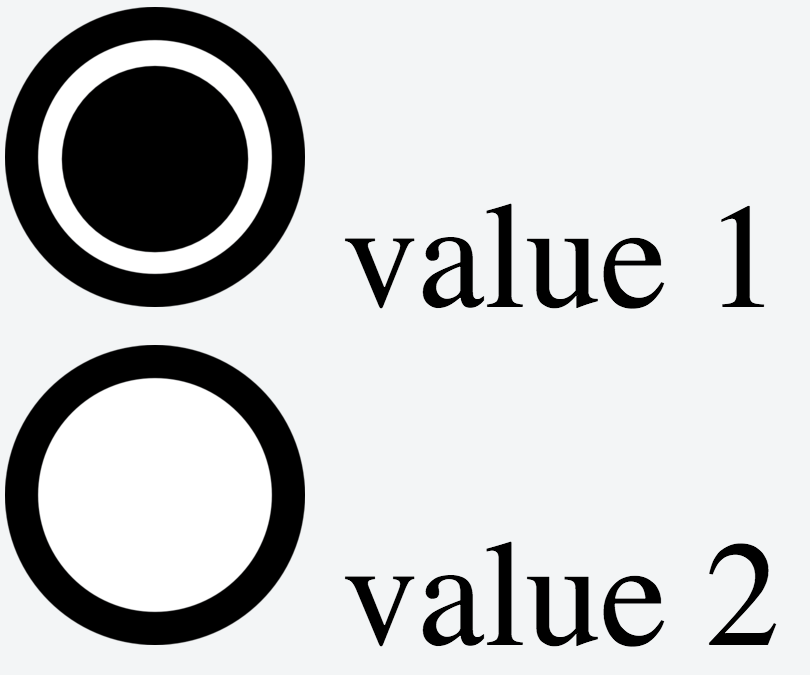
Вот очень простой пример
HTML
<div>
  <input type="radio" id="shipadd1" value=1 name="address" />
  <label for="shipadd1"></label>
  value 1
</div>

<div>
  <input type="radio" id="shipadd2" value=2 name="address" />
  <label for="shipadd2"></label>
  value 2
</div>
CSS
input[type="radio"]{
   display:none;
}

input[type="radio"] + label
{
    background-image:url(http://www.clker.com/cliparts/c/q/l/t/l/B/radiobutton-unchecked-sm-md.png);
    height: 300px;
    width: 300px;
    display:inline-block;
    padding: 0 0 0 0px;
    cursor:pointer;
}

input[type="radio"]:checked + label
{
    background-image:url(http://www.clker.com/cliparts/M/2/V/6/F/u/radiobutton-checked-sm-md.png);
}
Демо: http://jsfiddle.net/La8wQ/2471/
Этот пример основан на этом трюке: https://css-tricks.com/the-checkbox-hack/
Я проверил это на: Chrome, Firefox, Safari
Ниже приведен скриншот для шрифтов Biggg (из-за того, что я быстро нашел только изображения с большими переключателями)
      $spinTime: 3;
html, body { height: 100%; }
* { user-select: none; }
body {
    display: flex;
    flex-direction: column;
    align-items: center;
    justify-content: center;
    font-family: 'Raleway', sans-serif;
    font-size: 72px;
    input {
        display: none;
        + div > span {
            display: inline-block;
            position: relative;
            white-space: nowrap;
            color: rgba(#fff, 0);
            transition: all 0.5s ease-in-out;
            span {
                display: inline-block;
                position: absolute;
                left: 50%;
                text-align: center;
                color: rgba(#000, 1);
                transform: translateX(-50%);
                transform-origin: left;
                transition: all 0.5s ease-in-out;
                &:first-of-type {
                    transform: rotateY(0deg) translateX(-50%);
                }
                &:last-of-type {
                    transform: rotateY(0deg) translateX(0%) scaleX(0.75) skew(23deg,0deg);
                }
            }
        }
        &#fat:checked ~ div > span span {
            &:first-of-type {
                transform: rotateY(0deg) translateX(-50%);
            }
            &:last-of-type {
                transform: rotateY(0deg) translateX(0%) scaleX(0.75) skew(23deg,0deg);
            }
        }
        &#fit:checked ~ div > span {
            margin: 0 -10px;
            span {
                &:first-of-type {
                    transform: rotateY(90deg) translateX(-50%);
                }
                &:last-of-type {
                    transform: rotateY(0deg) translateX(-50%) scaleX(1) skew(0deg,0deg);
                }
            }
        }
        + div + div {
            width: 280px;
            margin-top: 10px;
            label {
                display: block;
                padding: 20px 10px;
                text-align: center;
                transition: all 0.15s ease-in-out;
                background: #fff;
                border-radius: 10px;
                box-sizing: border-box;
                width: 48%;
                font-size: 64px;
                cursor: pointer;
                &:first-child {
                    float: left;
                    box-shadow:
                        inset 0 0 0 4px #1597ff,
                        0 15px 15px -10px rgba(darken(#1597ff, 10%), 0.375);
                }
                &:last-child { float: right; }
            }
        }
        &#fat:checked ~ div + div label {
            &:first-child {
                box-shadow:
                    inset 0 0 0 4px #1597ff,
                    0 15px 15px -10px rgba(darken(#1597ff, 10%), 0.375);
            }
            &:last-child {
                box-shadow:
                    inset 0 0 0 0px #1597ff,
                    0 10px 15px -20px rgba(#1597ff, 0);
            }
        }
        &#fit:checked ~ div + div label {
            &:first-child {
                box-shadow:
                    inset 0 0 0 0px #1597ff,
                    0 10px 15px -20px rgba(#1597ff, 0);
            }
            &:last-child {
                box-shadow:
                    inset 0 0 0 4px #1597ff,
                    0 15px 15px -10px rgba(darken(#1597ff, 10%), 0.375);
            }
        }
    }
}


<input type="radio" id="fat" name="fatfit">
<input type="radio" id="fit" name="fatfit">
<div>
    GET F<span>A<span>A</span><span>I</span></span>T
</div>
<div>
    <label for="fat">🍕</label>
    <label for="fit">💪🏼</label>
</div>