WPF ListView Неактивный цвет выделения
Я создаю приложение WPF, в котором несколько вариантов ListView выполняются подряд (аналогично браузеру iTunes). Проблема в том, что неактивный цвет выделения по умолчанию слишком светлый. (увидеть ниже)
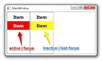
Как я могу изменить этот цвет, чтобы мой неактивный просмотр списка выглядел так? (увидеть ниже)
Решение
Переопределите стандартный цвет SystemColor с помощью Style вот так:
<Style TargetType="ListViewItem">
    <Style.Resources>
        <SolidColorBrush x:Key="{x:Static SystemColors.ControlBrushKey}" Color="{x:Static SystemColors.HighlightColor}"/>
    </Style.Resources>
</Style>
8 ответов
ListBox шаблон использует системный цвет под названием ControlBrush установить неактивный цвет выделения. Поэтому вы можете просто переопределить этот цвет:
<ListBox>
    <ListBox.Resources>
        <SolidColorBrush x:Key="{x:Static SystemColors.ControlBrushKey}">Red</SolidColorBrush>
    </ListBox.Resources>
</ListBox>
Изменения SystemColors.ControlBrushKey у меня не сработало, пришлось менять SystemColors.InactiveSelectionHighlightBrushKey
Так что вместо:
<SolidColorBrush x:Key="{x:Static SystemColors.ControlBrushKey}" Color="Red" />
Я должен был использовать:
<SolidColorBrush x:Key="{x:Static SystemColors.InactiveSelectionHighlightBrushKey}" Color="Red"/>
Ответ в некоторых случаях решит проблему, но не является идеальным, поскольку он ломается, когда элемент управления отключен / доступен только для чтения, и он также переопределяет цветовые схемы, а не использует их преимущества. Я предлагаю добавить в теги ListBox следующее:
<ListBox....>
    <ListBox.Resources>
            <Style TargetType="ListBoxItem">
                <Setter Property="Template">
                    <Setter.Value>
                        <ControlTemplate TargetType="ListBoxItem">
                            <Border Name="Border" Padding="2" SnapsToDevicePixels="true">
                                <ContentPresenter />
                            </Border>
                            <ControlTemplate.Triggers>
                                <Trigger Property="IsSelected" Value="true">
                                    <Setter TargetName="Border" Property="Background"
                                            Value="{DynamicResource {x:Static SystemColors.HighlightBrushKey}}"/>
                                </Trigger>
                            </ControlTemplate.Triggers>
                        </ControlTemplate>
                    </Setter.Value>
                </Setter>
        </Style>
    </ListBox.Resources>
</ListBox>
Для этого нужно установить цвет фона "Подсветка" в элементе списка при каждом его выборе (независимо от состояния элемента управления).
Мой ответ основан на помощи уже полученного ответа, а также на следующем блоге: http://blogs.vbcity.com/xtab/archive/2009/06/29/9344.aspx
Вы должны переопределить некоторые свойства SystemColors. Взгляните на класс SystemColors (MSDN). Есть больше свойств, чем InactiveSelectionHighlightBrushKey, например InactiveSelectionHighlightTextBrushKey, который влияет на цвет текста.
<Window x:Class="WpfApplication1.MainWindow"
        xmlns="http://schemas.microsoft.com/winfx/2006/xaml/presentation"
        xmlns:x="http://schemas.microsoft.com/winfx/2006/xaml"
        Title="MainWindow" Height="350" Width="525">
    <Window.Resources>
        <SolidColorBrush x:Key="{x:Static SystemColors.HighlightBrushKey}" Color="Red"/>
        <SolidColorBrush x:Key="{x:Static SystemColors.HighlightTextBrushKey}" Color="White"/>
        <SolidColorBrush x:Key="{x:Static SystemColors.InactiveSelectionHighlightBrushKey}" Color="Yellow"/>
        <SolidColorBrush x:Key="{x:Static SystemColors.InactiveSelectionHighlightTextBrushKey}" Color="Blue"/>
        <Style TargetType="ListViewItem">
            <Setter Property="FontSize" Value="20" />
            <Setter Property="FontWeight" Value="Bold" />
            <Setter Property="Padding" Value="25,5" />
        </Style>
    </Window.Resources>
    <StackPanel Orientation="Horizontal">
        <ListView>
            <ListViewItem Content="Item" />
            <ListViewItem Content="Item" />
        </ListView>
        <ListView>
            <ListViewItem Content="Item" />
            <ListViewItem Content="Item" />
        </ListView>
    </StackPanel>
</Window>
Основываясь на этом другом ответе, я использовал следующее, чтобы сделать активные и неактивные цвета одинаковыми без жесткого кодирования действительного значения:
<ListBox.Resources>
    <SolidColorBrush x:Key="{x:Static SystemColors.InactiveSelectionHighlightBrushKey}"
                     Color="{x:Static SystemColors.HighlightColor}"/>
    <SolidColorBrush x:Key="{x:Static SystemColors.InactiveSelectionHighlightTextBrushKey}"
                     Color="{x:Static SystemColors.HighlightTextColor}"/>
</ListBox.Resources>
Наличие одинаковых цветов как для активных, так и для неактивных может быть не идеальным, но цвета по умолчанию были настолько слабыми, что было трудно определить, какой элемент был выбран, когда он был неактивным; это определенное улучшение.
В старых.NET Frameworks переопределение системных цветов не работает. Решение, которое работает в.NET Framework 4.0, здесь.
<ListView>
<ListView.Resources>
<Style TargetType="{x:Type ListViewItem}">
    <Setter Property="Template">
        <Setter.Value>
            <ControlTemplate TargetType="{x:Type ListViewItem}">
                <Border x:Name="Bd"
                        BorderBrush="{TemplateBinding BorderBrush}"
                        BorderThickness="{TemplateBinding BorderThickness}"
                        Background="{TemplateBinding Background}"
                        Padding="{TemplateBinding Padding}"
                        SnapsToDevicePixels="true">
                    <ContentPresenter HorizontalAlignment="{TemplateBinding HorizontalContentAlignment}"
                                        SnapsToDevicePixels="{TemplateBinding SnapsToDevicePixels}"
                                        VerticalAlignment="{TemplateBinding VerticalContentAlignment}" />
                </Border>
                <ControlTemplate.Triggers>
                    <MultiTrigger>
                        <MultiTrigger.Conditions>
                            <Condition Property="Selector.IsSelectionActive"
                                        Value="False" />
                            <Condition Property="IsSelected"
                                        Value="True" />
                        </MultiTrigger.Conditions>
                        <Setter Property="Background"
                                TargetName="Bd"
                                Value="DarkOrange" />
                    </MultiTrigger>
                    <MultiTrigger>
                        <MultiTrigger.Conditions>
                            <Condition Property="Selector.IsSelectionActive"
                                        Value="True" />
                            <Condition Property="IsSelected"
                                        Value="True" />
                        </MultiTrigger.Conditions>
                        <Setter Property="Background"
                                TargetName="Bd"
                                Value="OrangeRed" />
                    </MultiTrigger>
                </ControlTemplate.Triggers>
            </ControlTemplate>
        </Setter.Value>
    </Setter>
</Style>
Работает как для ListBox, так и для ListView.
Переопределение SystemColors, как советуют большинство других ответов, у меня не сработало. В итоге я просто отредактировал стиль по умолчанию для ListBoxItem и установил ItemContainerStyle для конкретного ListBox в отредактированный стиль. Это относительно безболезненно по сравнению с редактированием стилей по умолчанию для других элементов управления. Все, что вам нужно сделать, это изменить Item.SelectedInactive.Background и Item.SelectedInactive.Border на нужные вам цвета.
         <SolidColorBrush x:Key="Item.Static.Background" Color="#FFFCFCFC" />
    <SolidColorBrush x:Key="Item.Static.Border" Color="#FFFCFCFC" />
    <SolidColorBrush x:Key="Item.MouseOver.Background" Color="#1F26A0DA" />
    <SolidColorBrush x:Key="Item.MouseOver.Border" Color="#a826A0Da" />
    <SolidColorBrush x:Key="Item.SelectedActive.Background" Color="#3D26A0DA" />
    <SolidColorBrush x:Key="Item.SelectedActive.Border" Color="#FF26A0DA" />
    <SolidColorBrush x:Key="Item.SelectedInactive.Background" Color="#3DDADADA" />
    <SolidColorBrush x:Key="Item.SelectedInactive.Border" Color="#FFDADADA" />
    <Style x:Key="ModifiedColorListBox" TargetType="{x:Type ListBoxItem}">
        <Setter Property="SnapsToDevicePixels" Value="True" />
        <Setter Property="Padding" Value="4,1" />
        <Setter Property="HorizontalContentAlignment" Value="{Binding HorizontalContentAlignment, RelativeSource={RelativeSource AncestorType={x:Type ItemsControl}}}"/>
        <Setter Property="VerticalContentAlignment" Value="{Binding VerticalContentAlignment, RelativeSource={RelativeSource AncestorType={x:Type ItemsControl}}}"/>
        <Setter Property="Background" Value="Transparent" />
        <Setter Property="BorderBrush" Value="Transparent" />
        <Setter Property="BorderThickness" Value="1" />
        <Setter Property="FocusVisualStyle" Value="{StaticResource FocusVisual}" />
        <Setter Property="Template">
            <Setter.Value>
                <ControlTemplate TargetType="{x:Type ListBoxItem}">
                    <Border x:Name="Bd"
                        BorderBrush="{TemplateBinding BorderBrush}"
                        BorderThickness="{TemplateBinding BorderThickness}"
                        Background="{TemplateBinding Background}"
                        Padding="{TemplateBinding Padding}"
                        SnapsToDevicePixels="true">
                        <ContentPresenter
                            HorizontalAlignment="{TemplateBinding HorizontalContentAlignment}"
                            VerticalAlignment="{TemplateBinding VerticalContentAlignment}"
                            SnapsToDevicePixels="{TemplateBinding SnapsToDevicePixels}" />
                    </Border>
                    <ControlTemplate.Triggers>
                        <MultiTrigger>
                            <MultiTrigger.Conditions>
                                <Condition Property="IsMouseOver" Value="True" />
                            </MultiTrigger.Conditions>
                            <Setter TargetName="Bd" Property="Background" Value="{StaticResource Item.MouseOver.Background}" />
                            <Setter TargetName="Bd" Property="BorderBrush" Value="{StaticResource Item.MouseOver.Border}" />
                        </MultiTrigger>
                        <MultiTrigger>
                            <MultiTrigger.Conditions>
                                <Condition Property="Selector.IsSelectionActive" Value="False" />
                                <Condition Property="IsSelected" Value="True" />
                            </MultiTrigger.Conditions>
                            <Setter TargetName="Bd" Property="Background" Value="{StaticResource Item.SelectedInactive.Background}" />
                            <Setter TargetName="Bd" Property="BorderBrush" Value="{StaticResource Item.SelectedInactive.Border}" />
                        </MultiTrigger>
                        <MultiTrigger>
                            <MultiTrigger.Conditions>
                                <Condition Property="Selector.IsSelectionActive" Value="True" />
                                <Condition Property="IsSelected" Value="True" />
                            </MultiTrigger.Conditions>
                            <Setter TargetName="Bd" Property="Background" Value="{StaticResource Item.SelectedActive.Background}" />
                            <Setter TargetName="Bd" Property="BorderBrush" Value="{StaticResource Item.SelectedActive.Border}" />
                        </MultiTrigger>
                        <Trigger Property="IsEnabled" Value="False">
                            <Setter TargetName="Bd" Property="TextElement.Foreground" Value="{DynamicResource {x:Static SystemColors.GrayTextBrushKey}}"/>
                        </Trigger>
                    </ControlTemplate.Triggers>
                </ControlTemplate>
            </Setter.Value>
        </Setter>
    </Style>
А затем использование из xaml:
      <ListBox
    Name="SomeListBox"
    ItemContainerStyle="{StaticResource ModifiedColorListBox}"
    ItemsSource="{Binding SomeCollection}"
    SelectedItem="{Binding SomeObject}">
</ListBox>
Для меня это сработало:
 <ListBox HorizontalContentAlignment="Stretch">
                <ListBox.ItemTemplate>
                    <DataTemplate>
                        <Label  Margin="-5, -2,-5,-2" Content="{Binding Item}">
                            <Label.Style>
                                <Style TargetType="Label">
                                    <Style.Triggers>
                                        <MultiDataTrigger>
                                            <MultiDataTrigger.Conditions>
                                                <Condition Binding="{Binding RelativeSource={RelativeSource Mode=FindAncestor,AncestorType={x:Type ListBox}},Path=IsFocused}" Value="False"/>
                                                <Condition Binding="{Binding RelativeSource={RelativeSource Mode=FindAncestor,AncestorType={x:Type ListBoxItem}},Path=IsSelected}" Value="True"/>
                                            </MultiDataTrigger.Conditions>
                                            <Setter Property="Background" Value="CornflowerBlue"/>
                                        </MultiDataTrigger>
                                        <DataTrigger Binding="{Binding RelativeSource={RelativeSource Mode=FindAncestor,AncestorType={x:Type ListBoxItem}},Path=IsSelected}" Value="True">
                                            <Setter Property="Foreground" Value="White"/>
                                        </DataTrigger>
                                        <DataTrigger Binding="{Binding RelativeSource={RelativeSource Mode=FindAncestor,AncestorType={x:Type ListBoxItem}},Path=IsSelected}" Value="False">
                                            <Setter Property="Foreground" Value="Black"/>
                                        </DataTrigger>
                                    </Style.Triggers>
                                </Style>
                            </Label.Style>
                        </Label>
                    </DataTemplate>
                </ListBox.ItemTemplate>
            </ListBox>