matplotlib: оверлейные графики с разными масштабами?
Пока у меня есть следующий код:
colors = ('k','r','b')
ax = []
for i in range(3):
    ax.append(plt.axes())
    plt.plot(datamatrix[:,0],datamatrix[:,i],colors[i]+'o')
    ax[i].set(autoscale_on=True)
С autoscale_on=True Опция для каждой оси, я думал, что каждый график должен иметь свои собственные пределы оси Y, но, похоже, все они имеют одинаковое значение (даже если они имеют разные оси). Как мне установить их в масштабе, чтобы показать диапазон каждого datamatrix[:,i] (просто явный вызов .set_ylim()?) А также, как я могу создать смещение оси Y для третьей переменной (datamatrix[:,2]) что может потребоваться выше? Спасибо всем.
5 ответов
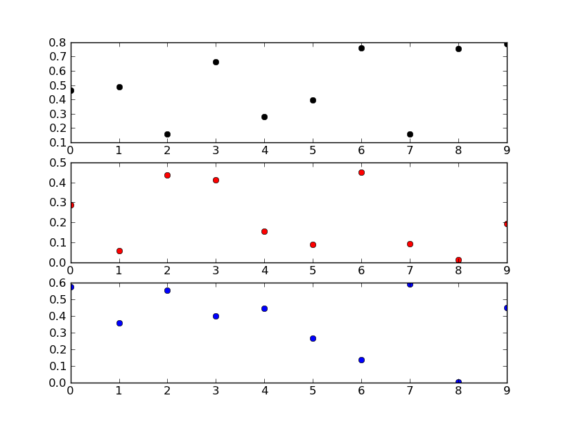
Похоже, что вы хотите, это подзаговоры... То, что вы делаете сейчас, не имеет особого смысла (или, во всяком случае, я очень смущен вашим фрагментом кода...).
Попробуйте что-то вроде этого:
import matplotlib.pyplot as plt
import numpy as np

fig, axes = plt.subplots(nrows=3)

colors = ('k', 'r', 'b')
for ax, color in zip(axes, colors):
    data = np.random.random(1) * np.random.random(10)
    ax.plot(data, marker='o', linestyle='none', color=color)

plt.show()
Редактировать:
Если вам не нужны подзаговоры, ваш фрагмент кода имеет гораздо больше смысла.
Вы пытаетесь добавить три оси прямо друг на друга. Matplotlib осознает, что в этом точно размере и расположении фигуры уже есть подзаговор, и поэтому каждый раз возвращает один и тот же объект осей. Другими словами, если вы посмотрите на свой список axвы увидите, что они все один и тот же объект.
Если вы действительно хотите это сделать, вам нужно сбросить fig._seen на пустой диктовку каждый раз, когда вы добавляете оси. Вы, вероятно, действительно не хотите делать это, однако.
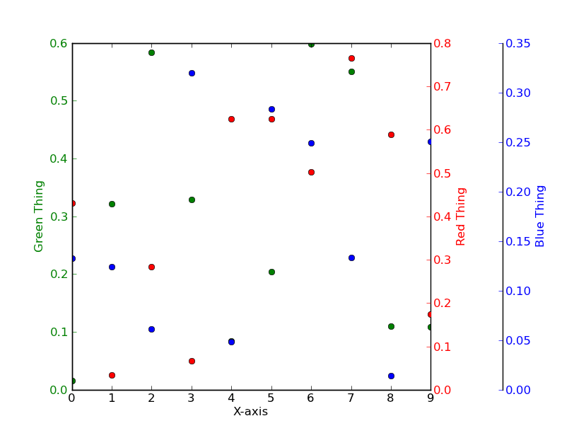
Вместо того, чтобы ставить три независимых графика друг на друга, взгляните на использование twinx вместо.
Например
import matplotlib.pyplot as plt
import numpy as np
# To make things reproducible...
np.random.seed(1977)

fig, ax = plt.subplots()

# Twin the x-axis twice to make independent y-axes.
axes = [ax, ax.twinx(), ax.twinx()]

# Make some space on the right side for the extra y-axis.
fig.subplots_adjust(right=0.75)

# Move the last y-axis spine over to the right by 20% of the width of the axes
axes[-1].spines['right'].set_position(('axes', 1.2))

# To make the border of the right-most axis visible, we need to turn the frame
# on. This hides the other plots, however, so we need to turn its fill off.
axes[-1].set_frame_on(True)
axes[-1].patch.set_visible(False)

# And finally we get to plot things...
colors = ('Green', 'Red', 'Blue')
for ax, color in zip(axes, colors):
    data = np.random.random(1) * np.random.random(10)
    ax.plot(data, marker='o', linestyle='none', color=color)
    ax.set_ylabel('%s Thing' % color, color=color)
    ax.tick_params(axis='y', colors=color)
axes[0].set_xlabel('X-axis')

plt.show()
Загрузите что-нибудь быстрое, чтобы построить несколько осей Y, имеющих общую ось X, используя ответ @joe-kington: 
# d = Pandas Dataframe,
# ys = [ [cols in the same y], [cols in the same y], [cols in the same y], .. ]
def chart(d,ys):

    from itertools import cycle
    fig, ax = plt.subplots()

    axes = [ax]
    for y in ys[1:]:
        # Twin the x-axis twice to make independent y-axes.
        axes.append(ax.twinx())

    extra_ys =  len(axes[2:])

    # Make some space on the right side for the extra y-axes.
    if extra_ys>0:
        temp = 0.85
        if extra_ys<=2:
            temp = 0.75
        elif extra_ys<=4:
            temp = 0.6
        if extra_ys>5:
            print 'you are being ridiculous'
        fig.subplots_adjust(right=temp)
        right_additive = (0.98-temp)/float(extra_ys)
    # Move the last y-axis spine over to the right by x% of the width of the axes
    i = 1.
    for ax in axes[2:]:
        ax.spines['right'].set_position(('axes', 1.+right_additive*i))
        ax.set_frame_on(True)
        ax.patch.set_visible(False)
        ax.yaxis.set_major_formatter(matplotlib.ticker.OldScalarFormatter())
        i +=1.
    # To make the border of the right-most axis visible, we need to turn the frame
    # on. This hides the other plots, however, so we need to turn its fill off.

    cols = []
    lines = []
    line_styles = cycle(['-','-','-', '--', '-.', ':', '.', ',', 'o', 'v', '^', '<', '>',
               '1', '2', '3', '4', 's', 'p', '*', 'h', 'H', '+', 'x', 'D', 'd', '|', '_'])
    colors = cycle(matplotlib.rcParams['axes.color_cycle'])
    for ax,y in zip(axes,ys):
        ls=line_styles.next()
        if len(y)==1:
            col = y[0]
            cols.append(col)
            color = colors.next()
            lines.append(ax.plot(d[col],linestyle =ls,label = col,color=color))
            ax.set_ylabel(col,color=color)
            #ax.tick_params(axis='y', colors=color)
            ax.spines['right'].set_color(color)
        else:
            for col in y:
                color = colors.next()
                lines.append(ax.plot(d[col],linestyle =ls,label = col,color=color))
                cols.append(col)
            ax.set_ylabel(', '.join(y))
            #ax.tick_params(axis='y')
    axes[0].set_xlabel(d.index.name)
    lns = lines[0]
    for l in lines[1:]:
        lns +=l
    labs = [l.get_label() for l in lns]
    axes[0].legend(lns, labs, loc=0)

    plt.show()
Благодаря ответу Джо Кингтона я смог найти решение для моего требования, чтобы все дополнительные оси Y находились в левой части графика.
Я все еще хотел бы знать, как сделать это правильно, потому что это всего лишь обходной путь:
import matplotlib.pyplot as plt
import numpy as np
# To make things reproducible...
np.random.seed(1977)

fig, ax = plt.subplots()

# Twin the x-axis twice to make independent y-axes.
axes = [ax, ax.twinx(), ax.twinx()]

# Make some space on the right side for the extra y-axis.
fig.subplots_adjust(right=0.75)

# Move the last y-axis spine over to the right by 20% of the width of the axes
axes[1].spines['right'].set_position(('axes', -0.25))
axes[2].spines['right'].set_position(('axes', -0.5))

# To make the border of the right-most axis visible, we need to turn the frame
# on. This hides the other plots, however, so we need to turn its fill off.
axes[-1].set_frame_on(True)
axes[-1].patch.set_visible(False)

# And finally we get to plot things...
colors = ('Green', 'Red', 'Blue')
intAxNo = 0
for ax, color in zip(axes, colors):
    intAxNo += 1
    data = np.random.random(1) * np.random.random(10)
    ax.plot(data, marker='o', linestyle='none', color=color)
    if (intAxNo > 1):
        if (intAxNo == 2):
            ax.set_ylabel('%s Thing' % color, color=color, labelpad = -40 )
        elif (intAxNo == 3):
            ax.set_ylabel('%s Thing' % color, color=color, labelpad = -45 )
        ax.get_yaxis().set_tick_params(direction='out')
    else:
        ax.set_ylabel('%s Thing' % color, color=color, labelpad = +0 )

    ax.tick_params(axis='y', colors=color)
axes[0].set_xlabel('X-axis')


plt.show()

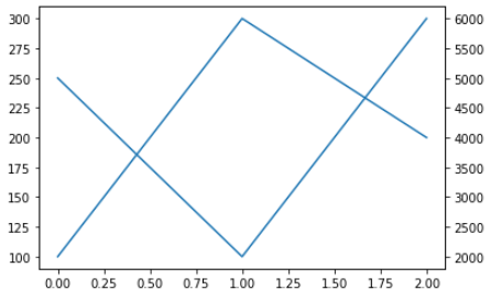
twinx. Краткий пример:
      fig1 = matplotlib.figure.Figure()  # Make a figure
ax1 = fig1.add_subplot()           # Add the primary axis
ax1.plot([100, 300, 200])          # Plot something
ax2 = ax1.twinx()                  # Add the secondary axis
ax2.plot([5000, 2000, 6000])       # Plot something with a different scale
display( fig1 )                    # Display it (Jupyter only)
Я использовал этот код, и он успешно сгенерировал две оси Y (первичную и вторичную) с желаемыми масштабами чтения данных из файла Excel:
      X = df[['x-axis variable']]
Y1=df[['1st Y-Variable']]
Y2=df[['2nd Y-Variable']]
Y3=df[['3rd Y-Variable']]

fig, ax1 = plt.subplots(figsize=(10,6))
ax2 = ax1.twinx()

ax1.plot(X, Y1, 'g', label='Curve.1 name') #plotting on primary Y-axis
ax1.plot(X, Y2, 'm', label='Curve.2 name') #plotting on primary Y-axis

ax2.plot(X, wob, 'b', label='Curve.3 name') #plotting on **second** Y-axis

ax1.set_ylim(0, 350) #Define limit/scale for primary Y-axis
ax2.set_ylim(1000, 1300) #Define limit/scale for secondary Y-axis

plt.show()