Выровнять кнопки карты по нижнему интерфейсу материала
Я разрабатываю приложение в ReactJS и использую следующее: MaterialUI (для реагирования) и React Flexbox.
Проблема, с которой я столкнулся, - это попытка расположить кнопки карты внизу (проблема, которая, похоже, спамит в Интернете в разных рамках). Я использую карту отсюда -> https://material-ui.com/demos/cards/
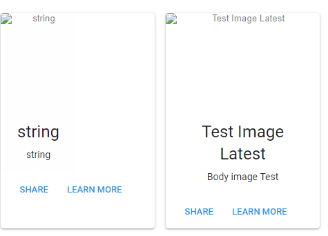
Я попробовал почти все, что мог придумать: от align-items до align-self и разных типов отображения. Я мог бы что-то упустить здесь, так как я обычно работаю с Bootstrap, поэтому я надеюсь, что CSS Master поможет мне. Я приложу картинку ниже для ссылки.
Также для ссылки вот как мой код реагирует ( ApiPosts - это компонент моих карт) ->
                    <Grid container>
                        <Grid item xs={12}>
                            <Paper className={classes.paper}>
                                <Row className="rowSpacer">
                                    <Col xs>
                                        <Typography variant="title" align="center" color="textPrimary" gutterBottom>
                                            Posts are below
                            </Typography>
                                    </Col>
                                </Row>
                                <Divider />
                                <ApiPosts />
                            </Paper>


                        </Grid>
                    </Grid>
И, наконец, мои карты завернуты в <Row around="xs"> (4 поста подряд) и каждая карточка в столбике <Col xs >
Заранее спасибо!
Редактировать: Решено благодаря ответу Ивана. Вот код на случай, если он все равно понадобится (работа с Материалами-Картами пользовательского интерфейса).
.portCardCl {
    display: flex;
    flex-direction: column;
    height:100%;
}

.portBodyCl {
    display: flex;
    flex: 1 0 auto;
    align-items: flex-end;
    justify-content: center;
    flex-direction: column;
}

.portButCl{
    display: flex;
    justify-content: flex-start;
}
portCardCl идет первым <Card>, portBodyCl продолжается <CardActionArea> и наконец portButCl продолжается <CardActions>
1 ответ
Вот пример с CSS-сеткой.
const {
  Button,
  createMuiTheme,
  CssBaseline,
  MuiThemeProvider,
  Typography,
  Paper,
  withStyles,
} = window['material-ui'];

const styles = theme => ({
  root: {
    display: "grid",
    gridTemplateColumns: "repeat(4, 1fr)",
    gridGap: "24px",
  },

  card: {
    display: "grid",
    gridTemplateRows: "1fr auto",
    gridGap: "8px",
    minHeight: 280,
    backgroundImage: `url(https://via.placeholder.com/100x200)`,
    backgroundSize: "cover"
  },

  body: {
    alignSelf: "end",
    textAlign: "center"
  },

  actions: {
    display: "flex",
    justifyContent: "space-between"
  }
});

const Grid = withStyles(styles)(
  class Grid extends React.Component {
    render () {
      const { classes } = this.props;
      const cards = [1, 2, 3, 4];

      return (
        <div className={classes.root}>
          {cards.map(c => (
            <Paper key={c} className={classes.card}>
              <div className={classes.body}>
                <Typography variant="subheading">
                  Test Image
                </Typography>

                <Typography variant="caption">
                  Small help text
                </Typography>
              </div>
              <div className={classes.actions}>
                <Button>Left</Button>
                <Button color="primary">Right</Button>
              </div>
            </Paper>
          ))}
        </div>
      )
    }
  }
)

const theme = createMuiTheme();

ReactDOM.render((
  <MuiThemeProvider theme={theme}>
    <Grid />
  </MuiThemeProvider>
), document.querySelector("#root"))
<script src="https://unpkg.com/react@latest/umd/react.development.js" crossorigin="anonymous"></script>
<script src="https://unpkg.com/react-dom@latest/umd/react-dom.development.js" crossorigin="anonymous"></script>
<script src="https://unpkg.com/@material-ui/core/umd/material-ui.development.js" crossorigin="anonymous"></script>
<script src="https://unpkg.com/babel-standalone@latest/babel.min.js" crossorigin="anonymous"></script>
<div id="root"></div>Вот пример карточки с flex используя только
.card {
  padding: 24px;
  box-shadow: 0 2px 5px 0 rgba(0, 0, 0, .13);
  background: skyblue;
  border-radius: 4px;
  font-family: "Helvetica", sans-serif;
  display: flex;
  flex-direction: column;
  height: 280px;
  width: 160px;
}

.card__body {
  display: flex;
  flex: 1 0 auto;
  align-items: flex-end;
  justify-content: center;
}

.card__actions {
  display: flex;
  align-items: center;
  justify-content: space-between;
  margin-top: 16px;
}
<div class="card">
<div class="card__body">
Test Text
</div>
<div class="card__actions">
<button>Left</button>
<button>Right</button>
</div>
</div>