Как создать сплошную радугу с CSS?
Как создать следующий эффект радуги с помощью CSS?
т. е. верхняя закругленная граница с остановками сплошного цвета радуги (без вставки HTML).
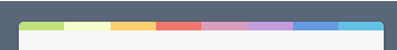
Цвета: #c4e17f. #f7fdca, #fad071, #f0766b, #db9dbe, #c49cdf, #6599e2, #61c2e4,
Что я уже пробовал:
.container {
  background: #596678;
  width: 100%;
  height: 300px;
  display: flex;
  justify-content: center;
  align-items: center;
}

.top-round-rainbow {
  width: 50%;
  height: 50%;
  background: white;
  border-radius: 4px;

  background-image: repeating-linear-gradient(to right, #c4e17f 50px, #f7fdca 50px, #fad071 50px, #f0766b, #db9dbe, #c49cdf, #6599e2, #61c2e4);
}
<div class="container">
<div class="top-round-rainbow">
</div>
</div>6 ответов
Ты не так далеко. Просто нужно установить цветовые остановки с равными значениями, чтобы они действовали как сплошные цвета, а размер фона, чтобы он был только сверху.
.container {
  background: #596678;
  width: 100%;
  height: 300px;
  display: flex;
  justify-content: center;
  align-items: center;
}

.top-round-rainbow {
  width: 400px;
  height: 50%;
  background: white;
  border-radius: 4px;

  background-image: repeating-linear-gradient(to right,
  #c4e17f 0px, #c4e17f 50px,
  #f7fdca 50px, #f7fdca 100px,
  #fad071 100px, #fad071 150px,
  #f0766b 150px, #f0766b 200px,
  #db9dbe 200px, #db9dbe 250px,
  #c49cdf 250px, #c49cdf 300px,
  #6599e2 300px, #6599e2 350px,
  #61c2e4 350px, #61c2e4 400px);
  background-size: 100% 10px;
  background-repeat:no-repeat;
}
<div class="container">
<div class="top-round-rainbow">
</div>
</div>Вы могли бы использовать after псевдоэлемент с linear-gradient создать границу.
.container {
  background: #596678;
  width: 100%;
  height: 300px;
  display: flex;
  justify-content: center;
  align-items: center;
}

.top-round-rainbow {
  width: 50%;
  height: 50px;
  background: white;
  border-radius: 4px;
  position: relative;
  overflow: hidden;
}

.top-round-rainbow:after {
  content: "";
  position: absolute;
  height: 10px;
  top: 0;
  width: 100%;
  left: 0;
  background: linear-gradient(to right, rgba(196,225,127,1) 0%, rgba(196,225,127,1) 12%, rgba(247,253,202,1) 12%, rgba(247,253,202,1) 25%, rgba(250,208,113,1) 25%, rgba(250,208,113,1) 39%, rgba(240,118,107,1) 39%, rgba(240,118,107,1) 52%, rgba(219,157,190,1) 52%, rgba(219,157,190,1) 65%, rgba(196,156,223,1) 65%, rgba(196,156,223,1) 78%, rgba(101,153,226,1) 78%, rgba(101,153,226,1) 89%, rgba(97,194,228,1) 89%, rgba(97,194,228,1) 100%);
}
<div class="container">
<div class="top-round-rainbow"></div>
</div>Уже предоставленные решения идеальны, но я добавлю еще одно с использованием границ и градиента. Вы также можете использовать свой градиент как изображение границы, но обратите внимание, так как это не будет работать с границей радиуса.
.container {
  background: #596678;
  width: 100%;
  height: 300px;
  display: flex;
  justify-content: center;
  align-items: center;
}

.top-round-rainbow {
  width: 400px;
  height: 50%;
  background: white;
  border-radius:5px;
  border-top: 10px solid;
  border-image:linear-gradient(to right,
  #c4e17f 0px, #c4e17f 50px,
  #f7fdca 50px, #f7fdca 100px,
  #fad071 100px, #fad071 150px,
  #f0766b 150px, #f0766b 200px,
  #db9dbe 200px, #db9dbe 250px,
  #c49cdf 250px, #c49cdf 300px,
  #6599e2 300px, #6599e2 350px,
  #61c2e4 350px, #61c2e4 400px) 10;
}
<div class="container">
<div class="top-round-rainbow">
</div>
</div>Эта проблема не обязательно требует псевдоэлементов или дополнительных слоев.
Чтобы добиться остановленного градиента, объявите цвета на пересечениях.
Чтобы ограничить высоту фонового изображения 10px (или любым произвольным числом), но сохранить ширину 100%, используйте background-size: 10px 100%,
Для предотвращения повторного использования градиента background-repeat: no-repeat;,
.container {
  background: #596678;
  width: 100%;
  height: 300px;
  display: flex;
  justify-content: center;
  align-items: center;
}

.top-round-rainbow {
  width: 50%;
  height: 50%;
  border-radius: 4px;
  background: repeating-linear-gradient(to right, #c4e17f 0%, #c4e17f 12.5%, #f7fdca 12.5%, #f7fdca 25%, #fad071 25%, #fad071 37.5%, #f0766b 37.5%, #f0766b 50%, #db9dbe 50%, #db9dbe 62.5%, #c49cdf 62.5%, #c49cdf 75%, #6599e2 75%, #6599e2 87.5%, #61c2e4 87.5%, #61c2e4 100%), white;
  background-size: 100% 10px, 100% 100%;
  background-repeat: no-repeat;
}
<div class="container">
<div class="top-round-rainbow">
</div>
</div>Другой подход, только для хихиканья. На этот раз с несколькими тенями.
.container {
  background: #596678;
  width: 100%;
  height: 300px;
  display: flex;
  justify-content: center;
  align-items: center;
}

.top-round-rainbow {
  width: 400px;
  height: 50%;
  background: white;
  box-shadow:
/*white overlay*/
  0 -150px 0 -10px white inset,
/*"borders" that cover each other*/
  50px 0 0 0 #c4e17f inset,
  100px 0 0 0 #f7fdca inset,
  150px 0 0 0 #fad071 inset,
  200px 0 0 0 #f0766b inset,
  250px 0 0 0 #db9dbe inset,
  300px 0 0 0 #c49cdf inset,
  350px 0 0 0 #6599e2 inset,
  400px 0 0 0 #61c2e4 inset;
}
<div class="container">
<div class="top-round-rainbow">
</div>
</div>Не совсем практично, так как нам нужно знать высоту div. Но они создают некоторые интересные эффекты с border-radius: p
.container {
  background: #596678;
  width: 100%;
  height: 300px;
  display: flex;
  justify-content: center;
  align-items: center;
}

.top-round-rainbow {
  width: 400px;
  height: 50%;
  background: white;
  box-shadow:
/*white overlay*/
  0 -150px 0 -10px white inset,
/*"borders" that cover each other*/
  50px 0 0 0 #c4e17f inset,
  100px 0 0 0 #f7fdca inset,
  150px 0 0 0 #fad071 inset,
  200px 0 0 0 #f0766b inset,
  250px 0 0 0 #db9dbe inset,
  300px 0 0 0 #c49cdf inset,
  350px 0 0 0 #6599e2 inset,
  400px 0 0 0 #61c2e4 inset;

  border-radius:10px;
}
<div class="container">
<div class="top-round-rainbow">
</div>
</div>and last but not least, one with rounded borders + rounded box-shadow, which makes for an awesome look imho. And makes a little more sense.
.container {
  background: #596678;
  width: 100%;
  height: 300px;
  display: flex;
  justify-content: center;
  align-items: center;
}

.top-round-rainbow {
  width: 400px;
  height: 50%;
  background: white;
  border-radius:10px;
  position:relative;
  overflow:hidden;
  padding-top:10px;
}

.top-round-rainbow::before{
  content:"";
  position:absolute; top:0; left:0;
  height:10px; width:100%;
  box-shadow:
  50px 0 0 0 #c4e17f inset,
  100px 0 0 0 #f7fdca inset,
  150px 0 0 0 #fad071 inset,
  200px 0 0 0 #f0766b inset,
  250px 0 0 0 #db9dbe inset,
  300px 0 0 0 #c49cdf inset,
  350px 0 0 0 #6599e2 inset,
  400px 0 0 0 #61c2e4 inset;
  border-radius:10px 0 0 0;
}
<div class="container">
<div class="top-round-rainbow">
</div>
</div>Просто добавьте новый слой, с помощью которого вы сможете указать размер белой области.
Надеюсь, это то, что вы искали. Рад объяснить или помочь в лучшем решении, если это необходимо.
.container {
  background: #596678;
  width: 100%;
  height: 300px;
  display: flex;
  justify-content: center;
  align-items: center;
}

.top-round-rainbow {
  width: 50%;
  height: 50%;
  background: white;
  border-radius: 4px;
  border-top-width: 4px;
  background-image: repeating-linear-gradient(to right, #c4e17f 50px, #f7fdca 50px, #fad071 50px, #f0766b, #db9dbe, #c49cdf, #6599e2, #61c2e4);
}

.white-layer {
  width: 100%;
  height: 95%;
  margin-top: 5%;
  background: white;
  border-radius:  0 0 4px 4px;
  border-top-width: 4px;
}
<div class="container">
<div class="top-round-rainbow">
<div class="white-layer">
</div>
</div>
</div>