Более простая популяционная пирамида в ggplot2
Я хочу создать популяционную пирамиду с ggplot2. Этот вопрос задавался ранее, но я считаю, что решение должно быть намного проще.
test <- (data.frame(v=rnorm(1000), g=c('M','F')))
require(ggplot2)
ggplot(data=test, aes(x=v)) +
    geom_histogram() +
    coord_flip() +
    facet_grid(. ~ g)
Создает это изображение. По моему мнению, единственный шаг, который здесь отсутствует для создания пирамиды населения, - это инвертировать ось X первой грани, то есть она изменяется от 50 до 0, оставляя вторую нетронутой. Кто-нибудь может помочь?

4 ответа
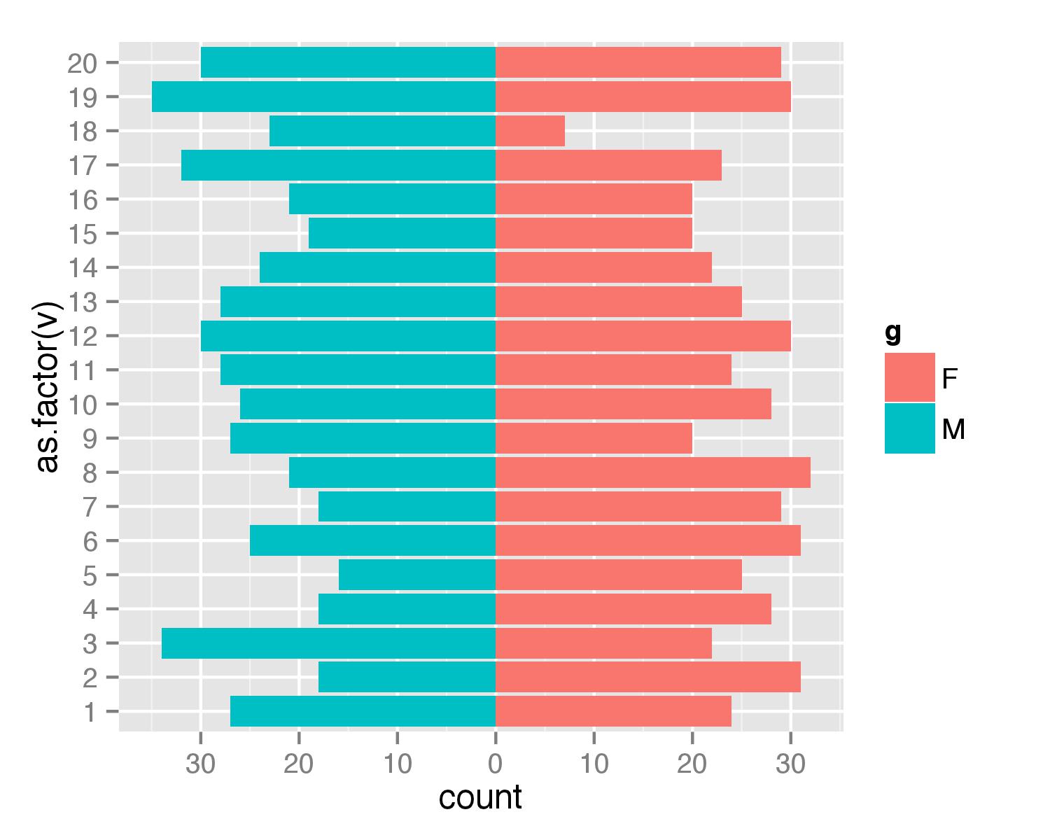
Вот решение без огранки. Сначала создайте фрейм данных. Я использовал значения от 1 до 20, чтобы убедиться, что ни одно из значений не является отрицательным (с пирамидами населения вы не получите отрицательный счет / возраст).
test <- data.frame(v=sample(1:20,1000,replace=T), g=c('M','F'))
Затем объединены два geom_bar() звонки отдельно для каждого из g ценности. За F рассчитывается как они есть, но для M Счетчик умножается на -1, чтобы получить бар в противоположном направлении. затем scale_y_continuous() используется, чтобы получить красивые значения для оси.
require(ggplot2)
require(plyr)
ggplot(data=test,aes(x=as.factor(v),fill=g)) +
  geom_bar(subset=.(g=="F")) +
  geom_bar(subset=.(g=="M"),aes(y=..count..*(-1))) +
  scale_y_continuous(breaks=seq(-40,40,10),labels=abs(seq(-40,40,10))) +
  coord_flip()
ОБНОВИТЬ
Как аргумент subset=. устарел в последней ggplot2 Версии тот же результат может быть достигнут с помощью функции subset(),
ggplot(data=test,aes(x=as.factor(v),fill=g)) +
  geom_bar(data=subset(test,g=="F")) +
  geom_bar(data=subset(test,g=="M"),aes(y=..count..*(-1))) +
  scale_y_continuous(breaks=seq(-40,40,10),labels=abs(seq(-40,40,10))) +
  coord_flip()
Общий код ggplot, который
- Предотвращает некоторую суету вокруг разрыва этикетки на горизонтальной оси
- Избегает
subsetили необходимость дополнительных пакетов (например, plyr). Это может быть особенно полезно, если вы хотите создать несколько пирамид в фасетном графике. - Пользы
geom_bar()только один раз, что может пригодиться, если вы хотите получить огранку. - Имеет равные мужские и женские горизонтальные оси;
limits = max(df0$Population) * c(-1,1)как это обычно используют демографы... удалите строку в коде, если не требуется.
Создание данных...
set.seed(1)
df0 <- data.frame(Age = factor(rep(x = 1:10, times = 2)),
                  Gender = rep(x = c("Female", "Male"), each = 10),
                  Population = sample(x = 1:100, size = 20))

head(df0)
#   Age Gender Population
# 1   1 Female         27
# 2   2 Female         37
# 3   3 Female         57
# 4   4 Female         89
# 5   5 Female         20
# 6   6 Female         86
Код участка...
library(ggplot2)
ggplot(data = df0,
       mapping = aes(x = Age, fill = Gender,
                     y = ifelse(test = Gender == "Male",
                                yes = -Population, no = Population))) +
  geom_bar(stat = "identity") +
  scale_y_continuous(labels = abs, limits = max(df0$Population) * c(-1,1)) +
  labs(y = "Population") +
  coord_flip()

Обратите внимание: если ваши данные представлены на индивидуальном уровне, а не суммированы по возрасту и полу, ответ здесь также довольно обобщенный.
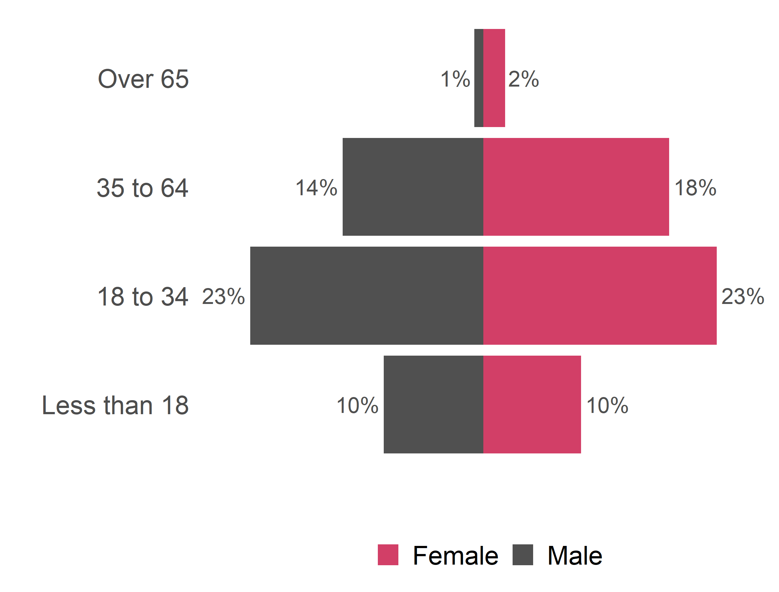
Продолжая пост @gjabel, вот более чистая пирамида населения, опять же с использованием ggplot2.
popPy1 <- ggplot(data = venDemo,
   mapping = aes(
      x = AgeName,
      y = ifelse(test = sex == "M",  yes = -Percent, no = Percent),
      fill = Sex2,
      label=paste(round(Percent*100, 0), "%", sep="")
   )) +
geom_bar(stat = "identity") +
#geom_text( aes(label = TotalCount, TotalCount = TotalCount + 0.05)) +
geom_text(hjust=ifelse(test = venDemo$sex == "M",  yes = 1.1, no = -0.1), size=6, colour="#505050") +
#  scale_y_continuous(limits=c(0,max(appArr$Count)*1.7)) +
# The 1.1 at the end is a buffer so there is space for the labels on each side
scale_y_continuous(labels = abs, limits = max(venDemo$Percent) * c(-1,1) * 1.1) +
# Custom colours
scale_fill_manual(values=as.vector(c("#d23f67","#505050"))) +
# Remove the axis labels and the fill label from the legend - these are unnecessary for a Population Pyramid
labs(
  x = "",
  y = "",
  fill="",
  family=fontsForCharts
) +
theme_minimal(base_family=fontsForCharts, base_size=20) +
coord_flip() +
# Remove the grid and the scale
theme(
  panel.grid.major = element_blank(),
  panel.grid.minor = element_blank(),
  axis.text.x=element_blank(),
  axis.text.y=element_text(family=fontsForCharts, size=20),
  strip.text.x=element_text(family=fontsForCharts, size=24),
  legend.position="bottom",
  legend.text=element_text(size=20)
)

popPy1
Посмотрите мою пирамиду населения:
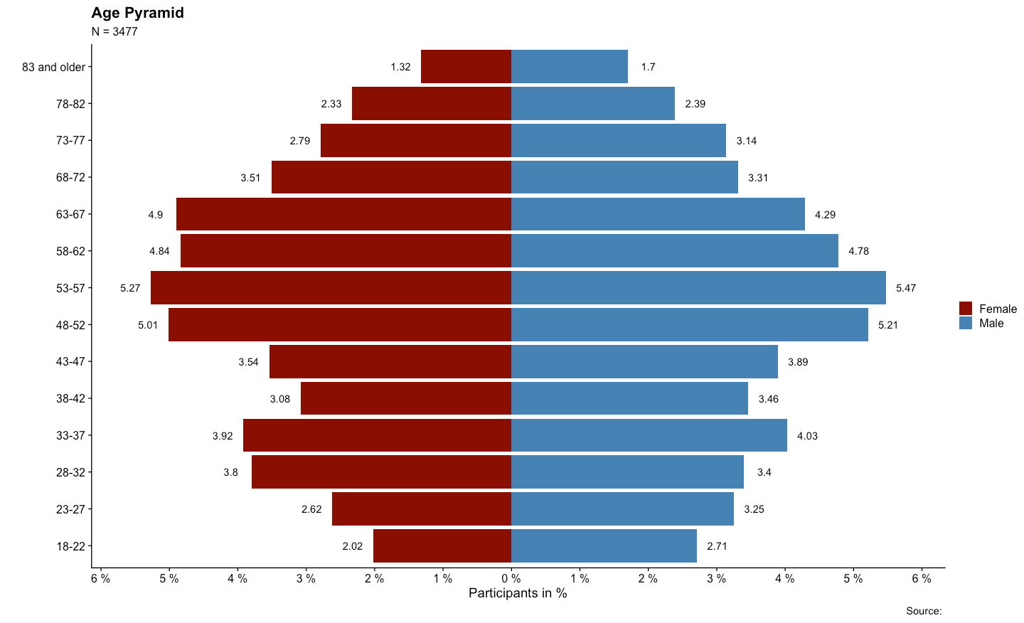
с вашими сгенерированными данными вы можете сделать это:
# import the packages in an elegant way ####

packages <- c("tidyverse")

installed_packages <- packages %in% rownames(installed.packages())

if (any(installed_packages == FALSE)) {
  install.packages(packages[!installed_packages])
}

invisible(lapply(packages, library, character.only = TRUE))

# _________________________________________________________

# create data ####

sex_age <- data.frame(age=rnorm(n = 10000, mean = 50, sd = 9), sex=c(1, 2)))


# _________________________________________________________

# prepare data + build the plot ####

sex_age %>%
  mutate(sex = ifelse(sex == 1, "Male",
                      ifelse(sex == 2, "Female", NA))) %>% # construct from the sex variable: "Male","Female"
  select(age, sex) %>% # pick just the two variables
  table() %>% # table it
  as.data.frame.matrix() %>% # create data frame matrix
  rownames_to_column("age") %>% # rownames are now the age variable
  mutate(across(everything(), as.numeric),
         # mutate everything as.numeric()
         age = ifelse(
           # create age groups 5 year steps
           age >= 18 & age <= 22 ,
           "18-22",
           ifelse(
             age >= 23 & age <= 27,
             "23-27",
             ifelse(
               age >= 28 & age <= 32,
               "28-32",
               ifelse(
                 age >= 33 & age <= 37,
                 "33-37",
                 ifelse(
                   age >= 38 & age <= 42,
                   "38-42",
                   ifelse(
                     age >= 43 & age <= 47,
                     "43-47",
                     ifelse(
                       age >= 48 & age <= 52,
                       "48-52",
                       ifelse(
                         age >= 53 & age <= 57,
                         "53-57",
                         ifelse(
                           age >= 58 & age <= 62,
                           "58-62",
                           ifelse(
                             age >= 63 & age <= 67,
                             "63-67",
                             ifelse(
                               age >= 68 & age <= 72,
                               "68-72",
                               ifelse(
                                 age >= 73 & age <= 77,
                                 "73-77",
                                 ifelse(age >= 78 &
                                          age <= 82, "78-82", "83 and older")
                               )
                             )
                           )
                         )
                       )
                     )
                   )
                 )
               )
             )
           )
         )) %>%
  group_by(age) %>% # group by the age
  summarize(Female = sum(Female), # summarize the sum of each sex
            Male = sum(Male)) %>%
  pivot_longer(names_to = 'sex',
               # pivot longer
               values_to = 'Population',
               cols = 2:3) %>%
  mutate(
    # create a pop perc and a signal 1 / -1
    PopPerc = case_when(
      sex == 'Male' ~ round(Population / sum(Population) * 100, 2),
      TRUE ~ -round(Population / sum(Population) *
                      100, 2)
    ),
    signal = case_when(sex == 'Male' ~ 1,
                       TRUE ~ -1)
  ) %>%
  ggplot() + # build the plot with ggplot2
  geom_bar(aes(x = age, y = PopPerc, fill = sex), stat = 'identity') + # define aesthetics
  geom_text(aes(
    # create the text
    x = age,
    y = PopPerc + signal * .3,
    label = abs(PopPerc)
  )) +
  coord_flip() + # flip the plot
  scale_fill_manual(name = '', values = c('darkred', 'steelblue')) + # define the colors (darkred = female, steelblue = male)
  scale_y_continuous(
    # scale the y-lab
    breaks = seq(-10, 10, 1),
    labels = function(x) {
      paste(abs(x), '%')
    }
  ) +
  labs(
    # name the labs
    x = '',
    y = 'Participants in %',
    title = 'Population Pyramid',
    subtitle = paste0('N = ', nrow(sex_age)),
    caption = 'Source: '
  ) +
  theme(
    # costume the theme
    axis.text.x = element_text(vjust = .5),
    panel.grid.major.y = element_line(color = 'lightgray', linetype =
                                        'dashed'),
    legend.position = 'top',
    legend.justification = 'center'
  ) +
  theme_classic() # choose theme
Чтобы получить пример фрейма данных с картинки, зайдите на мой GitHub .