Стримграфы в R?
Есть ли реализации Streamgraphs в R?
Потоковые графы - это вариант составных графиков и улучшение ThemeRiver Хавра и др. В способе выбора базовой линии, упорядочения слоев и выбора цвета.
Пример:

5 ответов
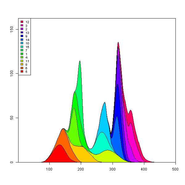
Я написал функцию plot.stacked Некоторое время назад это может помочь вам.
Функция:
plot.stacked <- function(x,y, ylab="", xlab="", ncol=1, xlim=range(x, na.rm=T), ylim=c(0, 1.2*max(rowSums(y), na.rm=T)), border = NULL, col=rainbow(length(y[1,]))){

    plot(x,y[,1], ylab=ylab, xlab=xlab, ylim=ylim, xaxs="i", yaxs="i", xlim=xlim, t="n")
    bottom=0*y[,1]
    for(i in 1:length(y[1,])){
        top=rowSums(as.matrix(y[,1:i]))
        polygon(c(x, rev(x)), c(top, rev(bottom)), border=border, col=col[i])
        bottom=top
    }
    abline(h=seq(0,200000, 10000), lty=3, col="grey")
    legend("topleft", rev(colnames(y)), ncol=ncol, inset = 0, fill=rev(col), bty="0", bg="white", cex=0.8, col=col)
    box()
}
Вот пример набора данных и графика:
set.seed(1)
m <- 500
n <- 15
x <- seq(m)
y <- matrix(0, nrow=m, ncol=n)
colnames(y) <- seq(n)
for(i in seq(ncol(y))){
    mu <- runif(1, min=0.25*m, max=0.75*m)
    SD <- runif(1, min=5, max=30)
    TMP <- rnorm(1000, mean=mu, sd=SD)
    HIST <- hist(TMP, breaks=c(0,x), plot=FALSE)
    fit <- smooth.spline(HIST$counts ~ HIST$mids)
    y[,i] <- fit$y
}

    plot.stacked(x,y)

Я могу представить, что вам просто нужно изменить определение многоугольника "дно", чтобы получить желаемый график.
Обновить:
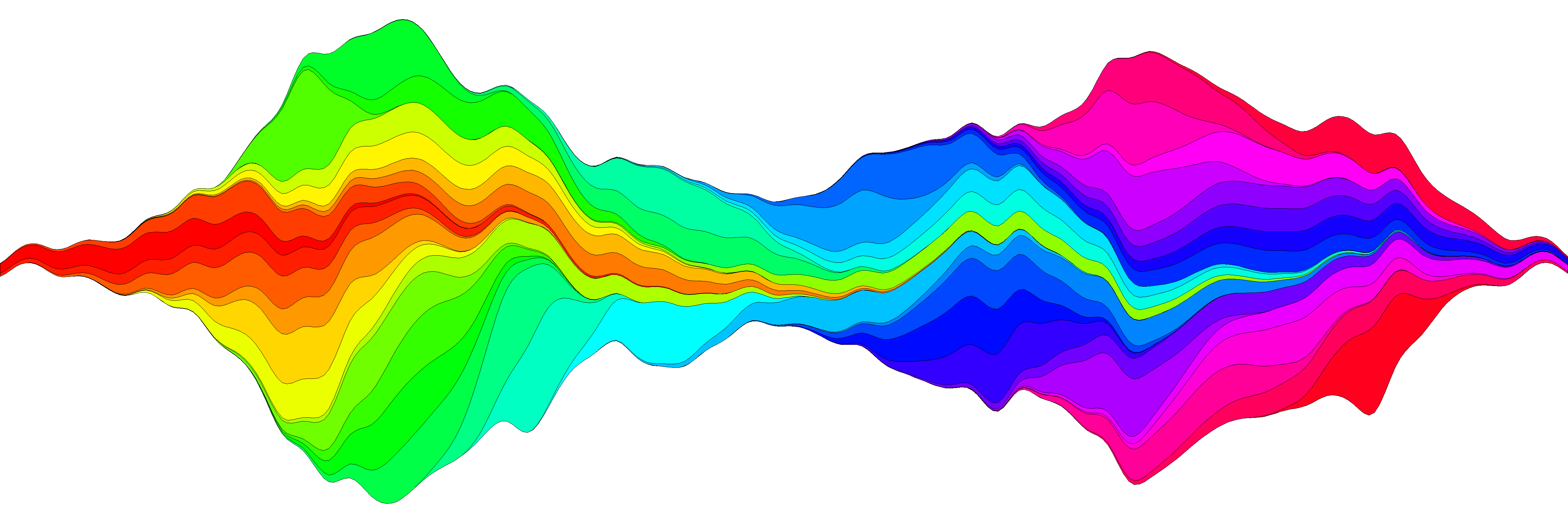
У меня был еще один способ создания сюжета потока, и я считаю, что более или менее воспроизвел идею в функции plot.stream, доступный в этой сути, а также скопированный внизу этого поста. По этой ссылке я покажу более подробно его использование, но вот основной пример:
library(devtools)
source_url('https://gist.github.com/menugget/7864454/raw/f698da873766347d837865eecfa726cdf52a6c40/plot.stream.4.R')

set.seed(1)
m <- 500
n <- 50
x <- seq(m)
y <- matrix(0, nrow=m, ncol=n)
colnames(y) <- seq(n)
for(i in seq(ncol(y))){
    mu <- runif(1, min=0.25*m, max=0.75*m)
    SD <- runif(1, min=5, max=30)
    TMP <- rnorm(1000, mean=mu, sd=SD)
    HIST <- hist(TMP, breaks=c(0,x), plot=FALSE)
    fit <- smooth.spline(HIST$counts ~ HIST$mids)
    y[,i] <- fit$y
}
y <- replace(y, y<0.01, 0)

#order by when 1st value occurs
ord <- order(apply(y, 2, function(r) min(which(r>0))))
y2 <- y[, ord]
COLS <- rainbow(ncol(y2))

png("stream.png", res=400, units="in", width=12, height=4)
par(mar=c(0,0,0,0), bty="n")
plot.stream(x,y2, axes=FALSE, xlim=c(100, 400), xaxs="i", center=TRUE, spar=0.2, frac.rand=0.1, col=COLS, border=1, lwd=0.1)
dev.off()
Код для plot.stream()
#plot.stream makes a "stream plot" where each y series is plotted
#as stacked filled polygons on alternating sides of a baseline.
#
#Arguments include:
#'x' - a vector of values
#'y' - a matrix of data series (columns) corresponding to x
#'order.method' = c("as.is", "max", "first")
#  "as.is" - plot in order of y column
#  "max" - plot in order of when each y series reaches maximum value
#  "first" - plot in order of when each y series first value > 0
#'center' - if TRUE, the stacked polygons will be centered so that the middle,
#i.e. baseline ("g0"), of the stream is approximately equal to zero.
#Centering is done before the addition of random wiggle to the baseline.
#'frac.rand' - fraction of the overall data "stream" range used to define the range of
#random wiggle (uniform distrubution) to be added to the baseline 'g0'
#'spar' - setting for smooth.spline function to make a smoothed version of baseline "g0"
#'col' - fill colors for polygons corresponding to y columns (will recycle)
#'border' - border colors for polygons corresponding to y columns (will recycle) (see ?polygon for details)
#'lwd' - border line width for polygons corresponding to y columns (will recycle)
#'...' - other plot arguments
plot.stream <- function(
    x, y,
    order.method = "as.is", frac.rand=0.1, spar=0.2,
    center=TRUE,
    ylab="", xlab="",
    border = NULL, lwd=1,
    col=rainbow(length(y[1,])),
    ylim=NULL,
    ...
){

if(sum(y < 0) > 0) error("y cannot contain negative numbers")

if(is.null(border)) border <- par("fg")
border <- as.vector(matrix(border, nrow=ncol(y), ncol=1))
col <- as.vector(matrix(col, nrow=ncol(y), ncol=1))
lwd <- as.vector(matrix(lwd, nrow=ncol(y), ncol=1))

if(order.method == "max") {
    ord <- order(apply(y, 2, which.max))
    y <- y[, ord]
    col <- col[ord]
    border <- border[ord]
}

if(order.method == "first") {
    ord <- order(apply(y, 2, function(x) min(which(r>0))))
    y <- y[, ord]
    col <- col[ord]
    border <- border[ord]
}

bottom.old <- x*0
top.old <- x*0
polys <- vector(mode="list", ncol(y))
for(i in seq(polys)){
    if(i %% 2 == 1){ #if odd
        top.new <- top.old + y[,i]
        polys[[i]] <- list(x=c(x, rev(x)), y=c(top.old, rev(top.new)))
        top.old <- top.new
    }
    if(i %% 2 == 0){ #if even
        bottom.new <- bottom.old - y[,i]
        polys[[i]] <- list(x=c(x, rev(x)), y=c(bottom.old, rev(bottom.new)))
        bottom.old <- bottom.new
    }
}

ylim.tmp <- range(sapply(polys, function(x) range(x$y, na.rm=TRUE)), na.rm=TRUE)
outer.lims <- sapply(polys, function(r) rev(r$y[(length(r$y)/2+1):length(r$y)]))
mid <- apply(outer.lims, 1, function(r) mean(c(max(r, na.rm=TRUE), min(r, na.rm=TRUE)), na.rm=TRUE))

#center and wiggle
if(center) {
    g0 <- -mid + runif(length(x), min=frac.rand*ylim.tmp[1], max=frac.rand*ylim.tmp[2])
} else {
    g0 <- runif(length(x), min=frac.rand*ylim.tmp[1], max=frac.rand*ylim.tmp[2])
}

fit <- smooth.spline(g0 ~ x, spar=spar)

for(i in seq(polys)){
    polys[[i]]$y <- polys[[i]]$y + c(fit$y, rev(fit$y))
}

if(is.null(ylim)) ylim <- range(sapply(polys, function(x) range(x$y, na.rm=TRUE)), na.rm=TRUE)
plot(x,y[,1], ylab=ylab, xlab=xlab, ylim=ylim, t="n", ...)
for(i in seq(polys)){
    polygon(polys[[i]], border=border[i], col=col[i], lwd=lwd[i])
}

}
В эти дни есть htmlwidget потоковых графиков:
https://hrbrmstr.github.io/streamgraph/
devtools::install_github("hrbrmstr/streamgraph")

library(streamgraph)

streamgraph(data, key, value, date, width = NULL, height = NULL,
  offset = "silhouette", interpolate = "cardinal", interactive = TRUE,
  scale = "date", top = 20, right = 40, bottom = 30, left = 50)
Он создает действительно красивые графики и даже интерактивен. 
редактировать
Другой вариант - использовать ggTimeSeries, который использует синтаксис ggplot2:
# creating some data
library(ggTimeSeries)
library(ggplot2)

set.seed(10)
dfData = data.frame(
   Time = 1:1000,
   Signal = abs(
      c(
         cumsum(rnorm(1000, 0, 3)),
         cumsum(rnorm(1000, 0, 4)),
         cumsum(rnorm(1000, 0, 1)),
         cumsum(rnorm(1000, 0, 2))
      )
   ),
   VariableLabel = c(rep('Class A', 1000),
                     rep('Class B', 1000),
                     rep('Class C', 1000),
                     rep('Class D', 1000))
)

# base plot
ggplot(dfData,
       aes(x = Time,
           y = Signal,
           group = VariableLabel,
           fill = VariableLabel)) +
   stat_steamgraph() +
   theme_bw()

Я написал решение, используя lattice::xyplot, Код находится в моем репозитории spacetimeVis.
Следующий пример использует этот набор данных:
library(lattice)
library(zoo)
library(colorspace)

nCols <- ncol(unemployUSA)
pal <- rainbow_hcl(nCols, c=70, l=75, start=30, end=300)
myTheme <- custom.theme(fill=pal, lwd=0.2)

xyplot(unemployUSA, superpose=TRUE, auto.key=FALSE,
       panel=panel.flow, prepanel=prepanel.flow,
       origin='themeRiver', scales=list(y=list(draw=FALSE)),
       par.settings=myTheme)
Он производит это изображение.

xyplot для работы нужны две функции: panel.flow а также prepanel.flow:
panel.flow <- function(x, y, groups, origin, ...){
  dat <- data.frame(x=x, y=y, groups=groups)
  nVars <- nlevels(groups)
  groupLevels <- levels(groups)

  ## From long to wide
  yWide <- unstack(dat, y~groups)
  ## Where are the maxima of each variable located? We will use
  ## them to position labels.
  idxMaxes <- apply(yWide, 2, which.max)

  ##Origin calculated following Havr.eHetzler.ea2002
  if (origin=='themeRiver') origin= -1/2*rowSums(yWide)
  else origin=0
  yWide <- cbind(origin=origin, yWide)
  ## Cumulative sums to define the polygon
  yCumSum <- t(apply(yWide, 1, cumsum))
  Y <- as.data.frame(sapply(seq_len(nVars),
                            function(iCol)c(yCumSum[,iCol+1],
                                            rev(yCumSum[,iCol]))))
  names(Y) <- levels(groups)
  ## Back to long format, since xyplot works that way
  y <- stack(Y)$values

  ## Similar but easier for x
  xWide <- unstack(dat, x~groups)
  x <- rep(c(xWide[,1], rev(xWide[,1])), nVars)
  ## Groups repeated twice (upper and lower limits of the polygon)
  groups <- rep(groups, each=2)

  ## Graphical parameters
  superpose.polygon <- trellis.par.get("superpose.polygon")
  col = superpose.polygon$col
  border = superpose.polygon$border
  lwd = superpose.polygon$lwd

  ## Draw polygons
  for (i in seq_len(nVars)){
    xi <- x[groups==groupLevels[i]]
    yi <- y[groups==groupLevels[i]]
    panel.polygon(xi, yi, border=border,
                  lwd=lwd, col=col[i])
  }

  ## Print labels
  for (i in seq_len(nVars)){
    xi <- x[groups==groupLevels[i]]
    yi <- y[groups==groupLevels[i]]
    N <- length(xi)/2
    ## Height available for the label
    h <- unit(yi[idxMaxes[i]], 'native') -
      unit(yi[idxMaxes[i] + 2*(N-idxMaxes[i]) +1], 'native')
    ##...converted to "char" units
    hChar <- convertHeight(h, 'char', TRUE)
    ## If there is enough space and we are not at the first or
    ## last variable, then the label is printed inside the polygon.
    if((hChar >= 1) && !(i %in% c(1, nVars))){
      grid.text(groupLevels[i],
                xi[idxMaxes[i]],
                (yi[idxMaxes[i]] +
                 yi[idxMaxes[i] + 2*(N-idxMaxes[i]) +1])/2,
                gp = gpar(col='white', alpha=0.7, cex=0.7),
                default.units='native')
    } else {
      ## Elsewhere, the label is printed outside

      grid.text(groupLevels[i],
                xi[N],
                (yi[N] + yi[N+1])/2,
                gp=gpar(col=col[i], cex=0.7),
                just='left', default.units='native')
    }
  }
}

prepanel.flow <- function(x, y, groups, origin,...){
  dat <- data.frame(x=x, y=y, groups=groups)
  nVars <- nlevels(groups)
  groupLevels <- levels(groups)
  yWide <- unstack(dat, y~groups)
  if (origin=='themeRiver') origin= -1/2*rowSums(yWide)
  else origin=0
  yWide <- cbind(origin=origin, yWide)
  yCumSum <- t(apply(yWide, 1, cumsum))

  list(xlim=range(x),
       ylim=c(min(yCumSum[,1]), max(yCumSum[,nVars+1])),
       dx=diff(x),
       dy=diff(c(yCumSum[,-1])))
}
Добавление одной строки к Марку в изящном коде коробки сделает вас намного ближе. (Остальная часть пути будет зависеть от настройки цвета заливки на основе максимальной высоты каждой кривой.)
## reorder the columns so each curve first appears behind previous curves
## when it first becomes the tallest curve on the landscape
y <- y[, unique(apply(y, 1, which.max))]

## Use plot.stacked() from Marc's post
plot.stacked(x,y)
Может быть, что-то подобное с ggplot2, Я собираюсь отредактировать его позже, а также выгрузить данные в формате csv где-нибудь разумно
Пара вопросов, о которых мне нужно подумать:
- Получение значения y из сглаженного графика, чтобы вы могли наложить название для фильмов с высокой кассовой характеристикой
- Добавление "волны" к оси х, как в вашем примере.
Оба должны быть в порядке, чтобы немного подумать. К сожалению, интерактивность будет сложно. Может быть, посмотрим на googleVis,

## PRE-REQS
require(plyr)
require(ggplot2)

## GET SOME BASIC DATA
films<-read.csv("box.csv")

## ALL OF THIS IS FAKING DATA
get_dist<-function(n,g){

  dist<-g-(abs(sort(g-abs(rnorm(n,g,g*runif(1))))))
  dist<-c(0,dist-min(dist),0)
  dist<-dist*g/sum(dist)
  return(dist)
}

get_dates<-function(w){
  start<-as.Date("01-01-00",format="%d-%m-%y")+ceiling(runif(1)*365)
  return(start+w)
}

films$WEEKS<-ceiling(runif(1)*10)+6
f<-ddply(films,.(RANK),function(df)expand.grid(RANK=df$RANK,WEEKGROSS=get_dist(df$WEEKS,df$GROSS)))
weekly<-merge(films,f,by=("RANK"))


## GENERATE THE PLOT DATA
plot.data<-ddply(weekly,.(RANK),summarise,NAME=NAME,WEEKDATE=get_dates(seq_along(WEEKS)*7),WEEKGROSS=ifelse(RANK %% 2 == 0,-WEEKGROSS,WEEKGROSS),GROSS=GROSS)

g<-ggplot() +

  geom_area(data=plot.data[plot.data$WEEKGROSS>=0,],
            aes(x=WEEKDATE,
                ymin=0,
                y=WEEKGROSS,
                group=NAME,
                fill=cut(GROSS,c(seq(0,1000,100),Inf)))
            ,alpha=0.5,
            stat="smooth", fullrange=T,n=1000,
            colour="white",
            size=0.25,alpha=0.5) +

  geom_area(data=plot.data[plot.data$WEEKGROSS<0,],
            aes(x=WEEKDATE,
                ymin=0,
                y=WEEKGROSS,
                group=NAME,
                fill=cut(GROSS,c(seq(0,1000,100),Inf)))
            ,alpha=0.5,
            stat="smooth", fullrange=T,n=1000,
            colour="white",
            size=0.25,alpha=0.5) +

  theme_bw() +
  scale_fill_brewer(palette="RdPu",name="Gross\nEUR (M)") +
  ylab("") + xlab("")

b<-ggplot_build(g)$data[[1]]
b.ymax<-max(b$y)


## MAKE LABELS FOR GROSS > 450M
labels<-ddply(plot.data[plot.data$GROSS>450,],.(RANK,NAME),summarise,x=median(WEEKDATE),y=ifelse(sum(WEEKGROSS)>0,b.ymax,-b.ymax),GROSS=max(GROSS))
labels<-ddply(labels,.(y>0),transform,NAME=paste(NAME,GROSS),y=(y*1.1)+((seq_along(y)*20*(y/abs(y)))))

## PLOT
g +
  geom_segment(data=labels,aes(x=x,xend=x,y=0,yend=y,label=NAME),size=0.5,linetype=2,color="purple",alpha=0.5) +
  geom_text(data=labels,aes(x,y,label=NAME),size=3)
Вот dput() из фильмов, если кто-то хочет играть с ним:
structure(list(RANK = 1:50, NAME = structure(c(2L, 45L, 18L,
                                               33L, 32L, 29L, 34L, 23L, 4L, 21L, 38L, 46L, 15L, 36L, 26L, 49L,
                                               16L, 8L, 5L, 31L, 17L, 27L, 41L, 3L, 48L, 40L, 28L, 1L, 6L, 24L,
                                               47L, 13L, 10L, 12L, 39L, 14L, 30L, 20L, 22L, 11L, 19L, 25L, 35L,
                                               9L, 43L, 44L, 37L, 7L, 42L, 50L), .Label = c("Alice in Wonderland",
                                                                                            "Avatar", "Despicable Me 2", "E.T.", "Finding Nemo", "Forrest Gump",
                                                                                            "Harry Potter and the Deathly Hallows Part 1", "Harry Potter and the Deathly Hallows Part 2",
                                                                                            "Harry Potter and the Half-Blood Prince", "Harry Potter and the Sorcerer's Stone",
                                                                                            "Independence Day", "Indiana Jones and the Kingdom of the Crystal Skull",
                                                                                            "Iron Man", "Iron Man 2", "Iron Man 3", "Jurassic Park", "LOTR: The Return of the King",
                                                                                            "Marvel's The Avengers", "Pirates of the Caribbean", "Pirates of the Caribbean: At World's End",
                                                                                            "Pirates of the Caribbean: Dead Man's Chest", "Return of the Jedi",
                                                                                            "Shrek 2", "Shrek the Third", "Skyfall", "Spider-Man", "Spider-Man 2",
                                                                                            "Spider-Man 3", "Star Wars", "Star Wars: Episode II -- Attack of the Clones",
                                                                                            "Star Wars: Episode III", "Star Wars: The Phantom Menace", "The Dark Knight",
                                                                                            "The Dark Knight Rises", "The Hobbit: An Unexpected Journey",
                                                                                            "The Hunger Games", "The Hunger Games: Catching Fire", "The Lion King",
                                                                                            "The Lord of the Rings: The Fellowship of the Ring", "The Lord of the Rings: The Two Towers",
                                                                                            "The Passion of the Christ", "The Sixth Sense", "The Twilight Saga: Eclipse",
                                                                                            "The Twilight Saga: New Moon", "Titanic", "Toy Story 3", "Transformers",
                                                                                            "Transformers: Dark of the Moon", "Transformers: Revenge of the Fallen",
                                                                                            "Up"), class = "factor"), YEAR = c(2009L, 1997L, 2012L, 2008L,
                                                                                                                               1999L, 1977L, 2012L, 2004L, 1982L, 2006L, 1994L, 2010L, 2013L,
                                                                                                                               2012L, 2002L, 2009L, 1993L, 2011L, 2003L, 2005L, 2003L, 2004L,
                                                                                                                               2004L, 2013L, 2011L, 2002L, 2007L, 2010L, 1994L, 2007L, 2007L,
                                                                                                                               2008L, 2001L, 2008L, 2001L, 2010L, 2002L, 2007L, 1983L, 1996L,
                                                                                                                               2003L, 2012L, 2012L, 2009L, 2010L, 2009L, 2013L, 2010L, 1999L,
                                                                                                                               2009L), GROSS = c(760.5, 658.6, 623.4, 533.3, 474.5, 460.9, 448.1,
                                                                                                                                                 436.5, 434.9, 423.3, 422.7, 415, 409, 408, 403.7, 402.1, 395.8,
                                                                                                                                                 381, 380.8, 380.2, 377, 373.4, 370.3, 366.9, 352.4, 340.5, 336.5,
                                                                                                                                                 334.2, 329.7, 321, 319.1, 318.3, 317.6, 317, 313.8, 312.1, 310.7,
                                                                                                                                                 309.4, 309.1, 306.1, 305.4, 304.4, 303, 301.9, 300.5, 296.6,
                                                                                                                                                 296.3, 295, 293.5, 293), WEEKS = c(9, 9, 9, 9, 9, 9, 9, 9, 9,
                                                                                                                                                                                    9, 9, 9, 9, 9, 9, 9, 9, 9, 9, 9, 9, 9, 9, 9, 9, 9, 9, 9, 9, 9,
                                                                                                                                                                                    9, 9, 9, 9, 9, 9, 9, 9, 9, 9, 9, 9, 9, 9, 9, 9, 9, 9, 9, 9)), .Names = c("RANK",
                                                                                                                                                                                                                                                             "NAME", "YEAR", "GROSS", "WEEKS"), row.names = c(NA, -50L), class = "data.frame")