Отсутствует дополнительный сюжет без ошибок
Я хочу создать блестящее приложение, которое дает тепловую карту различных аспектов данных, и когда я нажимаю на тепловую карту, оно дает еще один график, который рассказывает больше о конкретной компании. Я создал один, но после того, как тепловая карта была построена, когда я нажимаю на тепловую карту в определенной точке, следующий график не является графиком и не отображается какая-либо ошибка.
library(shiny)
library(ggplot2)
library(gplots)
ui <- fluidPage(
  titlePanel("Creating a database"),
  sidebarLayout(
    sidebarPanel(
      textInput("name", "Company Name"),
      numericInput("income", "Income", value = 1),
      numericInput("expenditure", "Expenditure", value = 1),
      dateInput("date", h3("Date input"),value = Sys.Date() ,min = "0000-01-01",
                max = Sys.Date(), format = "dd/mm/yy"),
      actionButton("Action", "Submit"),#Submit Button
      actionButton("new", "New")),

    mainPanel(
      tabsetPanel(type = "tabs",
                  tabPanel("Table", tableOutput("table")),
                  tabPanel("Download",
                           textInput("filename", "Enter Filename for download"),   #filename
                           helpText(strong("Warning: Append if want to update existing data.")),
                           downloadButton('downloadData', 'Download'), #Button to save the file
                           downloadButton('Appenddata', 'Append')),#Button to update a file )
                  tabPanel("Plot",
                           actionButton("filechoose", "Choose File"),
                           br(),
                           selectInput("toplot", "To Plot", choices =c("Income" = "inc1",
                                                                       "Expenditure" = "exp1",
                                                                       "Compare Income And
                                                                       Expenditure" = "cmp1",
                                                                       "Gross Profit" = "gprofit1",
                                                                       "Net Profit" = "nprofit1",
                                                                       "Profit Lost" = "plost1",
                                                                       "Profit Percent" = "pp1",
                                                                       "Profit Trend" = "proftrend1"
                           )),
                           actionButton("plotit", "PLOT"),
                           plotOutput("Plot")),
                  tabPanel("Heatmap",
                           actionButton("combine","Combine"),
                           selectInput("ploth", "Plot Heatmap Of", choices =c("Income" = "inc1",
                                                                       "Expenditure" = "exp1",
                                                                       "Gross Profit" = "gprofit1",
                                                                       "Net Profit" = "nprofit1")),
                           actionButton("hplotit","Plot Heatmap"),
                           plotlyOutput("HeatPlot"),
                           textOutput("HAha"),
                           plotOutput("Next")
                           )
                  )
      )

    )
  )
# Define server logic required to draw a histogram
server <- function(input, output){
  #Global variable to save the data
  Data <- data.frame()
  Results <- reactive(data.frame(input$name, input$income, input$expenditure,
                                 as.character(input$date),
                                 as.character(Sys.Date())))

  #To append the row and display in the table when the submit button is clicked
  observeEvent(input$Action,{
    Data <<- rbind(Data,Results()) #Append the row in the dataframe
    output$table <- renderTable(Data) #Display the output in the table
  })

  observeEvent(input$new, {
    Data <<- NULL
    output$table <- renderTable(Data)
  })

  observeEvent(input$filechoose, {
    Data <<- read.csv(file.choose()) #Choose file to plot
    output$table <- renderTable(Data) #Display the choosen file details
  })

  output$downloadData <- downloadHandler(
    filename = function() {
      paste(input$filename , ".csv", sep="")}, # Create the download file name
    content = function(file) {
      write.csv(Data, file,row.names = FALSE) # download data
    })

  output$Appenddata <- downloadHandler(
    filename = function() {
      paste(input$filename, ".csv", sep="")},
    content = function(file) {
      write.table( Data, file=file.choose(),append = T, sep=',',
                   row.names = FALSE, col.names = FALSE) # Append data in existing
    })

  observeEvent(input$plotit, {
    inc <- c(Data[ ,2])
    exp <- c(Data[ ,3])
    date <- c(Data[,4])
    gprofit <- c(Data[ ,2]- Data[ ,3])
    nprofit <- c(gprofit - (gprofit*0.06))
    z <- as.numeric(nrow(Data))
    plost <- gprofit - nprofit
    pp <- (gprofit/inc) * 100
    proftrend <- c(gprofit[2:z]-gprofit[1:(z-1)])
    slope = c(((proftrend[2:(z-1)]-proftrend[1:(z-2)])/1),0)
    y = input$toplot
    switch(EXPR = y ,
           inc = output$Plot <- renderPlot(ggplot(data = Data, aes(x= Data[,4], y= inc))+
                                             geom_bar(stat = "identity",
                                                      fill = "blue")+xlab("Dates")+
                                             ylab("Income")+
                                             theme(axis.text.x = element_text(angle = 90))),
           exp = output$Plot <- renderPlot(ggplot(data = Data, aes(x= Data[,4], y= exp))+
                                             geom_bar(stat = "identity",
                                                      fill = "red")+xlab("Dates")+
                                             ylab("Expenditure")+
                                             theme(axis.text.x = element_text(angle = 90))),

           cmp = output$Plot <- renderPlot(ggplot(data = Data, aes(x= Data[,4]))+
                                             geom_line(aes(y= inc,group = 1, colour = "Income"))
                                           + geom_line(aes(y= exp,group =1, colour = "Expenditure"))+
                                             xlab("Dates")+ ylab("Income (in lakhs)")+
                                             scale_color_manual("",
                                                                breaks = c("Income","Expenditure"),
                                                                values = c(
                                                                  "Income"="green", "Expenditure"= "red"
                                                                ))+
                                             theme(axis.text.x = element_text(angle = 90))),

           gprofit = output$Plot <- renderPlot(ggplot(data = Data, aes(x= Data[,4], y= gprofit))+
                                                 geom_bar(stat = "identity",
                                                          fill = "blue")+xlab("Dates")+
                                                 ylab("Gross Profit (in lakhs)")+
                                                 theme(axis.text.x = element_text(angle = 90))),

           nprofit =  output$Plot <- renderPlot(ggplot(data = Data, aes(x= Data[,4], y= nprofit))
                                                +geom_bar(stat = "identity",
                                                          fill = "blue")+xlab("Dates")+
                                                  ylab("Net Profit (in lakhs)")+
                                                  theme(axis.text.x = element_text(angle = 90))),

           plost =  output$Plot <- renderPlot(ggplot(data = Data, aes(x= Data[,4], y= plost))
                                              +geom_bar(stat = "identity",
                                                        fill = "blue")+xlab("Dates")+
                                                ylab("Profit Lost (in lakhs)")+
                                                theme(axis.text.x = element_text(angle = 90))),

           pp = output$Plot <- renderPlot(ggplot(data = Data, aes(x= Data[,4], y= pp))+
                                            geom_bar(stat = "identity",
                                                     fill = "blue")+xlab("Dates")+
                                            ylab("Profit Percentage")+
                                            theme(axis.text.x = element_text(angle = 90))),
           proftrend = output$Plot <- renderPlot(ggplot()+
                                                   geom_line(data = as.data.frame(date[2:z]),
                                                             aes(x= Data[c(2:z),4] , y= proftrend,
                                                                 group = 1, color = slope > 0))+
                                                   xlab("Dates")+ ylab("Profit Trend")+
                                                   theme(axis.text.x = element_text(angle = 90))
           ))})
  observeEvent(input$combine, {
    Data <<- cbind(read.csv(file.choose()),read.csv(file.choose()),read.csv(file.choose()),read.csv(file.choose()))
    output$table <- renderTable(Data)}) #Display the choosen file details

    observeEvent(input$hplotit, {
             inc1 <- as.data.frame(cbind(Dummy1 = Data[,2],Dummy2 = Data[,7],Dummy3 = Data[,12], Dummy4 = Data[,17]))
             inc1 <- as.matrix(inc1)
             exp1 <- as.data.frame(cbind(Dummy1 = Data[,3],Dummy2 = Data[,8],Dummy3 = Data[,13], Dummy4 = Data[,18]))
             exp1 <- as.matrix(exp1)
             gprofit1 <- as.data.frame(cbind(Dummy1 = Data[,3] - Data[,2],
                                            Dummy2 = Data[,8] - Data[,7],
                                            Dummy3 = Data[,13] - Data[,12],
                                            Dummy4 = Data[,18] - Data[,17]))
             gprofit1 <- as.matrix(gprofit1)
             nprofit1 <- as.data.frame(cbind(Dummy1 = (Data[,3] - Data[,2]) - ((Data[,3] - Data[,2]) * 0.06),
                                             Dummy2 = (Data[,8] - Data[,7]) - ((Data[,8] - Data[,7]) * 0.10),
                                             Dummy3 = (Data[,13] - Data[,12]) - ((Data[,13] - Data[,12]) * 0.18),
                                             Dummy4 = (Data[,18] - Data[,17]) - ((Data[,18] - Data[,17]) * 0.22)))
             nprofit1 <- as.matrix(nprofit1)
             date <- as.character(Data[,4])
             h = input$ploth
             switch(EXPR = h ,
                    inc1 = output$HeatPlot <- renderPlotly( plot_ly(x = colnames(inc1), y = date, z = inc1, type = "heatmap", colorscale = "Earth")),

                    exp1 = output$HeatPlot <- renderPlotly( plot_ly(x = colnames(exp1), y = date, z = exp1, type = "heatmap", colors = colorRamp(c("red", "yellow")))),

                    gprofit1 = output$HeatPlot <- renderPlotly( plot_ly(x = colnames(gprofit1), y = date, z = gprofit1, type = "heatmap", colorscale="Greys")),

                    nprofit1 = output$HeatPlot <- renderPlotly( plot_ly(x = colnames(nprofit1), y = date, z = nprofit1, type = "heatmap"))
                    )

    })

    output$HAha <- renderText({
      event_data(event = "plotly_click", source = "heatplot")
    })

    output$Next <- renderPlot({
d <- event_data(event = "plotly_click", source = "heatplot")
vars <- c(d[["x"]])
if(is.null(d))return(NULL)
else
  switch(EXPR = vars,
         Dummy1 = plot(x = Data[,4], y = inc1$vars),
         Dummy2 = plot(x = Data[,4], y = exp1$vars),
         Dummy3 = plot(x = Data[,4], y = gprofit1$vars),
         Dummy4 = plot(x = Data[,4], y = nprofit1$vars)
         )})
}

# Run the application
shinyApp(ui = ui, server = server)
То, что я хочу, это то, что после тепловой карты, как
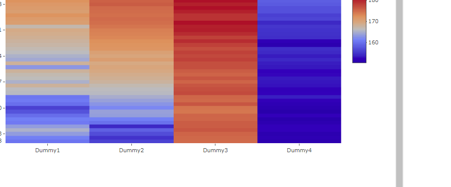
было построено, когда я щелкаю по какой-либо одной ячейке, строится следующая линейная диаграмма в зависимости от значений из этого конкретного выбранного столбца. Что мне не хватает? Пожалуйста помоги. Данные представляют собой набор из 4 CSV-файлов, поэтому не могут быть размещены здесь. Сожалею.
Основные части кода, которые имеют значение
ui.server

 tabPanel("Plot",
                       actionButton("filechoose", "Choose File"),
                       br(),
                       selectInput("toplot", "To Plot", choices =c("Income" = "inc1",
                                                                   "Expenditure" = "exp1",
                                                                   "Compare Income And
                                                                   Expenditure" = "cmp1",
                                                                   "Gross Profit" = "gprofit1",
                                                                   "Net Profit" = "nprofit1",
                                                                   "Profit Lost" = "plost1",
                                                                   "Profit Percent" = "pp1",
                                                                   "Profit Trend" = "proftrend1"
                       )),
                       actionButton("plotit", "PLOT"),
                       plotOutput("Plot")),
              tabPanel("Heatmap",
                       actionButton("combine","Combine"),
                       selectInput("ploth", "Plot Heatmap Of", choices =c("Income" = "inc1",
                                                                          "Expenditure" = "exp1",
                                                                          "Gross Profit" = "gprofit1",
                                                                          "Net Profit" = "nprofit1")),
                       actionButton("hplotit","Plot Heatmap"),
                       plotlyOutput("HeatPlot"),
                       plotlyOutput("Next")

shiny.server

observeEvent(input$hplotit, {
    inc1 <- as.data.frame(cbind(Dummy1 = Data[,2],Dummy2 = Data[,7],Dummy3 = Data[,12], Dummy4 = Data[,17]))
    inc1 <- as.matrix(inc1)
    exp1 <- as.data.frame(cbind(Dummy1 = Data[,3],Dummy2 = Data[,8],Dummy3 = Data[,13], Dummy4 = Data[,18]))
    exp1 <- as.matrix(exp1)
    gprofit1 <- as.data.frame(cbind(Dummy1 = Data[,3] - Data[,2],
                                    Dummy2 = Data[,8] - Data[,7],
                                    Dummy3 = Data[,13] - Data[,12],
                                    Dummy4 = Data[,18] - Data[,17]))
    gprofit1 <- as.matrix(gprofit1)
    nprofit1 <- as.data.frame(cbind(Dummy1 = (Data[,3] - Data[,2]) - ((Data[,3] - Data[,2]) * 0.06),
                                    Dummy2 = (Data[,8] - Data[,7]) - ((Data[,8] - Data[,7]) * 0.10),
                                    Dummy3 = (Data[,13] - Data[,12]) - ((Data[,13] - Data[,12]) * 0.18),
                                    Dummy4 = (Data[,18] - Data[,17]) - ((Data[,18] - Data[,17]) * 0.22)))
    nprofit1 <- as.matrix(nprofit1)
    date <- as.character(Data[,4])
    h = input$ploth
    switch(EXPR = h ,
           inc1 = output$HeatPlot <- renderPlotly( plot_ly(x = colnames(inc1), y = date, z = inc1, type = "heatmap", colorscale = "Earth")),

           exp1 = output$HeatPlot <- renderPlotly( plot_ly(x = colnames(exp1), y = date, z = exp1, type = "heatmap", colors = colorRamp(c("red", "yellow")))),

           gprofit1 = output$HeatPlot <- renderPlotly( plot_ly(x = colnames(gprofit1), y = date, z = gprofit1, type = "heatmap", colorscale="Greys")),

           nprofit1 = output$HeatPlot <- renderPlotly( plot_ly(x = colnames(nprofit1), y = date, z = nprofit1, type = "heatmap"))
    )

  })
output$HAha <- renderText({
      event_data(event = "plotly_click", source = "heatplot")
    })

    output$Next <- renderPlot({
d <- event_data(event = "plotly_click", source = "heatplot")
vars <- c(d[["x"]])
if(is.null(d))return(NULL)
else
  switch(EXPR = vars,
         Dummy1 = plot(x = Data[,4], y = inc1$vars),
         Dummy2 = plot(x = Data[,4], y = exp1$vars),
         Dummy3 = plot(x = Data[,4], y = gprofit1$vars),
         Dummy4 = plot(x = Data[,4], y = nprofit1$vars)
         )})


    }
        })
Плот находится в обоих местах, так что компьютер знает, выбран ли dummyy1, тогда он должен только строить график дохода. Не нужно давать два выбранных входа для обоих.