Как сместить положение тика оси журнала (на 10) в гистограмме в Python (Pandas или matplotlib)
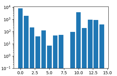
На оси Y (логарифмическая шкала), почему диапазон 0-10 меньше других диапазонов (10-100, 100-1000 и т. Д.). Есть ли способ отрегулировать расположение метки x и значения? Я хочу ясно показать маленькие значения. 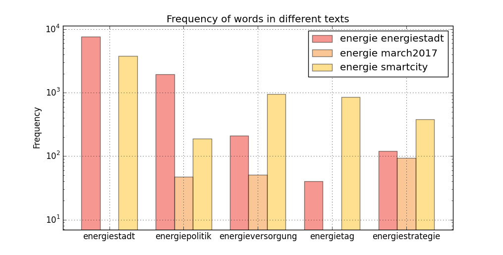
word_freqs, words
([[7637.78430956, 1938.76578683, 208.902929772, 40.3146004823,
120.943801447],
[6.99469414131, 46.9678505732, 51.2011611144, 0, 93.9478658318],
[3773.94093782, 188.697046891, 943.485234456, 849.13671101, 377.394093782]],
['energiestadt','energiepolitik','energieversorgung','energietag',
'energiestrategie'])
Мой сценарий, чтобы сделать это
import pandas as pd
import matplotlib.pyplot as plt
raw_data = {'Words': words,
'energie_energiestadt': word_freqs[0],
'energie_march2017': word_freqs[1],
'energie_smartcity': word_freqs[2]}
df = pd.DataFrame(raw_data, columns = ['Words', 'energie_energiestadt',
'energie_march2017', 'energie_smartcity'])
df

# Setting the positions and width for the bars
pos = list(range(len(df['energie_energiestadt'])))
width = 0.25

# Plotting the bars
fig, ax = plt.subplots(figsize=(10,5))

# Create a bar with energie_energiestadt data,
# in position pos,
plt.bar(pos,
        #using df['energie_energiestadt'] data,
        df['energie_energiestadt'],
        # of width
        width,
        # with alpha 0.5
        alpha=0.5,
        # with color
        color='#EE3224',
        # with label the first value in Words
        label=df['Words'][0])

# Create a bar with energie_march2017 data,
# in position pos + some width buffer,
plt.bar([p + width for p in pos],
        #using df['energie_march2017'] data,
        df['energie_march2017'],
        # of width
        width,
        # with alpha 0.5
        alpha=0.5,
        # with color
        color='#F78F2E',
        # with label the second value in Words
        label=df['Words'][1])

# Create a bar with energie_smartcity data,
# in position pos + some width buffer,
plt.bar([p + width*2 for p in pos],
        #using df['energie_smartcity'] data,
        df['energie_smartcity'],
        # of width
        width,
        # with alpha 0.5
        alpha=0.5,
        # with color
        color='#FFC222',
        # with label the third value in Words
        label=df['Words'][2], log=1)

# Set the y axis label
ax.set_ylabel('Frequency')

# Set the chart's title
ax.set_title('Frequency of words in different texts')

# Set the position of the x ticks
ax.set_xticks([p + 1.5 * width for p in pos])

# Set the labels for the x ticks
ax.set_xticklabels(df['Words'])

# Setting the x-axis and y-axis limits
plt.xlim(min(pos)-width, max(pos)+width*4)
plt.ylim([0, max(df['energie_energiestadt'] + df['energie_march2017'] +
df['energie_smartcity'])] )

# Adding the legend and showing the plot
plt.legend(['energie energiestadt', 'energie march2017', 'energie
smartcity'], loc='upper right')
plt.grid()
plt.show()
1 ответ
Решение
Пределы оси Y могут быть установлены с помощью ax.set_ylim() или же plt.ylim(), очевидно 0 не может быть пределом в логарифмическом масштабе, поэтому вам нужно использовать некоторое положительное число, например ax.set_ylim((1e-1,None))
import matplotlib.pyplot as plt
import numpy as np


y = [7637.78,  1938.77,  208.9,  40.31,  120.94,  6.99,  46.97,
     51.2,  0.0,  93.95,  3773.94,  188.7,  943.49,  849.14,  377.39]

y = np.array(y)

fig, ax = plt.subplots()
ax.bar(range(len(y)), y)
ax.set_yscale("log")
ax.set_ylim((1e-1,None))
plt.show()