HTML-таблица шириной 100% с вертикальной прокруткой внутри тела
Как я могу установить для <table> 100% ширина и только внутри <tbody> вертикальная прокрутка для некоторой высоты?

table {
    width: 100%;
    display:block;
}
thead {
    display: inline-block;
    width: 100%;
    height: 20px;
}
tbody {
    height: 200px;
    display: inline-block;
    width: 100%;
    overflow: auto;
}
<table>
  <thead>
    <tr>
     <th>Head 1</th>
     <th>Head 2</th>
     <th>Head 3</th>
     <th>Head 4</th>
     <th>Head 5</th>
    </tr>
  </thead>
  <tbody>
    <tr>
     <td>Content 1</td>
     <td>Content 2</td>
     <td>Content 3</td>
     <td>Content 4</td>
     <td>Content 5</td>
    </tr>
  </tbody>
</table>
Я хочу избежать добавления какого-либо дополнительного div, все, что мне нужно, это простая таблица, как эта, и когда я пытаюсь изменить отображение, table-layout, position и многое другое в таблице CSS не работает хорошо с шириной 100% только с фиксированной шириной в пикселях.
10 ответов
Чтобы сделать <tbody> прокручиваемый элемент, нам нужно изменить способ его отображения на странице, т.е. используя display: block; чтобы отобразить это как элемент уровня блока.
Так как мы меняем display собственностью tbody мы должны изменить это свойство для thead элемент, а также, чтобы предотвратить нарушение макета таблицы.
Итак, мы имеем:
thead, tbody { display: block; }

tbody {
    height: 100px;       /* Just for the demo          */
    overflow-y: auto;    /* Trigger vertical scroll    */
    overflow-x: hidden;  /* Hide the horizontal scroll */
}
Веб-браузеры отображают thead а также tbody элементы как группа строк (table-header-group а также table-row-group) по умолчанию.
Как только мы изменим это, внутри tr элементы не заполняют все пространство своего контейнера.
Чтобы это исправить, мы должны рассчитать ширину tbody столбцы и применить соответствующее значение к thead столбцы с помощью JavaScript.
Авто ширина столбцов
Вот версия jQuery вышеупомянутой логики:
// Change the selector if needed
var $table = $('table'),
    $bodyCells = $table.find('tbody tr:first').children(),
    colWidth;

// Get the tbody columns width array
colWidth = $bodyCells.map(function() {
    return $(this).width();
}).get();

// Set the width of thead columns
$table.find('thead tr').children().each(function(i, v) {
    $(v).width(colWidth[i]);
});
И вот вывод (на Windows 7 Chrome 32):

Таблица полной ширины, столбцы относительной ширины
Так как нужен оригинальный плакат, мы могли бы расширить table до 100% width его контейнера, а затем с использованием относительного (в процентах) width для каждого столбца таблицы.
table {
    width: 100%; /* Optional */
}

tbody td, thead th {
    width: 20%;  /* Optional */
}
Поскольку таблица имеет (своего рода) текучую структуру, мы должны отрегулировать ширину thead столбцы, когда размер контейнера.
Следовательно, мы должны установить ширину столбцов после изменения размера окна:
// Adjust the width of thead cells when *window* resizes
$(window).resize(function() {
    /* Same as before */
}).resize(); // Trigger the resize handler once the script runs
Выход будет:

Поддержка браузера и альтернативы
Я протестировал два вышеуказанных метода в Windows 7 через новые версии основных веб-браузеров (включая IE10+), и это сработало.
Тем не менее, он не работает должным образом на IE9 и ниже.
Это связано с тем, что в макете таблицы все элементы должны иметь одинаковые структурные свойства.
Используя display: block; для <thead> а также <tbody> элементы, мы разбили структуру таблицы.
Редизайн макета с помощью JavaScript
Один из подходов заключается в перепроектировании (всей) компоновки таблицы. Использование JavaScript для создания нового макета на лету, обработки и / или динамической регулировки ширины / высоты ячеек.
Например, взгляните на следующие примеры:
- Плагин jQuery .floatThead () ( плагин плавающей / заблокированной / липкой заголовка таблицы)
- Плагин jQuery Scrollable Table. ( исходный код на github)
- Плагин jQuery .FixedHeaderTable () ( исходный код на github)
- Пример вертикальной прокрутки в DataTables.
Скворечники
Этот подход использует две вложенные таблицы с содержащим div. Первый table имеет только одну клетку, которая имеет div и вторая таблица находится внутри этого div элемент.
Проверьте таблицы вертикальной прокрутки в CSS Play.
Это работает в большинстве веб-браузеров. Мы также можем динамически выполнять вышеуказанную логику с помощью JavaScript.
Таблица с фиксированным заголовком на свитке
Поскольку цель добавления вертикальной полосы прокрутки к <tbody> отображает заголовок таблицы в верхней части каждой строки, мы могли бы разместить thead элемент, чтобы остаться fixed вместо этого вверху экрана.
Вот рабочая демонстрация этого подхода в исполнении Жюльена.
Имеет многообещающую поддержку веб-браузера.
А здесь чистая реализация CSS от Willem Van Bockstal.
Чистое решение CSS
Вот старый ответ. Конечно, я добавил новый метод и уточнил объявления CSS.
Стол с фиксированной шириной
В этом случае table должен иметь фиксированный width (включая сумму ширины столбцов и ширины вертикальной полосы прокрутки).
Каждый столбец должен иметь определенную ширину и последний столбец thead элемент должен иметь большую ширину, равную ширине других + ширине вертикальной полосы прокрутки.
Следовательно, CSS будет:
table {
    width: 716px; /* 140px * 5 column + 16px scrollbar width */
    border-spacing: 0;
}

tbody, thead tr { display: block; }

tbody {
    height: 100px;
    overflow-y: auto;
    overflow-x: hidden;
}

tbody td, thead th {
    width: 140px;
}

thead th:last-child {
    width: 156px; /* 140px + 16px scrollbar width */
}
Вот вывод:

Стол со 100% шириной
При таком подходе table имеет ширину 100% и для каждого th а также td, значение width свойство должно быть меньше 100% / number of cols,
Также нам нужно уменьшить ширину thead в качестве значения ширины вертикальной полосы прокрутки.
Для этого нам нужно использовать CSS3 calc() функция следующим образом:
table {
    width: 100%;
    border-spacing: 0;
}

thead, tbody, tr, th, td { display: block; }

thead tr {
    /* fallback */
    width: 97%;
    /* minus scroll bar width */
    width: -webkit-calc(100% - 16px);
    width:    -moz-calc(100% - 16px);
    width:         calc(100% - 16px);
}

tr:after {  /* clearing float */
    content: ' ';
    display: block;
    visibility: hidden;
    clear: both;
}

tbody {
    height: 100px;
    overflow-y: auto;
    overflow-x: hidden;
}

tbody td, thead th {
    width: 19%;  /* 19% is less than (100% / 5 cols) = 20% */
    float: left;
}
Вот онлайн демо.
Примечание. Этот подход потерпит неудачу, если содержимое каждого столбца разбивает строку, то есть содержимое каждой ячейки должно быть достаточно коротким.
Ниже приведены два простых примера чистого решения CSS, которые я создал, когда ответил на этот вопрос.
Вот демоверсия jsFiddle v2.
Старая версия: jsFiddle Demo v1
В следующем решении таблица занимает 100% родительского контейнера, абсолютные размеры не требуются. Это чистый CSS, используется гибкий макет.
Вот как это выглядит: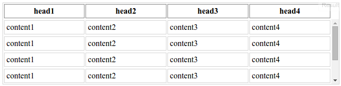
Возможные недостатки:
- вертикальная полоса прокрутки всегда видна, независимо от того, требуется ли она;
- фиксированный макет таблицы - размер столбцов не изменяется в соответствии с шириной содержимого (вы все равно можете явно указать любую ширину столбца);
- есть один абсолютный размер - ширина полосы прокрутки, которая составляет около 0,9 мкм для браузеров, которые я смог проверить.
HTML (сокращенно):
<div class="table-container">
    <table>
        <thead>
            <tr>
                <th>head1</th>
                <th>head2</th>
                <th>head3</th>
                <th>head4</th>
            </tr>
        </thead>
        <tbody>
            <tr>
                <td>content1</td>
                <td>content2</td>
                <td>content3</td>
                <td>content4</td>
            </tr>
            <tr>
                <td>content1</td>
                <td>content2</td>
                <td>content3</td>
                <td>content4</td>
            </tr>
            ...
        </tbody>
    </table>
</div>
CSS, с некоторыми украшениями, опущенными для ясности:
.table-container {
    height: 10em;
}
table {
    display: flex;
    flex-flow: column;
    height: 100%;
    width: 100%;
}
table thead {
    /* head takes the height it requires,
    and it's not scaled when table is resized */
    flex: 0 0 auto;
    width: calc(100% - 0.9em);
}
table tbody {
    /* body takes all the remaining available space */
    flex: 1 1 auto;
    display: block;
    overflow-y: scroll;
}
table tbody tr {
    width: 100%;
}
table thead, table tbody tr {
    display: table;
    table-layout: fixed;
}
Тот же код в LESS, так что вы можете смешать его в:
.table-scrollable() {
  @scrollbar-width: 0.9em;
  display: flex;
  flex-flow: column;

  thead,
  tbody tr {
    display: table;
    table-layout: fixed;
  }

  thead {
    flex: 0 0 auto;
    width: ~"calc(100% - @{scrollbar-width})";
  }

  tbody {
    display: block;
    flex: 1 1 auto;
    overflow-y: scroll;

    tr {
      width: 100%;
    }
  }
}
Только CSS
для Chrome, Firefox, Edge (и других вечнозеленых браузеров)
Просто position: sticky; top: 0; твой th элементы:
/* Fix table head */
.tableFixHead    { overflow-y: auto; height: 100px; }
.tableFixHead th { position: sticky; top: 0; }

/* Just common table stuff. */
table  { border-collapse: collapse; width: 100%; }
th, td { padding: 8px 16px; }
th     { background:#eee; }
<div class="tableFixHead">
<table>
<thead>
<tr><th>TH 1</th><th>TH 2</th></tr>
</thead>
<tbody>
<tr><td>A1</td><td>A2</td></tr>
<tr><td>B1</td><td>B2</td></tr>
<tr><td>C1</td><td>C2</td></tr>
<tr><td>D1</td><td>D2</td></tr>
<tr><td>E1</td><td>E2</td></tr>
</tbody>
</table>
</div>PS: если вам нужны границы для элементов THth {box-shadow: 1px 1px 0 #000; border-top: 0;} поможет (поскольку границы по умолчанию не отображаются правильно при прокрутке).
Для варианта вышеизложенного, в котором используется только немного JS, чтобы приспособиться к IE11, см. Этот ответ /questions/26375264/tablitsa-fiksirovannogo-zagolovka-i-prokruchivaemogo-tela/26375296#26375296
В современных браузерах вы можете просто использовать css:
th {
  position: sticky;
  top: 0;
  z-index: 2;
}
Я использую display:block за thead а также tbody, Из-за этого ширина thead столбцы отличается от ширины tbody колонны.
table {
    margin:0 auto;
    border-collapse:collapse;
}
thead {
    background:#CCCCCC;
    display:block
}
tbody {
    height:10em;overflow-y:scroll;
    display:block
}
Чтобы исправить это, я использую маленький jQuery код, но это можно сделать в JavaScript только.
var colNumber=3 //number of table columns

for (var i=0; i<colNumber; i++) {
  var thWidth=$("#myTable").find("th:eq("+i+")").width();
  var tdWidth=$("#myTable").find("td:eq("+i+")").width();
  if (thWidth<tdWidth)
      $("#myTable").find("th:eq("+i+")").width(tdWidth);
  else
      $("#myTable").find("td:eq("+i+")").width(thWidth);
}
Вот мое рабочее демо: http://jsfiddle.net/gavroche/N7LEF/
Не работает в IE 8
var colNumber=3 //number of table columns


for (var i=0; i<colNumber; i++)
  {
      var thWidth=$("#myTable").find("th:eq("+i+")").width();
      var tdWidth=$("#myTable").find("td:eq("+i+")").width();
      if (thWidth<tdWidth)
          $("#myTable").find("th:eq("+i+")").width(tdWidth);
      else
          $("#myTable").find("td:eq("+i+")").width(thWidth);
  }
table {margin:0 auto; border-collapse:separate;}
thead {background:#CCCCCC;display:block}
tbody {height:10em;overflow-y:scroll;display:block}<script src="https://ajax.googleapis.com/ajax/libs/jquery/1.11.1/jquery.min.js"></script>
<table id="myTable" border="1">
<thead>
<tr>
<th>A really Very Long Header Text</th>
<th>Normal Header</th>
<th>Short</th>
</tr>
</thead>
<tbody>
<tr>
<td>
Text shorter than header
</td>
<td>
Text is longer than header
</td>
<td>
Exact
</td>
</tr>
<tr>
<td>
Text shorter than header
</td>
<td>
Text is longer than header
</td>
<td>
Exact
</td>
</tr>
<tr>
<td>
Text shorter than header
</td>
<td>
Text is longer than header
</td>
<td>
Exact
</td>
</tr>
<tr>
<td>
Text shorter than header
</td>
<td>
Text is longer than header
</td>
<td>
Exact
</td>
</tr>
<tr>
<td>
Text shorter than header
</td>
<td>
Text is longer than header
</td>
<td>
Exact
</td>
</tr>
<tr>
<td>
Text shorter than header
</td>
<td>
Text is longer than header
</td>
<td>
Exact
</td>
</tr>
<tr>
<td>
Text shorter than header
</td>
<td>
Text is longer than header
</td>
<td>
Exact
</td>
</tr>
<tr>
<td>
Text shorter than header
</td>
<td>
Text is longer than header
</td>
<td>
Exact
</td>
</tr>
<tr>
<td>
Text shorter than header
</td>
<td>
Text is longer than header
</td>
<td>
Exact
</td>
</tr>
<tr>
<td>
Text shorter than header
</td>
<td>
Text is longer than header
</td>
<td>
Exact
</td>
</tr>
<tr>
<td>
Text shorter than header
</td>
<td>
Text is longer than header
</td>
<td>
Exact
</td>
</tr>
</tbody>
</table>Создайте две таблицы одну за другой, поместите вторую таблицу в div с фиксированной высотой и установите для свойства overflow значение auto. Также держите все td внутри thead во втором столе пустыми.
<div>
    <table>
        <thead>
            <tr>
                <th>Head 1</th>
                <th>Head 2</th>
                <th>Head 3</th>
                <th>Head 4</th>
                <th>Head 5</th>
            </tr>
        </thead>
    </table>
</div>

<div style="max-height:500px;overflow:auto;">
    <table>
        <thead>
            <tr>
                <th></th>
                <th></th>
                <th></th>
                <th></th>
                <th></th>
            </tr>
        </thead>
        <tbody>
        <tr>
            <td>Content 1</td>
            <td>Content 2</td>
            <td>Content 3</td>
            <td>Content 4</td>
            <td>Content 5</td>
        </tr>
        </tbody>
    </table>
</div>
Наконец-то я понял это правильно с помощью чистого CSS, выполнив следующие инструкции:
http://tjvantoll.com/2012/11/10/creating-cross-browser-scrollable-tbody/
Первый шаг - установить <tbody> отображать: блокировать, чтобы можно было использовать переполнение и высоту. Оттуда строки в <thead> нужно установить в положение: относительное и отображать: блок, чтобы они располагались поверх прокручиваемой в данный момент <tbody>,
tbody, thead { display: block; overflow-y: auto; }
Поскольку <thead> относительно позиционируется каждая ячейка таблицы нуждается в явной ширине
td:nth-child(1), th:nth-child(1) { width: 100px; }
td:nth-child(2), th:nth-child(2) { width: 100px; }
td:nth-child(3), th:nth-child(3) { width: 100px; }
Но, к сожалению, этого недостаточно. Когда полоса прокрутки присутствует, браузеры выделяют для нее место, поэтому <tbody> заканчивается меньше доступного места, чем <thead> , Обратите внимание на небольшое смещение, которое это создает...
Единственный обходной путь, который я мог придумать, - это установить минимальную ширину для всех столбцов, кроме последнего.
td:nth-child(1), th:nth-child(1) { min-width: 100px; }
td:nth-child(2), th:nth-child(2) { min-width: 100px; }
td:nth-child(3), th:nth-child(3) { width: 100px; }
Весь пример codepen ниже:
CSS:
.fixed_headers {
  width: 750px;
  table-layout: fixed;
  border-collapse: collapse;
}
.fixed_headers th {
  text-decoration: underline;
}
.fixed_headers th,
.fixed_headers td {
  padding: 5px;
  text-align: left;
}
.fixed_headers td:nth-child(1),
.fixed_headers th:nth-child(1) {
  min-width: 200px;
}
.fixed_headers td:nth-child(2),
.fixed_headers th:nth-child(2) {
  min-width: 200px;
}
.fixed_headers td:nth-child(3),
.fixed_headers th:nth-child(3) {
  width: 350px;
}
.fixed_headers thead {
  background-color: #333333;
  color: #fdfdfd;
}
.fixed_headers thead tr {
  display: block;
  position: relative;
}
.fixed_headers tbody {
  display: block;
  overflow: auto;
  width: 100%;
  height: 300px;
}
.fixed_headers tbody tr:nth-child(even) {
  background-color: #dddddd;
}
.old_ie_wrapper {
  height: 300px;
  width: 750px;
  overflow-x: hidden;
  overflow-y: auto;
}
.old_ie_wrapper tbody {
  height: auto;
}
Html:
<!-- IE < 10 does not like giving a tbody a height.  The workaround here applies the scrolling to a wrapped <div>. -->
<!--[if lte IE 9]>
<div class="old_ie_wrapper">
<!--<![endif]-->

<table class="fixed_headers">
  <thead>
    <tr>
      <th>Name</th>
      <th>Color</th>
      <th>Description</th>
    </tr>
  </thead>
  <tbody>
    <tr>
      <td>Apple</td>
      <td>Red</td>
      <td>These are red.</td>
    </tr>
    <tr>
      <td>Pear</td>
      <td>Green</td>
      <td>These are green.</td>
    </tr>
    <tr>
      <td>Grape</td>
      <td>Purple / Green</td>
      <td>These are purple and green.</td>
    </tr>
    <tr>
      <td>Orange</td>
      <td>Orange</td>
      <td>These are orange.</td>
    </tr>
    <tr>
      <td>Banana</td>
      <td>Yellow</td>
      <td>These are yellow.</td>
    </tr>
    <tr>
      <td>Kiwi</td>
      <td>Green</td>
      <td>These are green.</td>
    </tr>
    <tr>
      <td>Plum</td>
      <td>Purple</td>
      <td>These are Purple</td>
    </tr>
    <tr>
      <td>Watermelon</td>
      <td>Red</td>
      <td>These are red.</td>
    </tr>
    <tr>
      <td>Tomato</td>
      <td>Red</td>
      <td>These are red.</td>
    </tr>
    <tr>
      <td>Cherry</td>
      <td>Red</td>
      <td>These are red.</td>
    </tr>
    <tr>
      <td>Cantelope</td>
      <td>Orange</td>
      <td>These are orange inside.</td>
    </tr>
    <tr>
      <td>Honeydew</td>
      <td>Green</td>
      <td>These are green inside.</td>
    </tr>
    <tr>
      <td>Papaya</td>
      <td>Green</td>
      <td>These are green.</td>
    </tr>
    <tr>
      <td>Raspberry</td>
      <td>Red</td>
      <td>These are red.</td>
    </tr>
    <tr>
      <td>Blueberry</td>
      <td>Blue</td>
      <td>These are blue.</td>
    </tr>
    <tr>
      <td>Mango</td>
      <td>Orange</td>
      <td>These are orange.</td>
    </tr>
    <tr>
      <td>Passion Fruit</td>
      <td>Green</td>
      <td>These are green.</td>
    </tr>
  </tbody>
</table>

<!--[if lte IE 9]>
</div>
<!--<![endif]-->
РЕДАКТИРОВАТЬ: Альтернативное решение для ширины таблицы 100% (выше на самом деле для фиксированной ширины и не ответил на вопрос):
HTML:
<table>
  <thead>
    <tr>
      <th>Name</th>
      <th>Color</th>
      <th>Description</th>
    </tr>
  </thead>
  <tbody>
    <tr>
      <td>Apple</td>
      <td>Red</td>
      <td>These are red.</td>
    </tr>
    <tr>
      <td>Pear</td>
      <td>Green</td>
      <td>These are green.</td>
    </tr>
    <tr>
      <td>Grape</td>
      <td>Purple / Green</td>
      <td>These are purple and green.</td>
    </tr>
    <tr>
      <td>Orange</td>
      <td>Orange</td>
      <td>These are orange.</td>
    </tr>
    <tr>
      <td>Banana</td>
      <td>Yellow</td>
      <td>These are yellow.</td>
    </tr>
    <tr>
      <td>Kiwi</td>
      <td>Green</td>
      <td>These are green.</td>
    </tr>
  </tbody>
</table>
CSS:
table {
  width: 100%;
  text-align: left;
  min-width: 610px;
}
tr {
  height: 30px;
  padding-top: 10px
}
tbody {
  height: 150px;
  overflow-y: auto;
  overflow-x: hidden;
}
th,td,tr,thead,tbody { display: block; }
td,th { float: left; }
td:nth-child(1),
th:nth-child(1) {
  width: 20%;
}
td:nth-child(2),
th:nth-child(2) {
  width: 20%;
  float: left;
}
td:nth-child(3),
th:nth-child(3) {
  width: 59%;
  float: left;
}
/* some colors */
thead {
  background-color: #333333;
  color: #fdfdfd;
}
table tbody tr:nth-child(even) {
  background-color: #dddddd;
}
Добавление фиксированной ширины к td,th после того, как блок tbody & thead работает нормально, также мы можем использовать плагин slimscroll, чтобы сделать полосу прокрутки красивой.
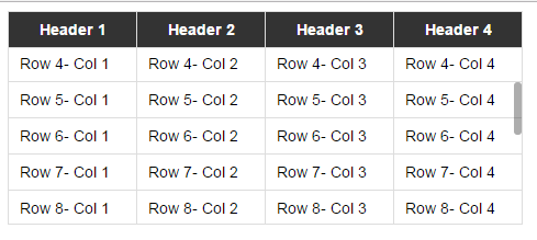
<!DOCTYPE html>
<html>

<head>
    <title> Scrollable table </title>
    <style>
        body {
            font-family: sans-serif;
            font-size: 0.9em;
        }
        table {
            border-collapse: collapse;
            border-bottom: 1px solid #ddd;
        }
        thead {
            background-color: #333;
            color: #fff;
        }
        thead,tbody {
            display: block;
        }
        th,td {
            padding: 8px 10px;
            border: 1px solid #ddd;
            width: 117px;
            box-sizing: border-box;
        }
        tbody {
            height: 160px;
            overflow-y: scroll
        }
    </style>
</head>

<body>

    <table class="example-table">
        <thead>
            <tr>
                <th> Header 1 </th>
                <th> Header 2 </th>
                <th> Header 3 </th>
                <th> Header 4 </th>
            </tr>
        </thead>
        <tbody>
            <tr>
                <td> Row 1- Col 1 </td>
                <td> Row 1- Col 2 </td>
                <td> Row 1- Col 3 </td>
                <td> Row 1- Col 4 </td>
            </tr>
            <tr>
                <td> Row 2- Col 1 </td>
                <td> Row 2- Col 2 </td>
                <td> Row 2- Col 3 </td>
                <td> Row 2- Col 4 </td>
            </tr>
            <tr>
                <td> Row 3- Col 1 </td>
                <td> Row 3- Col 2 </td>
                <td> Row 3- Col 3 </td>
                <td> Row 3- Col 4 </td>
            </tr>
            <tr>
                <td> Row 4- Col 1 </td>
                <td> Row 4- Col 2 </td>
                <td> Row 4- Col 3 </td>
                <td> Row 4- Col 4 </td>
            </tr>
            <tr>
                <td> Row 5- Col 1 </td>
                <td> Row 5- Col 2 </td>
                <td> Row 5- Col 3 </td>
                <td> Row 5- Col 4 </td>
            </tr>
            <tr>
                <td> Row 6- Col 1 </td>
                <td> Row 6- Col 2 </td>
                <td> Row 6- Col 3 </td>
                <td> Row 6- Col 4 </td>
            </tr>
            <tr>
                <td> Row 7- Col 1 </td>
                <td> Row 7- Col 2 </td>
                <td> Row 7- Col 3 </td>
                <td> Row 7- Col 4 </td>
            </tr>
            <tr>
                <td> Row 8- Col 1 </td>
                <td> Row 8- Col 2 </td>
                <td> Row 8- Col 3 </td>
                <td> Row 8- Col 4 </td>
            </tr>
            <tr>
                <td> Row 9- Col 1 </td>
                <td> Row 9- Col 2 </td>
                <td> Row 9- Col 3 </td>
                <td> Row 9- Col 4 </td>
            </tr>
            <tr>
                <td> Row 10- Col 1 </td>
                <td> Row 10- Col 2 </td>
                <td> Row 10- Col 3 </td>
                <td> Row 10- Col 4 </td>
            </tr>
            <tr>
                <td> Row 11- Col 1 </td>
                <td> Row 11- Col 2 </td>
                <td> Row 11- Col 3 </td>
                <td> Row 11- Col 4 </td>
            </tr>
            <tr>
                <td> Row 12- Col 1 </td>
                <td> Row 12- Col 2 </td>
                <td> Row 12- Col 3 </td>
                <td> Row 12- Col 4 </td>
            </tr>
            <tr>
                <td> Row 13- Col 1 </td>
                <td> Row 13- Col 2 </td>
                <td> Row 13- Col 3 </td>
                <td> Row 13- Col 4 </td>
            </tr>
            <tr>
                <td> Row 14- Col 1 </td>
                <td> Row 14- Col 2 </td>
                <td> Row 14- Col 3 </td>
                <td> Row 14- Col 4 </td>
            </tr>
            <tr>
                <td> Row 15- Col 1 </td>
                <td> Row 15- Col 2 </td>
                <td> Row 15- Col 3 </td>
                <td> Row 15- Col 4 </td>
            </tr>
            <tr>
                <td> Row 16- Col 1 </td>
                <td> Row 16- Col 2 </td>
                <td> Row 16- Col 3 </td>
                <td> Row 16- Col 4 </td>
            </tr>
        </tbody>
    </table>


    <script src="https://cdnjs.cloudflare.com/ajax/libs/jquery/3.2.1/jquery.min.js"></script>
    <script src="https://cdnjs.cloudflare.com/ajax/libs/jQuery-slimScroll/1.3.8/jquery.slimscroll.min.js"></script>
    <script>
        $('.example-table tbody').slimscroll({
            height: '160px',
            alwaysVisible: true,
            color: '#333'
        })
    </script>
</body>

</html>Попробуйте этот jsfiddle. Это использует jQuery и сделано из ответа Хашема Колами. Сначала сделайте обычную таблицу, а затем сделайте ее прокручиваемой.
const makeScrollableTable = function (tableSelector, tbodyHeight) {
  let $table = $(tableSelector);
  let $bodyCells = $table.find('tbody tr:first').children();
  let $headCells = $table.find('thead tr:first').children();
  let headColWidth = 0;
  let bodyColWidth = 0;

  headColWidth = $headCells.map(function () {
    return $(this).outerWidth();
  }).get();
  bodyColWidth = $bodyCells.map(function () {
    return $(this).outerWidth();
  }).get();

  $table.find('thead tr').children().each(function (i, v) {
    $(v).css("width", headColWidth[i]+"px");
    $(v).css("min-width", headColWidth[i]+"px");
    $(v).css("max-width", headColWidth[i]+"px");
  });
  $table.find('tbody tr').children().each(function (i, v) {
    $(v).css("width", bodyColWidth[i]+"px");
    $(v).css("min-width", bodyColWidth[i]+"px");
    $(v).css("max-width", bodyColWidth[i]+"px");
  });

  $table.find('thead').css("display", "block");
  $table.find('tbody').css("display", "block");

  $table.find('tbody').css("height", tbodyHeight+"px");
  $table.find('tbody').css("overflow-y", "auto");
  $table.find('tbody').css("overflow-x", "hidden");

};
Попробуйте подход ниже, очень просто, легко реализовать
Ниже ссылка jsfiddle
http://jsfiddle.net/v2t2k8ke/2/
HTML:
<table border='1' id='tbl_cnt'>
<thead><tr></tr></thead><tbody></tbody>
CSS:
 #tbl_cnt{
 border-collapse: collapse; width: 100%;word-break:break-all;
 }
 #tbl_cnt thead, #tbl_cnt tbody{
 display: block;
 }
 #tbl_cnt thead tr{
 background-color: #8C8787; text-align: center;width:100%;display:block;
 }
 #tbl_cnt tbody {
 height: 100px;overflow-y: auto;overflow-x: hidden;
 }
Jquery:
 var data = [
    {
    "status":"moving","vehno":"tr544","loc":"bng","dri":"ttt"
    }, {
    "status":"stop","vehno":"tr54","loc":"che", "dri":"ttt"
    },{    "status":"idle","vehno":"yy5499999999999994","loc":"bng","dri":"ttt"
    },{
    "status":"moving","vehno":"tr544","loc":"bng", "dri":"ttt"
    }, {
    "status":"stop","vehno":"tr54","loc":"che","dri":"ttt"
    },{
    "status":"idle","vehno":"yy544","loc":"bng","dri":"ttt"
    }
    ];
   var sth = '';
   $.each(data[0], function (key, value) {
     sth += '<td>' + key + '</td>';
   });
   var stb = '';
   $.each(data, function (key, value) {
       stb += '<tr>';
       $.each(value, function (key, value) {
       stb += '<td>' + value + '</td>';
       });
       stb += '</tr>';
    });
      $('#tbl_cnt thead tr').append(sth);
      $('#tbl_cnt tbody').append(stb);
      setTimeout(function () {
      var col_cnt=0
      $.each(data[0], function (key, value) {col_cnt++;});
      $('#tbl_cnt thead tr').css('width', ($("#tbl_cnt tbody") [0].scrollWidth)+ 'px');
      $('#tbl_cnt thead tr td,#tbl_cnt tbody tr td').css('width',  ($('#tbl_cnt thead tr ').width()/Number(col_cnt)) + 'px');}, 100)
Вот код, который работает для меня, чтобы создать липкую игру на столе с прокручиваемым телом:
table ,tr td{
    border:1px solid red
}
tbody {
    display:block;
    height:50px;
    overflow:auto;
}
thead, tbody tr {
    display:table;
    width:100%;
    table-layout:fixed;/* even columns width , fix width of table too*/
}
thead {
    width: calc( 100% - 1em )/* scrollbar is average 1em/16px width, remove it from thead width */
}
table {
    width:400px;
}
Обходной путь Css для принудительного отображения столбцов с помощью блока block
Это решение все еще требует th ширина, которая будет рассчитана и установлена jQuery
table.scroll tbody,
table.scroll thead { display: block; }

table.scroll tbody {
    overflow-y: auto;
    overflow-x: hidden;
    max-height: 300px;
}

table.scroll tr {
    display: flex;
}

table.scroll tr > td {
    flex-grow: 1;
    flex-basis: 0;
}
И Jquery / Javascript
var $table = $('#the_table_element'),
    $bodyCells = $table.find('tbody tr:first').children(),
    colWidth;

$table.addClass('scroll');

// Adjust the width of thead cells when window resizes
$(window).resize(function () {

    // Get the tbody columns width array
    colWidth = $bodyCells.map(function () {
        return $(this).width();
    }).get();

    // Set the width of thead columns
    $table.find('thead tr').children().each(function (i, v) {
        $(v).width(colWidth[i]);
    });

}).resize(); // Trigger resize handler
Для использования "overflow: scroll" вы должны установить "display:block" на thead и tbody. И это меняет ширину столбцов между ними. Но затем вы можете клонировать строку thead с помощью Javascript и вставить ее в tbody как скрытую строку, чтобы сохранить точную ширину столбца.
$('.myTable thead > tr').clone().appendTo('.myTable tbody').addClass('hidden-to-set-col-widths');
http://jsfiddle.net/Julesezaar/mup0c5hk/
<table class="myTable">
    <thead>
        <tr>
            <td>Problem</td>
            <td>Solution</td>
            <td>blah</td>
            <td>derp</td>
        </tr>
    </thead>
    <tbody></tbody>
</table>
<p>
  Some text to here
</p>
CSS:
table {
  background-color: #aaa;
  width: 100%;
}

thead,
tbody {
  display: block; // Necessary to use overflow: scroll
}

tbody {
  background-color: #ddd;
  height: 150px;
  overflow-y: scroll;
}

tbody tr.hidden-to-set-col-widths,
tbody tr.hidden-to-set-col-widths td {
  visibility: hidden;
  height: 0;
  line-height: 0;
  padding-top: 0;
  padding-bottom: 0;
}

td {
  padding: 3px 10px;
}