Добавьте вторичные метки оси X в ggplot с одной осью X
** Отредактируйте, здесь есть два отличных решения, одно помечено как ответ, но @hrbrmstr предоставляет отличное решение, объединяющее два ggplots, которые хорошо подходят для этого простого графика. *
Вот код
breaks.major <- c(0,15,37.5,52.5,67.5,82.5,95,100) #defines the midpoints of the categories (label locations)
breaks.minor <- c(30,45,60,75,90) #defines the edges of the categories (second label set I need)
labels.minor <- c("","Extremely \nDissatisfied","Dissatisfied","Uncertain","Satisfied","Very \nSatisfied","Extremely \nSatisfied","")
lims =c(0,100)
g <- ggplot(mpg, aes(class))+
  geom_bar()+
  coord_flip()+
  scale_y_continuous(limit = lims, minor_breaks = breaks.minor, breaks = breaks.major, labels = labels.minor) +
  theme(panel.grid.major.x = element_blank()) +
  theme(panel.grid.major.y = element_blank()) +
  theme(axis.ticks.x=element_blank()) +
  theme(axis.title= element_blank())
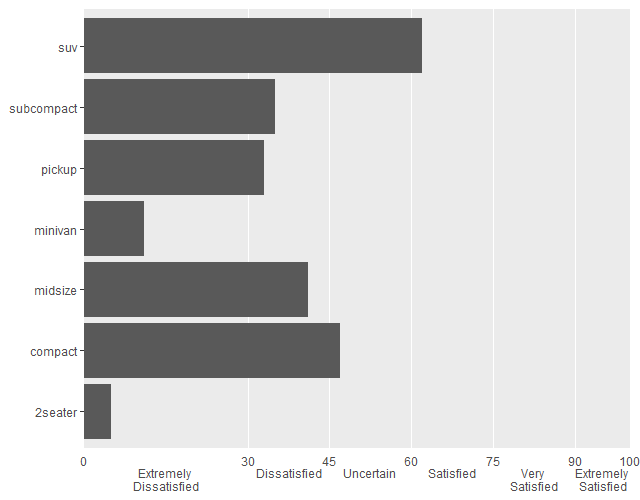
Он производит этот сюжет:

Мне нужно иметь два набора меток оси X, один из которых показывает названия категорий (т.е. "удовлетворены" и т. Д., Которые уже есть через labels.minor), и один показывает значения на breaks.minor местоположения (соответствующие ограничениям категории, то есть вертикальным линиям сетки панели). Мне нужен ток labels.minor ярлыки должны быть ниже требуемых дополнительных ярлыков.
В настоящее время я делаю это с переносами строк, чтобы все числа и категории были в одной длинной строке, но интервал становится смешным с изменением размера сюжета. Я мог бы сделать это с помощью текстовых полей (я полагаю), есть ли способ в ggplot?
Дополнительные очки, если вы получите мои текущие ярлыки в центре их секций (например, "Чрезвычайно удовлетворен" не в центре)
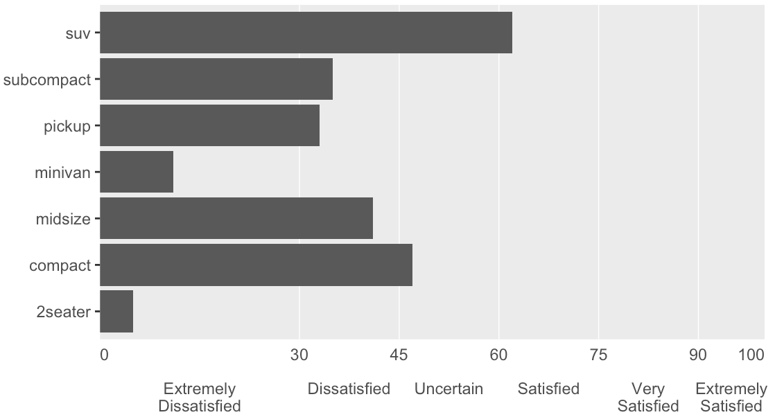
Это мой желаемый результат (простите за мой 'mspaint')

3 ответа
Что-то вроде этого, возможно. Обратите внимание на настройку expand для обеих осей, чтобы иметь дело с надлежащим интервалом, и положениями названий категорий.
Ярлыки на вашем рисунке на самом деле не смещены от центра, они находятся в центре границы их категории. Просто по умолчанию оси расширяются немного дальше.
Если вы хотите получить больше фантазии, вы можете рисовать и за пределами области построения, но для этого нужно немного больше. Этот вопрос должен помочь вам начать.
ggplot(mpg, aes(class))+
  geom_bar()+
  geom_text(data = data.frame(br = breaks.minor), aes(y = br, label = br, x = 7.75),
            size = 4, col = 'grey30') +
  coord_flip()+
  scale_y_continuous(limit = lims, minor_breaks = breaks.minor,
                     breaks = breaks.major, labels = labels.minor,
                     expand = c(0, 0)) +
  scale_x_discrete(expand = c(0.05, 0)) +
  theme(panel.grid.major.x = element_blank()) +
  theme(panel.grid.major.y = element_blank()) +
  theme(axis.ticks.x=element_blank()) +
  theme(axis.title= element_blank())

Я думаю, что это делает то, что вы ищете:
library(ggplot2)
library(grid)
library(gtable)
library(gridExtra)

breaks.major <- c(0, 15, 37.5, 52.5, 67.5, 82.5, 95, 100)
breaks.minor <- c(30, 45, 60, 75, 90)
labels.minor <- c("", "Extremely\nDissatisfied", "Dissatisfied", "Uncertain",
                  "Satisfied", "Very\nSatisfied", "Extremely\nSatisfied", "")
lims <- c(0, 100)

# build the main plot with the text axis
gg1 <- ggplot(mpg, aes(class))
gg1 <- gg1 + geom_bar()
gg1 <- gg1 + scale_y_continuous(expand=c(0,0), limit=lims,
                                minor_breaks=breaks.minor,
                                breaks=breaks.major,
                                labels=labels.minor)
gg1 <- gg1 + coord_flip()
gg1 <- gg1 + theme(panel.grid.major.x=element_blank())
gg1 <- gg1 + theme(panel.grid.major.y=element_blank())
gg1 <- gg1 + theme(axis.ticks.x=element_blank())
gg1 <- gg1 + theme(axis.title=element_blank())

# let ggplot2 do the work of building the second axis
gg2 <- ggplot(mpg, aes(class))
gg2 <- gg2 + scale_y_continuous(expand=c(0,0), limit=lims,
                                breaks=c(0, breaks.minor, 100))
gg2 <- gg2 + coord_flip()
gg2 <- gg2 + theme(axis.ticks.x=element_blank())
gg2 <- gg2 + theme(axis.text.x=element_text(hjust=c(0, 0.5, 0.5, 0.5, 0.5, 0.5, 1)))

gt1 <- ggplot_gtable(ggplot_build(gg1))
gt2 <- ggplot_gtable(ggplot_build(gg2))
axis2 <- grid.arrange(gt2$grobs[[5]])

gt <- gtable_add_rows(gt1, unit(0.1, "null"), 4)
grid.arrange(gtable_add_grob(gt, axis2, t=5, l=4, b=5, r=4))
Я написал все лейблы как мажорные лейблы.
# OP's
breaks.major <- c(0,15,37.5,52.5,67.5,82.5,95,100) #defines the midpoints of the categories (label locations)
breaks.minor <- c(30,45,60,75,90) #defines the edges of the categories (second label set I need)
labels.minor <- c("","Extremely \nDissatisfied","Dissatisfied","Uncertain","Satisfied","Very \nSatisfied","Extremely \nSatisfied","")
lims =c(0,100)

breaks.major2 <- c(0,15,37.5,52.5,67.5,82.5,95)
breaks.minor2 <- c(30,45,60,75,90,100)       # put 100 into minor from major

breaks.comb <- sort(c(breaks.major2, breaks.minor2 - 1.0E-6))  # avoid the just same value as minor
label.comb <- c(0, "\nExtremely \nDissatisfied", 30, "\nDissatisfied", 45, "\nUncertain", 60,
                "\nSatisfied", 75, "\nVery \nSatisfied", 90, "\nExtremely \nSatisfied", 100)

library(ggplot2)
g <- ggplot(mpg, aes(class))+
  geom_bar()+
  coord_flip()+
  scale_y_continuous(limit = lims, minor_breaks = breaks.minor2, breaks = breaks.comb,
                     labels = label.comb, expand = c(0,0)) +
  theme(panel.grid.major.x = element_blank()) +
  theme(panel.grid.major.y = element_blank()) +
  theme(axis.ticks.x=element_blank()) +
  theme(axis.title= element_blank()) +
  theme(plot.margin = unit(c(0.5, 0.5, 0.5, 0.5), "lines"))