Как я могу поместить преобразованную шкалу на правой стороне ggplot2?
Я создаю график, показывающий изменение уровня озера с течением времени. Я приложил простой пример ниже. Я хотел бы добавить шкалу (отметки и аннотации) на правой стороне графика, который показывает высоту в футах. Я знаю, что ggplot2 не допустит двух разных масштабов (см. График с двумя осями y, одной осью y слева и другой осью y справа), но поскольку это преобразование одного масштаба, есть ли способ сделай это? Я бы предпочел продолжать использовать ggplot2 и не возвращаться к функции plot().
library(ggplot2)
LakeLevels<-data.frame(Day=c(1:365),Elevation=sin(seq(0,2*pi,2*pi/364))*10+100)
p <- ggplot(data=LakeLevels) + geom_line(aes(x=Day,y=Elevation)) +
  scale_y_continuous(name="Elevation (m)",limits=c(75,125))
p
4 ответа
Вы должны взглянуть на эту ссылку http://rpubs.com/kohske/dual_axis_in_ggplot2.
Я адаптировал приведенный там код для вашего примера. Это исправление кажется очень "хакерским", но оно поможет вам в этом. Единственный оставшийся фрагмент - это выяснить, как добавить текст к правой оси графика.
    library(ggplot2)
    library(gtable)
    library(grid)
    LakeLevels<-data.frame(Day=c(1:365),Elevation=sin(seq(0,2*pi,2*pi/364))*10+100)
    p1 <- ggplot(data=LakeLevels) + geom_line(aes(x=Day,y=Elevation)) +
          scale_y_continuous(name="Elevation (m)",limits=c(75,125))

    p2<-ggplot(data=LakeLevels)+geom_line(aes(x=Day, y=Elevation))+
        scale_y_continuous(name="Elevation (ft)", limits=c(75,125),
        breaks=c(80,90,100,110,120),
                 labels=c("262", "295", "328", "361", "394"))

    #extract gtable
    g1<-ggplot_gtable(ggplot_build(p1))
    g2<-ggplot_gtable(ggplot_build(p2))

    #overlap the panel of the 2nd plot on that of the 1st plot

    pp<-c(subset(g1$layout, name=="panel", se=t:r))
    g<-gtable_add_grob(g1, g2$grobs[[which(g2$layout$name=="panel")]], pp$t, pp$l, pp$b,
                       pp$l)

   ia <- which(g2$layout$name == "axis-l")
   ga <- g2$grobs[[ia]]
   ax <- ga$children[[2]]
   ax$widths <- rev(ax$widths)
   ax$grobs <- rev(ax$grobs)
   ax$grobs[[1]]$x <- ax$grobs[[1]]$x - unit(1, "npc") + unit(0.15, "cm")
   g <- gtable_add_cols(g, g2$widths[g2$layout[ia, ]$l], length(g$widths) - 1)
   g <- gtable_add_grob(g, ax, pp$t, length(g$widths) - 1, pp$b)

   # draw it
   grid.draw(g)

Я мог бы найти решение для размещения названия оси, с некоторыми идеями из ответа Нейта Поупа, которые можно найти здесь:
ggplot2: добавление вторично преобразованной оси X поверх графика
И обсуждение доступа к гробам в gtable здесь: https://groups.google.com/forum/m/
В итоге я просто добавил строку
g <- gtable_add_grob(g, g2$grob[[7]], pp$t, length(g$widths), pp$b)
перед звонком grid.draw(g), который, казалось, сделал свое дело.
Насколько я понимаю, он принимает название оси Y g2$grob[[7]] и помещает его на крайнюю правую сторону. Возможно, это не решение для красивых вещей, но оно сработало для меня.
Одна последняя вещь. Было бы неплохо найти способ повернуть заголовок оси.
С Уважением,
Тим
На этот вопрос дан ответ, но общая проблема добавления вторичной оси и вторичной шкалы к правой стороне объекта ggplot- это проблема, которая возникает постоянно. Я хотел бы сообщить ниже мой собственный твик по проблеме, основанный на нескольких элементах, данных различными ответами в этой теме, а также в нескольких других темах (см. Частичный список ссылок ниже).
У меня есть потребность в массовом производстве участков с двойной осью Y, поэтому я построил функцию ggplot_dual_axis(), Вот особенности потенциального интереса:
Код отображает линии сетки для осей y-left и y-right (это мой основной вклад, хотя и тривиальный)
Код печатает символ евро и встраивает его в PDF (что-то, что я видел там: нанесение символа евро в ggplot2?)
Код пытается избежать печати определенных элементов дважды ("попытки" предполагает, что я сомневаюсь, что это полностью выполнено)
Неотвеченные вопросы:
Есть ли способ изменить
ggplot_dual_axis()функция для удаления одного изgeom_line()или жеgeom_point()или что бы то ни было без выдачи ошибок, если таких элементов geom нет. В псевдокоде что-то вродеif has(geom_line) ...Как я могу позвонить
g2$grobs[[7]]по ключевому слову, а не по индексу? Вот что он возвращает:text[axis.title.y.text.232]Мой интерес к этому вопросу проистекает из моих неудачных попыток схватить линии сетки, применяя аналогичный прием. Я думаю, что линии сетки скрыты где-то внутриg2$grobs[[4]], но я не уверен, как получить к ним доступ.
Редактировать Вопрос, на который я смог ответить самому себе: Как я могу увеличить маржу на графике с правой стороны, где находится знак "Евро"? Ответ: theme(plot.margin = unit(c(1,3,0.5,0.8), "lines")) сделает трюк, например.
Пожалуйста, укажите на любые очевидные проблемы или предложите улучшения.
Теперь код: надеюсь, это будет кому-то полезно. Как я уже сказал, я не претендую на оригинальность, это комбинация вещей, которые уже показали другие.
##' function named ggplot_dual_axis()
##' Takes 2 ggplot plots and makes a dual y-axis plot
##' function takes 2 compulsory arguments and 1 optional argument
##' arg lhs is the ggplot whose y-axis is to be displayed on the left
##' arg rhs is the ggplot whose y-axis is to be displayed on the right
##' arg 'axis.title.y.rhs' takes value "rotate" to rotate right y-axis label
##' The function does as little as possible, namely:
##'  # display the lhs plot without minor grid lines and with a
##'  transparent background to allow grid lines to show
##'  # display the rhs plot without minor grid lines and with a
##'  secondary y axis, a rotated axis label, without minor grid lines
##'  # justify the y-axis label by setting 'hjust = 0' in 'axis.text.y'
##'  # rotate the right plot 'axis.title.y' by 270 degrees, for symmetry
##'  # rotation can be turned off with 'axis.title.y.rhs' option
##'

ggplot_dual_axis <- function(lhs, rhs, axis.title.y.rhs = "rotate") {
  # 1. Fix the right y-axis label justification
    rhs <- rhs + theme(axis.text.y = element_text(hjust = 0))
  # 2. Rotate the right y-axis label by 270 degrees by default
    if (missing(axis.title.y.rhs) |
        axis.title.y.rhs %in% c("rotate", "rotated")) {
        rhs <- rhs + theme(axis.title.y = element_text(angle = 270))
    }
  # 3a. Use only major grid lines for the left axis
    lhs <- lhs + theme(panel.grid.minor = element_blank())
  # 3b. Use only major grid lines for the right axis
  #     force transparency of the backgrounds to allow grid lines to show
    rhs <- rhs + theme(panel.grid.minor = element_blank(),
        panel.background = element_rect(fill = "transparent", colour = NA),
        plot.background = element_rect(fill = "transparent", colour = NA))
# Process gtable objects
  # 4. Extract gtable
    library("gtable") # loads the grid package
    g1 <- ggplot_gtable(ggplot_build(lhs))
    g2 <- ggplot_gtable(ggplot_build(rhs))
  # 5. Overlap the panel of the rhs plot on that of the lhs plot
    pp <- c(subset(g1$layout, name == "panel", se = t:r))
    g <- gtable_add_grob(g1,
        g2$grobs[[which(g2$layout$name == "panel")]], pp$t, pp$l, pp$b, pp$l)
  # Tweak axis position and labels
    ia <- which(g2$layout$name == "axis-l")
    ga <- g2$grobs[[ia]]
    ax <- ga$children[["axis"]]  # ga$children[[2]]
    ax$widths <- rev(ax$widths)
    ax$grobs <- rev(ax$grobs)
    ax$grobs[[1]]$x <- ax$grobs[[1]]$x - unit(1, "npc") + unit(0.15, "cm")
    g <- gtable_add_cols(g, g2$widths[g2$layout[ia, ]$l], length(g$widths) - 1)
    g <- gtable_add_grob(g, ax, pp$t, length(g$widths) - 1, pp$b)
    g <- gtable_add_grob(g, g2$grobs[[7]], pp$t, length(g$widths), pp$b)
  # Display plot with arrangeGrob wrapper arrangeGrob(g)
    library("gridExtra")
    grid.newpage()
    return(arrangeGrob(g))
}
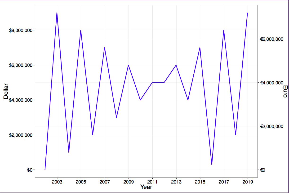
И ниже некоторые поддельные данные и два графика, которые должны быть в долларах и евро. Не было бы круто иметь пакет, который позволил бы вам сделать один график и обернуть его вызовом графика с двойной осью у, например, так ggplot_dual_axis_er(ggplot_object, currency = c("dollar", "euro")) и он автоматически получит обменные курсы для вас!:-)
# Set directory:
if(.Platform$OS.type == "windows"){
  setwd("c:/R/plots")
} else {
  setwd("~/R/plots")
}

# Load libraries
library("ggplot2")
library("scales")

# Create euro currency symbol in plot labels, simple version
# avoids loading multiple libraries
# avoids problems with rounding of small numbers, e.g. .0001
labels_euro <- function(x) {# no rounding
paste0("€", format(x, big.mark = ",", decimal.mark = ".", trim = TRUE,
    scientific = FALSE))
}

labels_dollar <- function(x) {# no rounding: overwrites dollar() of library scales
paste0("$", format(x, big.mark = ",", decimal.mark = ".", trim = TRUE,
    scientific = FALSE))
}

# Create data
df <- data.frame(
  Year = as.Date(c("2001", "2002", "2003", "2004", "2005", "2006", "2007", "2008", "2009", "2010", "2011", "2012", "2013", "2014", "2015", "2016", "2017", "2018"),
    "%Y"),
  Dollar = c(0, 9000000, 1000000, 8000000, 2000000, 7000000, 3000000, 6000000, 4000000, 5000000, 5000000, 6000000, 4000000, 7000000, 300000, 8000000, 2000000, 9000000))
# set Euro/Dollar exchange rate at 0.8 euros = 1 dollar
df <- cbind(df, Euro = 0.8 * df$Dollar)
# Left y-axis
p1 <- ggplot(data = df, aes(x = Year, y = Dollar)) +
    geom_line(linestyle = "blank") + # manually remove the line
    theme_bw(20) +                   # make sure font sizes match in both plots
    scale_x_date(labels = date_format("%Y"), breaks = date_breaks("2 years")) +
    scale_y_continuous(labels = labels_dollar,
        breaks = seq(from = 0, to = 8000000, by = 2000000))
# Right y-axis
p2 <- ggplot(data = df, aes(x = Year, y = Euro)) +
    geom_line(color = "blue", linestyle = "dotted", size = 1) +
    xlab(NULL) +                     # manually remove the label
    theme_bw(20) +                   # make sure font sizes match in both plots
    scale_x_date(labels = date_format("%Y"), breaks = date_breaks("2 years")) +
    scale_y_continuous(labels = labels_euro,
        breaks = seq(from = 0, to = 7000000, by = 2000000))

# Combine left y-axis with right y-axis
p <- ggplot_dual_axis(lhs = p1, rhs = p2)
p

# Save to PDF
pdf("ggplot-dual-axis-function-test.pdf",
  encoding = "ISOLatin9.enc", width = 12, height = 8)
p
dev.off()

embedFonts(file = "ggplot-dual-axis-function-test.pdf",
           outfile = "ggplot-dual-axis-function-test-embedded.pdf")
Частичный список литературы:
- Показать две параллельные оси на графике gg (R)
- Двойная ось Y в ggplot2 для фигуры с несколькими панелями
- Как я могу поместить преобразованную шкалу на правой стороне ggplot2?
- Сохранить пропорцию графиков с помощью grid.arrange
- Опасности выравнивания участков в ggplot
- https://github.com/kohske/ggplot2
Чтобы повернуть заголовок оси, добавьте следующее к графику p2:
p2 <- p2 + theme(axis.title.y=element_text(angle=270))