Добавить вертикальную линию в график ggplotly
Я пытаюсь построить сюжет, совмещающий ggplot2 а также plotly, Две вертикальные линии появляются на чистом ggplot2, но однажды я звоню plotly::ggplotly на этом они уходят. Как сделать так, чтобы данные также отображались на ggplotly версия? Если у вас есть решение, использующее только plot_ly, это было бы тоже хорошо.
Данные:
df <- structure(list(date = structure(c(17226, 17257, 17287, 17318,
17348, 17379, 17410, 17440, 17471, 17501, 17226, 17257, 17287,
17318, 17348, 17379, 17410, 17440, 17471, 17501, 17226, 17257,
17287, 17318, 17348, 17379, 17410, 17440, 17471, 17501), class = "Date"),
    n = c(253L, 217L, 257L, 166L, 121L, 56L, 68L, 62L, 142L,
    20L, 174L, 228L, 180L, 158L, 80L, 39L, 47L, 54L, 107L, 12L,
    93L, 74L, 47L, 49L, 55L, 16L, 52L, 53L, 32L, 3L), act = c("a",
    "a", "a", "a", "a", "a", "a", "a", "a", "a", "b", "b", "b",
    "b", "b", "b", "b", "b", "b", "b", "c", "c", "c", "c", "c",
    "c", "c", "c", "c", "c")), class = "data.frame", row.names = c(NA,
-30L), .Names = c("date", "n", "act"))

facts_timeline <- structure(list(Date = structure(c(17507, 17293), class = "Date"),
    ShortDescription = c("Marketing Campaign", "Relevant Fact 1"
    )), row.names = c(NA, -2L), class = c("tbl_df", "tbl", "data.frame"
), spec = structure(list(cols = structure(list(Date = structure(list(
    format = ""), .Names = "format", class = c("collector_date",
"collector")), Tenant = structure(list(), class = c("collector_character",
"collector")), ShortDescription = structure(list(), class = c("collector_character",
"collector")), LongDescription = structure(list(), class = c("collector_character",
"collector"))), .Names = c("Date", "Tenant", "ShortDescription",
"LongDescription")), default = structure(list(), class = c("collector_guess",
"collector"))), .Names = c("cols", "default"), class = "col_spec"), .Names = c("Date",
"ShortDescription"))
Код для составления сюжета:
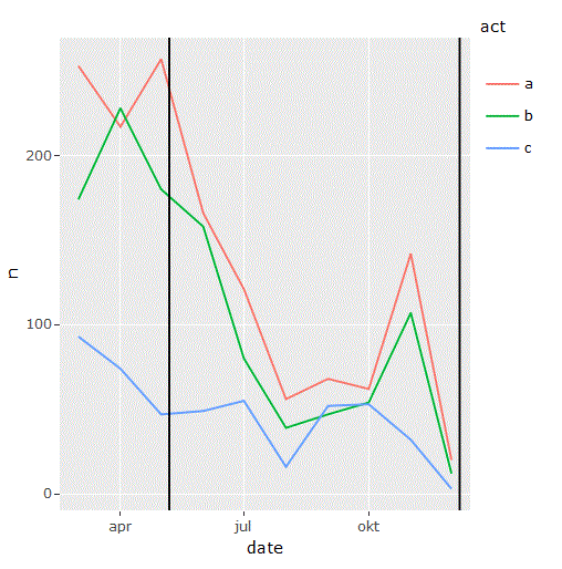
p <- df %>%
  ggplot(aes(date, n, group = act, color = act)) +
  geom_line() +
  geom_vline(data = facts_timeline, aes(xintercept = Date))
Здесь вы можете увидеть две вертикальные линии:
p
Но не здесь:
ggplotly(p)
3 ответа
Прямое построение вертикальных линий на графике невозможно, но вот мой обходной путь:
vline_list <- list()
for(i in 1:nrow(facts_timeline)){
  vline_list[[i]] <-
    list(type      = "line",
         fillcolor = line_color,
         line      = list("black"),
         opacity   = 0.3,
         x0        = facts_timeline$Date[i],
         x1        = facts_timeline$Date[i],
         xref      = "x",
         y0        = 0,
         y1        = max(df$n),
         yref      = "y")
}

plot_ly(x = ~df$date, y = ~df$n,color = df$act, mode = 'lines') %>%
  layout(shapes  = vline_list)
С помощью цикла for мы перебираем все строки в facts_timeline и создать новую линию. Эта линия не имеет длины бесконечности, как в `ggplot. В моем примере линия - это максимум оси Y. Вы можете изменить это для собственных нужд.
Просто установите xintercept to numeric, and everything will work.
p <- df %>%
  ggplot(aes(date, n, group = act, color = act)) +
  geom_line() +
  geom_vline(data = facts_timeline, aes(xintercept = as.numeric(Date)))

p

ggplotly(p)
plot_ly(df,
        x = ~ date,
        y = ~ n,
        color = ~act,
        text = ~act,
        mode = "lines",
        type = "scatter",
        hoverinfo = "x+y+text") %>%
    layout(hovermode = "closest",
        xaxis=list(range=c("2017-03-01", "2018-01-01"))) %>%
    add_lines(x=rep(facts_timeline[["Date"]][[1]], 2),
        y=c(0, 300),
        name=facts_timeline[["ShortDescription"]][[1]],
        inherit=FALSE,
        hoverinfo = "name",
        line = list(color="#000000")) %>%
    add_lines(x=rep(facts_timeline[["Date"]][[2]], 2),
        y=c(0, 300),
        name=facts_timeline[["ShortDescription"]][[1]],
        inherit=FALSE,
        hoverinfo = "name",
        line = list(color="#000000"))