Текст не переносится в CSS Grid
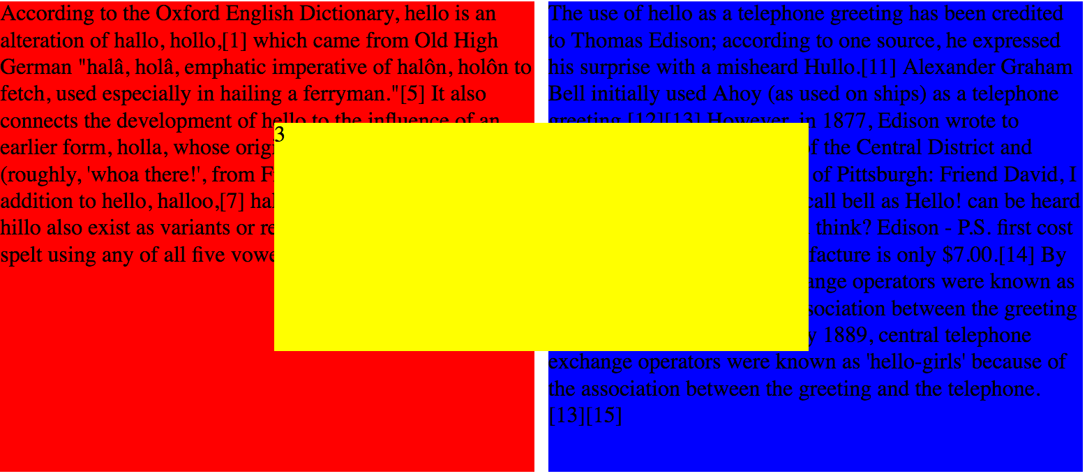
Я экспериментировал с CSS Grid и застрял в поиске наиболее эффективных способов обтекания текстом элемента div, который расположен частично поверх двух других элементов div. По сути, на изображении ниже я хочу, чтобы текст в красных и синих div-элементах обернулся вокруг желтого div-элемента, который был частично расположен в столбцах и строках двух других элементов. Очевидно, что это макет на основе Grid, поэтому я не заинтересован в том, чтобы делать это с типичными числами. Как я могу использовать CSS Grid для достижения этого эффекта?
HTML-код, который я настроил для этого:
<body>

    <div class="grid">
        <div class="red">According to the Oxford English Dictionary, hello is an alteration of hallo, hollo,[1] which came from Old High German "halâ, holâ, emphatic imperative of halôn, holôn to fetch, used especially in hailing a ferryman."[5] It also connects the development of hello to the influence of an earlier form, holla, whose origin is in the French holà (roughly, 'whoa there!', from French là 'there').[6] As in addition to hello, halloo,[7] hallo, hollo, hullo and (rarely) hillo also exist as variants or related words, the word can be spelt using any of all five vowels.[8][9][10]</div>
        <div class="blue">The use of hello as a telephone greeting has been credited to Thomas Edison; according to one source, he expressed his surprise with a misheard Hullo.[11] Alexander Graham Bell initially used Ahoy (as used on ships) as a telephone greeting.[12][13] However, in 1877, Edison wrote to T.B.A. David, the president of the Central District and Printing Telegraph Company of Pittsburgh:
                Friend David, I do not think we shall need a call bell as Hello! can be heard 10 to 20 feet away.
                What you think? Edison - P.S. first cost of sender & receiver to manufacture is only $7.00.[14]
                By 1889, central telephone exchange operators were known as 'hello-girls' because of the association between the greeting and the telephone.[13][15]
                By 1889, central telephone exchange operators were known as 'hello-girls' because of the association between the greeting and the telephone.[13][15]                </div>
        <div class="yellow">3</div>
    </div>

</body>
</html>
И CSS это:
.grid {
    display: grid;
    grid-template-columns: 1fr 1fr 1fr 1fr;
    grid-template-rows: 1fr 1fr 1fr 1fr;
    grid-gap: 10px;
}

.red {
    background-color: red;
    grid-column: 1 / span 2;
    grid-row: 1 / span 4;
}

.blue {
    background-color: blue;
    grid-column: 3 / span 2;
    grid-row: 1 / span 4;
}

.yellow {
    background-color: yellow;
    grid-column: 2 / span 2;
    grid-row: 2 / 4;
}
0 ответов
Вы можете использовать исключения, но они поддерживаются только в Internet Explorer и Edge от Microsoft и должны использоваться с осторожностью (на данный момент мы должны ставить свойства с префиксом -ms- для исключения на работу, но это не всегда заканчивается успехом). В двух словах, исключение - это область вокруг элемента, который окружает содержимое встроенного потока.
Элемент становится исключением, когда его свойство wrap-flow имеет вычисленное значение, отличное от auto, поэтому примером может быть .p { wrap-flow: maximum }, wrap-margin свойство устанавливает поле или смещение, окружающее область исключения. В вашем случае вы можете поместить .yellow { wrap-flow: both } в вашем CSS, чтобы текст в других элементах div обернулся вокруг желтого элемента div.
Пример wrap-flow: both
Ссылки: Учебник, поддержка браузера, спецификации, учебник