График плотности населения в г
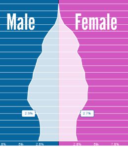
Я хотел бы создать график плотности пирамиды, как показано ниже:
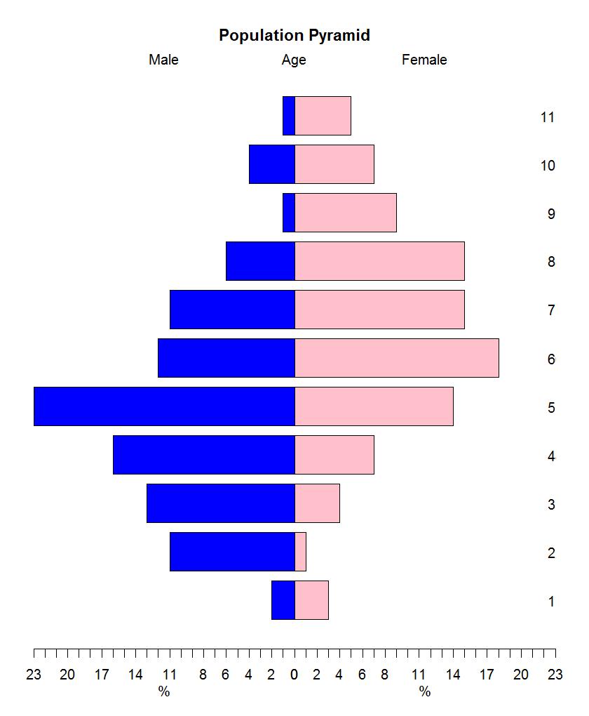
Точка, которую я могу достичь, это просто пример пирамиды, основанный на следующем примере:
set.seed (123)
xvar <- round (rnorm (100, 54, 10), 0)
xyvar <- round (rnorm (100, 54, 10), 0)
myd <- data.frame (xvar, xyvar)
valut <- as.numeric (cut(c(myd$xvar,myd$xyvar), 12))
myd$xwt <- valut[1:100]
myd$xywt <- valut[101:200]
xy.pop <- data.frame (table (myd$xywt))
xx.pop <- data.frame (table (myd$xwt))


 library(plotrix)
 par(mar=pyramid.plot(xy.pop$Freq,xx.pop$Freq,
    main="Population Pyramid",lxcol="blue",rxcol= "pink",
  gap=0,show.values=F))
Как мне этого добиться?
5 ответов
повеселиться с пакетом сетки
Работа с пакетом grid очень проста, если мы понимаем концепцию области просмотра. Как только мы получим это, мы можем сделать много забавных вещей. Например, сложность заключалась в том, чтобы построить полигон возраста. StickBoy и StickGirl - это просто смешно, вы можете пропустить это.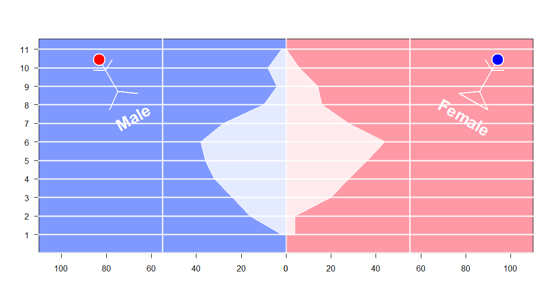
set.seed (123)
xvar <- round (rnorm (100, 54, 10), 0)
xyvar <- round (rnorm (100, 54, 10), 0)
myd <- data.frame (xvar, xyvar)
valut <- as.numeric (cut(c(myd$xvar,myd$xyvar), 12))
myd$xwt <- valut[1:100]
myd$xywt <- valut[101:200]
xy.pop <- data.frame (table (myd$xywt))
xx.pop <- data.frame (table (myd$xwt))


stickBoy <- function() {
  grid.circle(x=.5, y=.8, r=.1, gp=gpar(fill="red"))
  grid.lines(c(.5,.5), c(.7,.2)) # vertical line for body
  grid.lines(c(.5,.6), c(.6,.7)) # right arm
  grid.lines(c(.5,.4), c(.6,.7)) # left arm
  grid.lines(c(.5,.65), c(.2,0)) # right leg
  grid.lines(c(.5,.35), c(.2,0)) # left leg
  grid.lines(c(.5,.5), c(.7,.2)) # vertical line for body
  grid.text(x=.5,y=-0.3,label ='Male',
            gp =gpar(col='white',fontface=2,fontsize=32)) # vertical line for body
}

stickGirl <- function() {
  grid.circle(x=.5, y=.8, r=.1, gp=gpar(fill="blue"))
  grid.lines(c(.5,.5), c(.7,.2)) # vertical line for body
  grid.lines(c(.5,.6), c(.6,.7)) # right arm
  grid.lines(c(.5,.4), c(.6,.7)) # left arm
  grid.lines(c(.5,.65), c(.2,0)) # right leg
  grid.lines(c(.5,.35), c(.2,0)) # left leg
  grid.lines(c(.35,.65), c(0,0)) # horizontal  line for body
  grid.text(x=.5,y=-0.3,label ='Female',
            gp =gpar(col='white',fontface=2,fontsize=32)) # vertical line for body
}

xscale <- c(0, max(c(xx.pop$Freq,xy.pop$Freq)))* 5
levels <- nlevels(xy.pop$Var1)
barYscale<- xy.pop$Var1
vp <- plotViewport(c(5, 4, 4, 1),
                   yscale = range(0:levels)*1.05,
                   xscale =xscale)


pushViewport(vp)

grid.yaxis(at=c(1:levels))
pushViewport(viewport(width = unit(0.5, "npc"),just='right',
                      xscale =rev(xscale)))
grid.xaxis()
popViewport()

pushViewport(viewport(width = unit(0.5, "npc"),just='left',
                      xscale = xscale))
grid.xaxis()
popViewport()

grid.grill(gp=gpar(fill=NA,col='white',lwd=3),
           h = unit(seq(0,levels), "native"))
grid.rect(gp=gpar(fill=rgb(0,0.2,1,0.5)),
          width = unit(0.5, "npc"),just='right')

grid.rect(gp=gpar(fill=rgb(1,0.2,0.3,0.5)),
          width = unit(0.5, "npc"),just=c('left'))

vv.xy <- xy.pop$Freq
vv.xx <- c(xx.pop$Freq,0)

grid.polygon(x  = unit.c(unit(0.5,'npc')-unit(vv.xy,'native'),
                         unit(0.5,'npc')+unit(rev(vv.xx),'native')),
             y  = unit.c(unit(1:levels,'native'),
                         unit(rev(1:levels),'native')),
             gp=gpar(fill=rgb(1,1,1,0.8),col='white'))

grid.grill(gp=gpar(fill=NA,col='white',lwd=3,alpha=0.8),
           h = unit(seq(0,levels), "native"))
popViewport()

## some fun here
vp1 <- viewport(x=0.2, y=0.75, width=0.2, height=0.2,gp=gpar(lwd=2,col='white'),angle=30)
pushViewport(vp1)
stickBoy()
popViewport()
vp1 <- viewport(x=0.9, y=0.75, width=0.2, height=0.2,,gp=gpar(lwd=2,col='white'),angle=330)
pushViewport(vp1)
stickGirl()
popViewport()
Еще одно относительно простое решение с использованием base графика (и пакет scales играть с альфой):
library(scales)
xy.poly <- data.frame(Freq=c(xy.pop$Freq, rep(0,nrow(xy.pop))),
                      Var1=c(xy.pop$Var1, rev(xy.pop$Var1)))
xx.poly <- data.frame(Freq=c(xx.pop$Freq, rep(0,nrow(xx.pop))),
                      Var1=c(xx.pop$Var1, rev(xx.pop$Var1)))
xrange <- range(c(xy.poly$Freq, xx.poly$Freq))
yrange <- range(c(xy.poly$Var1, xx.poly$Var1))

par(mfcol=c(1,2))
par(mar=c(5,4,4,0))
plot(xy.poly,type="n", main="Men", xlab="", ylab="", xaxs="i",
     xlim=rev(xrange), ylim=yrange, axes=FALSE)
rect(-1,0,100,100, col="blue")
abline(h=0:15, col="white", lty=3)
polygon(xy.poly, col=alpha("grey",0.6))
axis(1, at=seq(0,20,by=5))
axis(2, las=2)
box()

par(mar=c(5,0,4,4))
plot(xx.poly,type="n", main="Women", xaxs="i", xlab="", ylab="",
     xlim=xrange, ylim=yrange, axes=FALSE)
rect(-1,0,100,100, col="red")
abline(h=0:15, col="white", lty=3)
axis(1, at=seq(5,20,by=5))
axis(4, las=2)
polygon(xx.poly, col=alpha("grey",0.6))
box()
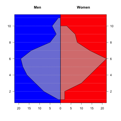
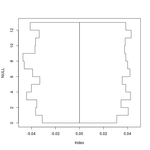
Вот удар с использованием базы R, оставляя вам большую часть работы, чтобы он выглядел хорошо. Вы можете сделать пирамиду со строкой, позвонив lines(), но если вы хотите полупрозрачную заливку, было бы лучше с polygon(), Обратите внимание, что ваш пример делает вид, что численность населения оценивалась в непрерывных возрастных группах, тогда как на самом деле данные относятся к пятилетним возрастным группам - мой пример здесь будет соответствующим образом перекрывать концы бункеров.
# sorry for my lame fake data
TotalPop <- 2000
m <- table(sample(0:12, TotalPop*.52, replace = TRUE))
f <- table(sample(0:12, TotalPop*.48, replace = TRUE))

# scale to make it density
m <- m / TotalPop
f <- f / TotalPop
# find appropriate x limits
xlim <- max(abs(pretty(c(m,f), n = 20))) * c(-1,1)
# open empty plot
plot(NULL, type = "n", xlim = xlim, ylim = c(0,13))

# females
polygon(c(0,rep(f, each = 2), 0), c(rep(0:13, each = 2)))
# males (negative to be on left)
polygon(c(0,rep(-m, each = 2), 0), c(rep(0:13, each = 2)))
поэтому, чтобы закончить работу, дайте полигонам некоторую полупрозрачную заливку поверх фона и сделайте ручные оси.
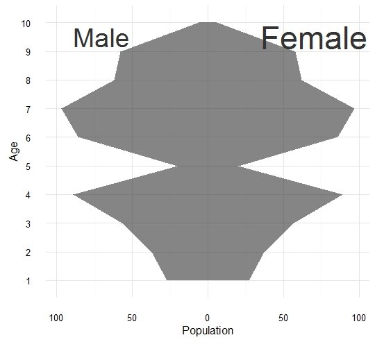
Вот близкое решение с использованием ggplot2
# load libraries
  library(ggplot2)
  library(ggthemes)


# load dataset
  set.seed(1)
  df0 <- data.frame(Age = factor(rep(x = 1:10, times = 2)),
                    Gender = rep(x = c("Female", "Male"), each = 10),
                    Population = sample(x = 1:100, size = 10))


# Plot !
  ggplot(data = df0, aes(x = Age, y = Population, group=Gender)) +
    geom_area(data = subset(df0, Gender=="Male"), mapping = aes(y = -Population), alpha=0.6) +
    geom_area(data = subset(df0, Gender=="Female"), alpha=0.6) +
    scale_y_continuous(labels = abs) +
    theme_minimal() +
    coord_flip() +
    annotate("text", x = 9.5, y = -70, size=10, color="gray20", label = "Male") +
    annotate("text", x = 9.5, y =  70, size=12, color="gray20", label = "Female")
Посмотрите мою пирамиду населения:
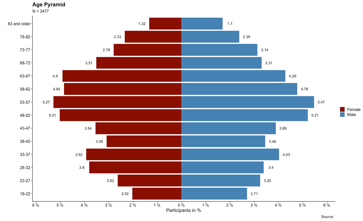
# import the packages in an elegant way ####

packages <- c("tidyverse")

installed_packages <- packages %in% rownames(installed.packages())

if (any(installed_packages == FALSE)) {
  install.packages(packages[!installed_packages])
}

invisible(lapply(packages, library, character.only = TRUE))

# _________________________________________________________

# let's quick generate some data ####

sex_age <- data.frame(age=rnorm(n = 10000, mean = 50, sd = 9), sex=c(1, 2)))


# _________________________________________________________

# prepare data + build the plot ####

sex_age %>%
  mutate(sex = ifelse(sex == 1, "Male",
                      ifelse(sex == 2, "Female", NA))) %>% # construct from the sex variable: "Male","Female"
  select(age, sex) %>% # pick just the two variables
  table() %>% # table it
  as.data.frame.matrix() %>% # create data frame matrix
  rownames_to_column("age") %>% # rownames are now the age variable
  mutate(across(everything(), as.numeric),
         # mutate everything as.numeric()
         age = ifelse(
           # create age groups 5 year steps
           age >= 18 & age <= 22 ,
           "18-22",
           ifelse(
             age >= 23 & age <= 27,
             "23-27",
             ifelse(
               age >= 28 & age <= 32,
               "28-32",
               ifelse(
                 age >= 33 & age <= 37,
                 "33-37",
                 ifelse(
                   age >= 38 & age <= 42,
                   "38-42",
                   ifelse(
                     age >= 43 & age <= 47,
                     "43-47",
                     ifelse(
                       age >= 48 & age <= 52,
                       "48-52",
                       ifelse(
                         age >= 53 & age <= 57,
                         "53-57",
                         ifelse(
                           age >= 58 & age <= 62,
                           "58-62",
                           ifelse(
                             age >= 63 & age <= 67,
                             "63-67",
                             ifelse(
                               age >= 68 & age <= 72,
                               "68-72",
                               ifelse(
                                 age >= 73 & age <= 77,
                                 "73-77",
                                 ifelse(age >= 78 &
                                          age <= 82, "78-82", "83 and older")
                               )
                             )
                           )
                         )
                       )
                     )
                   )
                 )
               )
             )
           )
         )) %>%
  group_by(age) %>% # group by the age
  summarize(Female = sum(Female), # summarize the sum of each sex
            Male = sum(Male)) %>%
  pivot_longer(names_to = 'sex',
               # pivot longer
               values_to = 'Population',
               cols = 2:3) %>%
  mutate(
    # create a pop perc and a signal 1 / -1
    PopPerc = case_when(
      sex == 'Male' ~ round(Population / sum(Population) * 100, 2),
      TRUE ~ -round(Population / sum(Population) *
                      100, 2)
    ),
    signal = case_when(sex == 'Male' ~ 1,
                       TRUE ~ -1)
  ) %>%
  ggplot() + # build the plot with ggplot2
  geom_bar(aes(x = age, y = PopPerc, fill = sex), stat = 'identity') + # define aesthetics
  geom_text(aes(
    # create the text
    x = age,
    y = PopPerc + signal * .3,
    label = abs(PopPerc)
  )) +
  coord_flip() + # flip the plot
  scale_fill_manual(name = '', values = c('darkred', 'steelblue')) + # define the colors (darkred = female, steelblue = male)
  scale_y_continuous(
    # scale the y-lab
    breaks = seq(-10, 10, 1),
    labels = function(x) {
      paste(abs(x), '%')
    }
  ) +
  labs(
    # name the labs
    x = '',
    y = 'Participants in %',
    title = 'Population Pyramid',
    subtitle = paste0('N = ', nrow(sex_age)),
    caption = 'Source: '
  ) +
  theme(
    # costume the theme
    axis.text.x = element_text(vjust = .5),
    panel.grid.major.y = element_line(color = 'lightgray', linetype =
                                        'dashed'),
    legend.position = 'top',
    legend.justification = 'center'
  ) +
  theme_classic() # choose theme
Чтобы получить пример фрейма данных с картинки, зайдите на мой GitHub .