Диаграммы JS в Google DataStudio
Для визуализации ваших данных в Data Studio вы можете использовать Java Script (бета): https://codelabs.developers.google.com/codelabs/community-visualization/
Существует способ, как работает, вам нужны следующие файлы для создания диаграмм: 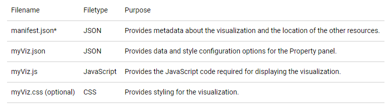
myViz создается командой, которая соединяет myVizSource.js и вспомогательную библиотеку визуализации (dscc.min.js)
Для создания простой гистограммы вы помещаете в myVizSource.js следующий код:
// create and add the canvas
var canvasElement = document.createElement('canvas');
var ctx = canvasElement.getContext('2d');
canvasElement.id = 'myViz';
document.body.appendChild(canvasElement);

function transformStyleById(vizData){
  // parse the style object
  var styleById = {};

  for (let styleSection of vizData.config.style) {
    for (let styleElement of styleSection.elements) {
      styleById[styleElement.id] = {
        value: styleElement.value,
        defaultValue: styleElement.defaultValue
      };
    }
  }
  return styleById;
}

function drawViz(vizData) {
  // parse the data into a row of rows format
  var data = dscc.rowsByConfigId(vizData).DEFAULT;
  var ctx = canvasElement.getContext('2d');

  // clear the canvas.
  ctx.clearRect(0, 0, canvasElement.width, canvasElement.height);

  // set the canvas width and height
  ctx.canvas.width = dscc.getWidth() - 20;
  ctx.canvas.height = dscc.getHeight() - 100;

  var styleById = transformStyleById(vizData);

  // scale the bar width and max bar height to the canvas
  var barWidth = ctx.canvas.width / (data.length * 2);
  var maxBarHeight = ctx.canvas.height - 20;

  // vertical offset for bar text
  var textYOffset = 20;

  // fill the bars using the user-selected bar color or the default
  ctx.fillStyle = styleById.barColor.value.color || styleById.barColor.defaultValue;

  // obtain the maximum bar metric value for scaling purposes
  var metricMax = 0;
  data.forEach(function(row){
    metricMax = Math.max(metricMax, row['barMetric'][0]);
  })

  // draw bars
  // add dimension labels below bars
  // 'barDimension' and 'barMetric' come from the id defined in myViz.json
  data.forEach(function(row, i) {

    // calculates the height of the bar using the row value, maximum bar
    // height, and the maximum metric value calculated earlier
    var barHeight = Math.round(
      -1 * ((row['barMetric'][0] * maxBarHeight) / metricMax)
    );

    // calculates the x coordinate of the bar based on the width of the convas
    // and the width of the bar
    var barX = (ctx.canvas.width / data.length) * i + barWidth / 2;

    ctx.fillRect(barX, maxBarHeight, barWidth, barHeight);

    var barText = row['barDimension'][0];
    var textX = barX + barWidth / 4;
    var textY = maxBarHeight + textYOffset;

    ctx.fillText(barText, textX, textY);
  });
}

// subscribe to data and style changes.
dscc.subscribeToData(drawViz);
То, что я хотел бы сделать, это использовать примеры диаграмм Java Script, диаграммы солнечных лучей, например, к сожалению, у меня нет опыта работы с Java Script. Возможно ли реализовать код, подобный этому: https://github.com/vasturiano/sunburst-chart/blob/master/src/sunburst.js в мой myVizSource.js простым способом?
1 ответ
Можно реализовать широкий спектр диаграмм, в том числе диаграммы солнечных лучей, используя визуализацию сообщества. Однако эта функция в ее нынешнем виде предназначена для того, чтобы помочь тем, кто знаком с JavaScript и кодом визуализации, интегрировать этот код в информационную панель Data Studio. Простота реализации визуализации будет во многом зависеть от библиотеки визуализации, которую вы решите использовать.