Отзывчивая сетка из шестиугольников
Я загрузил несколько изображений на моем сайте из Интернета. Можно ли придать всем этим изображениям форму шестиугольника в адаптивной сетке?
<div>
    <img src="link" class="Image">
</div>

<div>
    <img src="link" class="Image">
</div>
...
Я нашел несколько способов сделать это, но вам нужно было заполнить изображение src в коде CSS. Это невозможно для меня, потому что сайт загружает случайные изображения из Интернета с помощью jQuery, поэтому я не могу использовать фоновые изображения.
Я попробовал это: http://jsfiddle.net/8f5m5wv0/
10 ответов
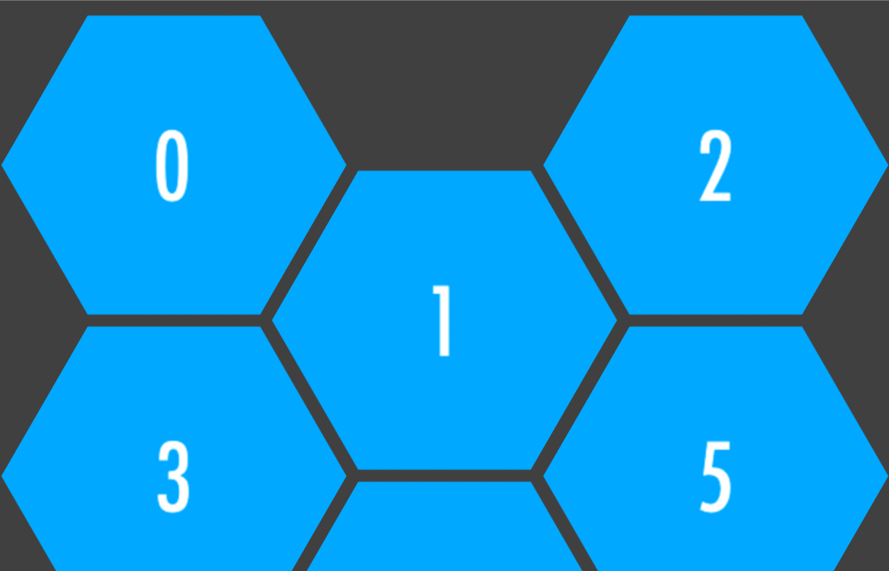
Вот демо и репозиторий для адаптивной сетки шестиугольников. Код здесь не поддерживается. Он был перенесен в github и улучшен, поэтому там должны быть комментарии, сообщения о проблемах и комментарии.

Эта техника использует:
-
<img>тег - неупорядоченный список: каждый шестиугольник содержится в
<li>тег и<a>тег - преобразовать вращение и наклон, чтобы сделать шестиугольник
overflow:hidden;nth-child()расставить шестиугольники в правильном порядке
И еще, чтобы создать шестиугольную сетку с <img> тег.
Особенности сетки шестиугольника:
- Сетка отзывчива, так как зависит от ширины в процентах. Шестиугольники сохраняют свои пропорции с помощью метода отступа, а размеры изображений изменяются в соответствии с формой шестиугольника.
- Эффект наведения на шестиугольники: текст скользит с прозрачным наложением на изображение.
- Каждый шестиугольник поддерживает свои границы: эффект наведения (или событие щелчка) для каждого шестиугольника срабатывает только внутри фактической формы.
Полный код
Следующий фрагмент не является последней версией сетки. Репозиторий GitHub поддерживается и обновляется. Вопросы и вклады могут быть сделаны там.
* {
    margin: 0;
    padding: 0;
}

body {
    font-family: 'Open Sans', arial, sans-serif;
    background: rgb(123, 158, 158);
}

#hexGrid {
    overflow: hidden;
    width: 90%;
    margin: 0 auto;
    padding:0.707% 0;
}

#hexGrid:after {
    content: "";
    display: block;
    clear: both;
}

.hex {
    position: relative;
    list-style-type: none;
    float: left;
    overflow: hidden;
    visibility: hidden;
    -webkit-transform: rotate(-60deg) skewY(30deg);
        -ms-transform: rotate(-60deg) skewY(30deg);
            transform: rotate(-60deg) skewY(30deg);
}

.hex * {
    position: absolute;
    visibility: visible;
}

.hexIn {
    display:block;
    width: 100%;
    height: 100%;
    text-align: center;
    color: #fff;
    overflow: hidden;
    -webkit-transform: skewY(-30deg) rotate(60deg);
        -ms-transform: skewY(-30deg) rotate(60deg);
            transform: skewY(-30deg) rotate(60deg);
    -webkit-backface-visibility: hidden;
            backface-visibility: hidden;
}


/* HEX CONTENT */

.hex img {
    left: -100%;
    right: -100%;
    width: auto;
    height: 100%;
    margin: 0 auto;
}

.hex h1, .hex p {
    width: 90%;
    padding: 0 5%;
    background-color: #008080;
    background-color: rgba(0, 128, 128, 0.8);
    font-family: 'Raleway', sans-serif;
    -webkit-transition: top .2s ease-out, bottom .2s ease-out, .2s padding .2s ease-out;
            transition: top .2s ease-out, bottom .2s ease-out, .2s padding .2s ease-out;
}

.hex h1 {
    bottom: 110%;
    font-style: italic;
    font-weight: normal;
    font-size: 1.5em;
    padding-top: 100%;
    padding-bottom: 100%;
}

.hex h1:after {
    content: '';
    display: block;
    position: absolute;
    bottom: -1px;
    left: 45%;
    width: 10%;
    text-align: center;
    z-index: 1;
    border-bottom: 2px solid #fff;
}

.hex p {
    padding-top: 50%;
    top: 110%;
    padding-bottom: 50%;
}


/* HOVER EFFECT  */

.hexIn:hover h1 {
    bottom: 50%;
    padding-bottom: 10%;
}

.hexIn:hover p {
    top: 50%;
    padding-top: 10%;
}

/* SPACING AND SIZING */

@media (min-width:1201px) {
    .hex {
        width: 19.2%; /* = (100-4) / 5 */
        padding-bottom: 22.170%; /* =  width / sin(60deg) */
    }
    .hex:nth-child(9n+6),
    .hex:nth-child(9n+7),
    .hex:nth-child(9n+8),
    .hex:nth-child(9n+9) {
        margin-top: -4.676%;
        margin-bottom: -4.676%;
        -webkit-transform: translateX(50%) rotate(-60deg) skewY(30deg);
            -ms-transform: translateX(50%) rotate(-60deg) skewY(30deg);
                transform: translateX(50%) rotate(-60deg) skewY(30deg);
    }
    .hex:nth-child(9n+6):last-child,
    .hex:nth-child(9n+7):last-child,
    .hex:nth-child(9n+8):last-child,
    .hex:nth-child(9n+9):last-child {
        margin-bottom: 0;
    }
    .hex:nth-child(9n+6) {
        margin-left: 0.5%;
        clear: left;
    }
    .hex:nth-child(9n+10) {
        clear: left;
    }
    .hex:nth-child(9n+2),
    .hex:nth-child(9n+ 7) {
        margin-left: 1%;
        margin-right: 1%;
    }
    .hex:nth-child(9n+3),
    .hex:nth-child(9n+4),
    .hex:nth-child(9n+8) {
        margin-right: 1%;
    }
}

@media (max-width: 1200px) and (min-width:901px) {
    .hex {
        width: 24.25%; /* = (100-3) / 4 */
        padding-bottom: 28.001%; /* =  width / sin(60deg) */
    }
    .hex:nth-child(7n+5),
    .hex:nth-child(7n+6),
    .hex:nth-child(7n+7) {
        margin-top: -6.134%;
        margin-bottom: -6.134%;
        -webkit-transform: translateX(50%) rotate(-60deg) skewY(30deg);
            -ms-transform: translateX(50%) rotate(-60deg) skewY(30deg);
                transform: translateX(50%) rotate(-60deg) skewY(30deg);
    }
    .hex:nth-child(7n+5):last-child,
    .hex:nth-child(7n+6):last-child,
    .hex:nth-child(7n+7):last-child {
        margin-bottom: 0;
    }
    .hex:nth-child(7n+2),
    .hex:nth-child(7n+6) {
        margin-left: 1%;
        margin-right: 1%;
    }
    .hex:nth-child(7n+3) {
        margin-right: 1%;
    }
    .hex:nth-child(7n+8) {
        clear: left;
    }
    .hex:nth-child(7n+5) {
        clear: left;
        margin-left: 0.5%;
    }
}

@media (max-width: 900px) and (min-width:601px) {
    .hex {
        width: 32.666%; /* = (100-2) / 3 */
        padding-bottom: 37.720%; /* =  width / sin(60) */
    }
    .hex:nth-child(5n+4),
    .hex:nth-child(5n+5) {
        margin-top: -8.564%;
        margin-bottom: -8.564%;
        -webkit-transform: translateX(50%) rotate(-60deg) skewY(30deg);
            -ms-transform: translateX(50%) rotate(-60deg) skewY(30deg);
                transform: translateX(50%) rotate(-60deg) skewY(30deg);
    }
    .hex:nth-child(5n+4):last-child,
    .hex:nth-child(5n+5):last-child {
        margin-bottom: 0;
    }
    .hex:nth-child(5n+4) {
        margin-right: 1%;
        margin-left: 0.5%;
    }
    .hex:nth-child(5n+2) {
        margin-left: 1%;
        margin-right: 1%;
    }
    .hex:nth-child(5n+6) {
        clear: left;
    }
}

@media (max-width: 600px) {
    .hex {
        width: 49.5%; /* = (100-1) / 2 */
        padding-bottom: 57.158%; /* =  width / sin(60) */
    }
    .hex:nth-child(3n+3) {
        margin-top: -13.423%;
        margin-bottom: -13.423%;
        -webkit-transform: translateX(50%) rotate(-60deg) skewY(30deg);
            -ms-transform: translateX(50%) rotate(-60deg) skewY(30deg);
                transform: translateX(50%) rotate(-60deg) skewY(30deg);
    }
    .hex:nth-child(3n+3):last-child {
        margin-bottom: 0;
    }
    .hex:nth-child(3n+3) {
        margin-left: 0.5%;
    }
    .hex:nth-child(3n+2) {
        margin-left: 1%;
    }
    .hex:nth-child(3n+4) {
        clear: left;
    }
}
<link href='http://fonts.googleapis.com/css?family=Open+Sans:400italic,700italic,800italic,400,700,800' rel='stylesheet' type='text/css'>
<link href='http://fonts.googleapis.com/css?family=Raleway:400,700,300,200,100,900' rel='stylesheet' type='text/css'>
<ul id="hexGrid">
<li class="hex">
<a class="hexIn" href="#">
<img src="https://farm9.staticflickr.com/8461/8048823381_0fbc2d8efb.jpg" alt="" />
<h1>This is a title</h1>
<p>Some sample text about the article this hexagon leads to</p>
</a>
</li>
<li class="hex">
<a class="hexIn" href="#">
<img src="https://farm5.staticflickr.com/4144/5053682635_b348b24698.jpg" alt="" />
<h1>This is a title</h1>
<p>Some sample text about the article this hexagon leads to</p>
</a>
</li>
<li class="hex">
<a class="hexIn" href="#">
<img src="https://farm3.staticflickr.com/2827/10384422264_d9c7299146.jpg" alt="" />
<h1>This is a title</h1>
<p>Some sample text about the article this hexagon leads to</p>
</a>
</li>
<li class="hex">
<a class="hexIn" href="#">
<img src="https://farm7.staticflickr.com/6217/6216951796_e50778255c.jpg" alt="" />
<h1>This is a title</h1>
<p>Some sample text about the article this hexagon leads to</p>
</a>
</li>
<li class="hex">
<a class="hexIn" href="#">
<img src="https://farm7.staticflickr.com/6083/6055581292_d94c2d90e3.jpg" alt="" />
<h1>This is a title</h1>
<p>Some sample text about the article this hexagon leads to</p>
</a>
</li>
<li class="hex">
<a class="hexIn" href="#">
<img src="https://farm3.staticflickr.com/2827/10384422264_d9c7299146.jpg" alt="" />
<h1>This is a title</h1>
<p>Some sample text about the article this hexagon leads to</p>
</a>
</li>
<li class="hex">
<a class="hexIn" href="#">
<img src="https://farm8.staticflickr.com/7187/6895047173_d4b1a0d798.jpg" alt="" />
<h1>This is a title</h1>
<p>Some sample text about the article this hexagon leads to</p>
</a>
</li>
<li class="hex">
<a class="hexIn" href="#">
<img src="https://farm4.staticflickr.com/3766/12953056854_b8cdf14f21.jpg" alt="" />
<h1>This is a title</h1>
<p>Some sample text about the article this hexagon leads to</p>
</a>
</li>
<li class="hex">
<a class="hexIn" href="#">
<img src="https://farm7.staticflickr.com/6139/5986939269_10721b8017.jpg" alt="" />
<h1>This is a title</h1>
<p>Some sample text about the article this hexagon leads to</p>
</a>
</li>
<li class="hex">
<a class="hexIn" href="#">
<img src="https://farm4.staticflickr.com/3165/5733278274_2626612c70.jpg" alt="" />
<h1>This is a title</h1>
<p>Some sample text about the article this hexagon leads to</p>
</a>
</li>
<li class="hex">
<a class="hexIn" href="#">
<img src="https://farm8.staticflickr.com/7163/6822904141_50277565c3.jpg" alt="" />
<h1>This is a title</h1>
<p>Some sample text about the article this hexagon leads to</p>
</a>
</li>
<li class="hex">
<a class="hexIn" href="#">
<img src="https://farm4.staticflickr.com/3771/13199704015_72aa535bd7.jpg" alt="" />
<h1>This is a title</h1>
<p>Some sample text about the article this hexagon leads to</p>
</a>
</li>
<li class="hex">
<a class="hexIn" href="#">
<img src="https://farm7.staticflickr.com/6083/6055581292_d94c2d90e3.jpg" alt="" />
<h1>This is a title</h1>
<p>Some sample text about the article this hexagon leads to</p>
</a>
</li>
<li class="hex">
<a class="hexIn" href="#">
<img src="https://farm8.staticflickr.com/7187/6895047173_d4b1a0d798.jpg" alt="" />
<h1>This is a title</h1>
<p>Some sample text about the article this hexagon leads to</p>
</a>
</li>
<li class="hex">
<a class="hexIn" href="#">
<img src="https://farm3.staticflickr.com/2878/10944255073_973d2cd25c.jpg" alt="" />
<h1>This is a title</h1>
<p>Some sample text about the article this hexagon leads to</p>
</a>
</li>
<li class="hex">
<a class="hexIn" href="#">
<img src="https://farm9.staticflickr.com/8461/8048823381_0fbc2d8efb.jpg" alt="" />
<h1>This is a title</h1>
<p>Some sample text about the article this hexagon leads to</p>
</a>
</li>
<li class="hex">
<a class="hexIn" href="#">
<img src="https://farm5.staticflickr.com/4144/5053682635_b348b24698.jpg" alt="" />
<h1>This is a title</h1>
<p>Some sample text about the article this hexagon leads to</p>
</a>
</li>
<li class="hex">
<a class="hexIn" href="#">
<img src="https://farm3.staticflickr.com/2827/10384422264_d9c7299146.jpg" alt="" />
<h1>This is a title</h1>
<p>Some sample text about the article this hexagon leads to</p>
</a>
</li>
<li class="hex">
<a class="hexIn" href="#">
<img src="https://farm7.staticflickr.com/6217/6216951796_e50778255c.jpg" alt="" />
<h1>This is a title</h1>
<p>Some sample text about the article this hexagon leads to</p>
</a>
</li>
<li class="hex">
<a class="hexIn" href="#">
<img src="https://farm7.staticflickr.com/6083/6055581292_d94c2d90e3.jpg" alt="" />
<h1>This is a title</h1>
<p>Some sample text about the article this hexagon leads to</p>
</a>
</li>
<li class="hex">
<a class="hexIn" href="#">
<img src="https://farm3.staticflickr.com/2827/10384422264_d9c7299146.jpg" alt="" />
<h1>This is a title</h1>
<p>Some sample text about the article this hexagon leads to</p>
</a>
</li>
<li class="hex">
<a class="hexIn" href="#">
<img src="https://farm8.staticflickr.com/7187/6895047173_d4b1a0d798.jpg" alt="" />
<h1>This is a title</h1>
<p>Some sample text about the article this hexagon leads to</p>
</a>
</li>
<li class="hex">
<a class="hexIn" href="#">
<img src="https://farm4.staticflickr.com/3766/12953056854_b8cdf14f21.jpg" alt="" />
<h1>This is a title</h1>
<p>Some sample text about the article this hexagon leads to</p>
</a>
</li>
<li class="hex">
<a class="hexIn" href="#">
<img src="https://farm7.staticflickr.com/6139/5986939269_10721b8017.jpg" alt="" />
<h1>This is a title</h1>
<p>Some sample text about the article this hexagon leads to</p>
</a>
</li>
<li class="hex">
<a class="hexIn" href="#">
<img src="https://farm4.staticflickr.com/3165/5733278274_2626612c70.jpg" alt="" />
<h1>This is a title</h1>
<p>Some sample text about the article this hexagon leads to</p>
</a>
</li>
<li class="hex">
<a class="hexIn" href="#">
<img src="https://farm8.staticflickr.com/7163/6822904141_50277565c3.jpg" alt="" />
<h1>This is a title</h1>
<p>Some sample text about the article this hexagon leads to</p>
</a>
</li>
<li class="hex">
<a class="hexIn" href="#">
<img src="https://farm4.staticflickr.com/3771/13199704015_72aa535bd7.jpg" alt="" />
<h1>This is a title</h1>
<p>Some sample text about the article this hexagon leads to</p>
</a>
</li>
<li class="hex">
<a class="hexIn" href="#">
<img src="https://farm7.staticflickr.com/6083/6055581292_d94c2d90e3.jpg" alt="" />
<h1>This is a title</h1>
<p>Some sample text about the article this hexagon leads to</p>
</a>
</li>
<li class="hex">
<a class="hexIn" href="#">
<img src="https://farm8.staticflickr.com/7187/6895047173_d4b1a0d798.jpg" alt="" />
<h1>This is a title</h1>
<p>Some sample text about the article this hexagon leads to</p>
</a>
</li>
<li class="hex">
<a class="hexIn" href="#">
<img src="https://farm7.staticflickr.com/6139/5986939269_10721b8017.jpg" alt="" />
<h1>This is a title</h1>
<p>Some sample text about the article this hexagon leads to</p>
</a>
</li>
<li class="hex">
<a class="hexIn" href="#">
<img src="https://farm4.staticflickr.com/3165/5733278274_2626612c70.jpg" alt="" />
<h1>This is a title</h1>
<p>Some sample text about the article this hexagon leads to</p>
</a>
</li>
<li class="hex">
<a class="hexIn" href="#">
<img src="https://farm8.staticflickr.com/7163/6822904141_50277565c3.jpg" alt="" />
<h1>This is a title</h1>
<p>Some sample text about the article this hexagon leads to</p>
</a>
</li>
<li class="hex">
<a class="hexIn" href="#">
<img src="https://farm4.staticflickr.com/3771/13199704015_72aa535bd7.jpg" alt="" />
<h1>This is a title</h1>
<p>Some sample text about the article this hexagon leads to</p>
</a>
</li>
<li class="hex">
<a class="hexIn" href="#">
<img src="https://farm7.staticflickr.com/6083/6055581292_d94c2d90e3.jpg" alt="" />
<h1>This is a title</h1>
<p>Some sample text about the article this hexagon leads to</p>
</a>
</li>
<li class="hex">
<a class="hexIn" href="#">
<img src="https://farm8.staticflickr.com/7187/6895047173_d4b1a0d798.jpg" alt="" />
<h1>This is a title</h1>
<p>Some sample text about the article this hexagon leads to</p>
</a>
</li>
</ul>Изменение количества шестиугольников в строке
Сетка адаптирует количество шестиугольников в строке в соответствии с шириной области просмотра от 5 на экранах шире, чем 1200px, до 2 на экранах, меньших 600px.
Если вам не нужны медиазапросы, а нужно просто изменить количество шестиугольников в строке, вы можете убрать CSS из соответствующего медиазапроса и удалить ненужные.
Для получения дополнительной настройки см. Определение размера и расстояния между шестиугольниками.
демос
Список всех демонстраций см. В этой коллекции кодов: отзывчивые сетки шестиугольников с различным количеством шестиугольников в строке, параметры центрирования и многое другое...
Вот оригинальная демонстрационная программа с кодом .pusher элемент, чтобы сделать неправильную сетку из шестиугольников. .pusher Элемент используется для создания "дыр" в сетке с пустыми шестиугольниками.
Хорошо, вот чистое, совместимое с браузером решение, которое даже позволит вам создавать соты шестиугольников:
Чтобы это работало, вам нужно обернуть каждое изображение в 2 контейнера, так как одно будет использоваться для верхнего левого / нижнего правого среза, а другое - для верхнего правого / нижнего левого среза.
<div class="outerclip">
    <div class="innerclip">
        <img src="http://img1.wikia.nocookie.net/__cb20090714124528/firefly/images/thumb/1/11/Firefly_class_ship.jpg/100px-136,568,0,431-Firefly_class_ship.jpg" />
    </div>
</div>
CSS затем дает каждому отсеченному контейнеру skew это добавляет углы к изображению:
.outerclip {
    -webkit-transform: skew(-30deg);
    -ms-transform: skew(-30deg);
    -transform: skew(-30deg);
    overflow: hidden;
    display: inline-block;
}
.innerclip {
    -webkit-transform: skew(50deg);
    -ms-transform: skew(50deg);
    transform: skew(50deg);
    overflow: hidden;
    display: inline-block;
}
img {
    -webkit-transform: skew(-30deg);
    -ms-transform: skew(-30deg);
    transform: skew(-30deg);
}
Демо: http://jsfiddle.net/XkQtF/3/
Примечание: для улучшения качества рендеринга я бы посоветовал .outerclip а также .innerclip такая же фиксированная высота.
Чтобы получить соты, вы можете поместить несколько изображений в row контейнер, а затем сместить каждую нечетную строку на пару пикселей, как это:

Если речь идет о сотах, вот возможность CSS. http://codepen.io/gc-nomade/pen/eyntg/
  <div><!-- even div gets a negative bottom margin. all of them gets a negative right margin -->
  <span><!-- skewed and rotated -->
    <img src="http://lorempixel.com/200/200/food/1"/><!-- rotated back, unskewed and rescaled -->
  </span>
</div>
Ты можешь использовать vertical-padding в % + псевдоэлемент, чтобы нарисовать квадрат для начала.
Затем используйте второй элемент, чтобы нарисовать маску.

HTML
        <div class="hex">
          <img src="image100x120">
        </div>
CSS
<!--language:css-->

.hex  {
  position:relative;
  margin:auto;
  text-align:center;
  overflow:hidden;
  white-space:nowrap;
  display:table;
}
.hex:before {
  content:'';
  padding-top:120%;
  display:inline-block;
  vertical-align:middle;
}

.hex:after {
  content:'';
  position:absolute;
  top:0%;
  left:-10%;
  width:120%;
  padding-top:120%;
  transform: rotatex(45deg) rotate(45deg);
  text-align:center;
  box-shadow:0 0 0 200px white;;
}
.hex img {
  display:inline-block;
  vertical-align:middle;
  margin:0 -10px;
}
HTML:
<div class="hexagon">
  <div class="contents"></div>
</div>
SASS (с компасом):
$width: 400px;
$fillColor: #CCC;
$height: $width*sin(60deg);
.hexagon {
  display: inline-block;
  position: relative;
  width: $width;
}
.hexagon:before, .hexagon:after {
  content: '';
  display: block;
  width: 50%;
  border: 0 solid transparent;
}
.hexagon:before {
  border-bottom-color: $fillColor;
  border-width: 0 $width/4 $height/2;
}
.hexagon:after {
  border-top-color: $fillColor;
  border-width: $height/2 $width/4 0;
}
.hexagon > .contents {
  position: absolute;
  top: 0; bottom: 0;
  left: 25%; right: 25%;
}
Затем, если вы хотите поместить изображение в шестиугольник, внутри .contents использование
<img id="myimg" src="foo" />
и, например, стилизовать это так:
#myimg {
  position: absolute;
  top: 0; bottom: 0;
  left: 0; right: 0;
  margin: auto;
  width: 50%;
}
Вы можете создать изображение с прозрачной шестиугольной формой и наложить его на изображение.
HTML:
<div class="hexagon">
    <!-- get the image -->
    <img src="injected.jpg" />

    <!-- apply hexagon shape to it -->
    <img src="transparentHex.png" />
</div>
CSS:
.hexagon {
    position: relative;
}

.hexagon > img {
    position: absolute;
}
Проверьте эту отзывчивую гексагональную сетку, которая реализована с AngularJS.
HTML
<div class="wrapper">

  <section class="hex-grid">

    <div
      ng-repeat="item in app.items"
      class="grid-item repeat-animation">

      <div class="inner">
        <div
          class="inner-inner"
          ng-style="{ 'background-image': 'url({{ item.imgSrc }})' }">

          <a
            href=""
            class="grid-info">

            <div class ="inner-text">
              <div class="inner-text-inner">

                <h2>{{ item.name }}</h2>
                <p>{{item.desc }}</p>

              </div><!-- /.inner-text-inner -->
            </div><!-- /.inner-text -->
          </a><!-- /.grid-info -->
        </div><!-- /.inner-inner -->
      </div><!-- /.inner -->
    </div><!-- /.grid-item -->
  </section><!-- /.hex-grid -->

</div><!-- /.wrapper -->
CSS: гексагональная сетка
.hex-grid {
  position: relative;
  width: 80%;
  left: 10%;
  padding-top: 120px;
}
@media (max-width: 767px) {
  .hex-grid {
    width: 100%;
    left: 0;
  }
}
.hex-grid .grid-item {
  position: relative;
  display: inline-block;
  float: left;
  overflow: hidden;
  visibility: hidden;
  -webkit-transform: rotate(120deg);
  -ms-transform: rotate(120deg);
  transform: rotate(120deg);
  cursor: pointer;
}
@media (max-width: 633px) {
  .hex-grid .grid-item {
    width: 222%;
    margin: 0 -61%;
    margin-bottom: 10px;
  }
}
@media (min-width: 634px) and (max-width: 1022px) {
  .hex-grid .grid-item {
    width: 133%;
    margin: 0 -42%;
    margin-bottom: -25%;
  }
  .hex-grid .grid-item:nth-child(2),
  .hex-grid .grid-item:nth-child(4),
  .hex-grid .grid-item:nth-child(6),
  .hex-grid .grid-item:nth-child(8),
  .hex-grid .grid-item:nth-child(10),
  .hex-grid .grid-item:nth-child(12),
  .hex-grid .grid-item:nth-child(14),
  .hex-grid .grid-item:nth-child(16),
  .hex-grid .grid-item:nth-child(18),
  .hex-grid .grid-item:nth-child(20),
  .hex-grid .grid-item:nth-child(22),
  .hex-grid .grid-item:nth-child(24),
  .hex-grid .grid-item:nth-child(26),
  .hex-grid .grid-item:nth-child(28),
  .hex-grid .grid-item:nth-child(30) {
    margin-top: 28%;
  }
  .hex-grid .grid-item:nth-child(3),
  .hex-grid .grid-item:nth-child(5),
  .hex-grid .grid-item:nth-child(7),
  .hex-grid .grid-item:nth-child(9),
  .hex-grid .grid-item:nth-child(11),
  .hex-grid .grid-item:nth-child(13),
  .hex-grid .grid-item:nth-child(15),
  .hex-grid .grid-item:nth-child(17),
  .hex-grid .grid-item:nth-child(19),
  .hex-grid .grid-item:nth-child(21),
  .hex-grid .grid-item:nth-child(23),
  .hex-grid .grid-item:nth-child(25),
  .hex-grid .grid-item:nth-child(27),
  .hex-grid .grid-item:nth-child(29) {
    clear: left;
  }
}
@media (min-width: 1023px) and (max-width: 1599px) {
  .hex-grid .grid-item {
    width: 91.6%;
    margin: 0 -29.2%;
    margin-bottom: -17.5%;
  }
  .hex-grid .grid-item:nth-child(2),
  .hex-grid .grid-item:nth-child(5),
  .hex-grid .grid-item:nth-child(8),
  .hex-grid .grid-item:nth-child(11),
  .hex-grid .grid-item:nth-child(14),
  .hex-grid .grid-item:nth-child(17),
  .hex-grid .grid-item:nth-child(20),
  .hex-grid .grid-item:nth-child(23),
  .hex-grid .grid-item:nth-child(26),
  .hex-grid .grid-item:nth-child(29) {
    margin-top: 19%;
  }
  .hex-grid .grid-item:nth-child(4),
  .hex-grid .grid-item:nth-child(7),
  .hex-grid .grid-item:nth-child(10),
  .hex-grid .grid-item:nth-child(13),
  .hex-grid .grid-item:nth-child(16),
  .hex-grid .grid-item:nth-child(19),
  .hex-grid .grid-item:nth-child(22),
  .hex-grid .grid-item:nth-child(25),
  .hex-grid .grid-item:nth-child(28) {
    clear: left;
  }
}
@media (min-width: 1600px) {
  .hex-grid .grid-item {
    width: 66.7%;
    margin: 0 -20.9%;
    margin-bottom: -12.5%;
  }
  .hex-grid .grid-item:nth-child(2),
  .hex-grid .grid-item:nth-child(4),
  .hex-grid .grid-item:nth-child(6),
  .hex-grid .grid-item:nth-child(8),
  .hex-grid .grid-item:nth-child(10),
  .hex-grid .grid-item:nth-child(12),
  .hex-grid .grid-item:nth-child(14),
  .hex-grid .grid-item:nth-child(16),
  .hex-grid .grid-item:nth-child(18),
  .hex-grid .grid-item:nth-child(20),
  .hex-grid .grid-item:nth-child(22),
  .hex-grid .grid-item:nth-child(24),
  .hex-grid .grid-item:nth-child(26),
  .hex-grid .grid-item:nth-child(28),
  .hex-grid .grid-item:nth-child(30) {
    margin-top: 14%;
  }
  .hex-grid .grid-item:nth-child(5),
  .hex-grid .grid-item:nth-child(9),
  .hex-grid .grid-item:nth-child(13),
  .hex-grid .grid-item:nth-child(17),
  .hex-grid .grid-item:nth-child(21),
  .hex-grid .grid-item:nth-child(25),
  .hex-grid .grid-item:nth-child(29) {
    clear: left;
  }
}
.hex-grid .grid-item .inner {
  overflow: hidden;
  position: relative;
  width: 100%;
  height: 100%;
  -webkit-transform: rotate(-60deg);
  -ms-transform: rotate(-60deg);
  transform: rotate(-60deg);
}
.hex-grid .grid-item .inner .inner-inner {
  -webkit-transform-style: preserve-3d;
  /* Chrome, Safari, Opera */
  transform-style: preserve-3d;
  visibility: visible;
  overflow: hidden;
  width: 100%;
  padding-bottom: 40%;
  -webkit-transform: rotate(-60deg);
  -ms-transform: rotate(-60deg);
  transform: rotate(-60deg);
  background-repeat: no-repeat;
  background-size: 50%;
  -webkit-transition: all 0.35s ease-out;
  transition: all 0.35s ease-out;
  background-position: 50%;
}
@media (min-width: 1100px) {
  .hex-grid .grid-item .inner .inner-inner {
    padding-bottom: 40%;
  }
}
.hex-grid .grid-item .inner .inner-inner:hover {
  background-size: 60%;
}
.hex-grid .grid-item .inner .inner-inner .grid-info {
  position: absolute;
  top: 0;
  left: 0;
  display: block;
  width: 100%;
  height: 100%;
  padding: 10%;
  background: #ffffff;
  color: #000000;
  text-decoration: none;
  text-align: center;
  z-index: 2;
  opacity: 0;
  filter: alpha(opacity=0);
  -webkit-transition: all 0.35s;
  transition: all 0.35s;
}
.hex-grid .grid-item .inner .inner-inner .grid-info:hover {
  opacity: 1;
  filter: alpha(opacity=100);
}
.hex-grid .grid-item .inner .inner-inner .grid-info .inner-text {
  display: table;
  position: relative;
  height: 100%;
  width: 46%;
  left: 27%;
}
.hex-grid .grid-item .inner .inner-inner .grid-info .inner-text .inner-text-inner {
  display: table-cell;
  vertical-align: middle;
}
.hex-grid .grid-item .inner .inner-inner {
  -webkit-backface-visibility: hidden;
}
CSS: анимация
.repeat-animation.ng-enter-stagger,
.repeat-animation.ng-leave-stagger,
.repeat-animation.ng-move-stagger {
  /* 100ms will be applied between each sucessive enter operation */
     -moz-transition-delay: 0.1s !important;
  -webkit-transition-delay: 0.1s !important;
          transition-delay: 0.1s !important;

  /* this is here to avoid accidental CSS inheritance */
  -webkit-transition-duration: 0 !important;
          transition-duration: 0 !important;
}

.repeat-animation.ng-enter,
.repeat-animation.ng-leave,
.repeat-animation.ng-move {
     -moz-transition: 0.2s ease-in-out all;
  -webkit-transition: 0.2s ease-in-out all;
          transition: 0.2s ease-in-out all;
}

.repeat-animation.ng-leave.ng-leave-active,
.repeat-animation.ng-enter,
.repeat-animation.ng-move {
     -moz-transition: 0.2s ease-in-out all;
  -webkit-transition: 0.2s ease-in-out all;
          transition: 0.2s ease-in-out all;

  opacity:0;
}

.repeat-animation.ng-leave,
.repeat-animation.ng-move.ng-move-active,
.repeat-animation.ng-enter.ng-enter-active {
  opacity:1;
}
AngularJS
'use strict';
(function() {
  /**
   * Declares the app module.
   */
  angular
    .module( 'app', [ 'ngAnimate' ] );

//...
Оригинал: http://rachidmrad.com/
Вся заслуга г-на Рашида Мрада, он отличный веб-дизайнер.
Попробуйте эту скрипку
<div class="hex one">
       <div class="images1">
          <div class="images2"></div>
       </div>
    </div>

    <div class="hex two">
       <div class="images1">
          <div class="images2"></div>
       </div>
    </div>
CSS
BODY {
    background: url(http://placekitten.com/600/600);
}
.hex {
    overflow: hidden;
    visibility: hidden;
    -webkit-transform: rotate(120deg);
    -moz-transform: rotate(120deg);
    -ms-transform: rotate(120deg);
    -o-transform: rotate(120deg);
    transform: rotate(120deg);
    cursor: pointer;
    }
.images1{
    overflow: hidden;
    width: 100%;
    height: 100%;
    -webkit-transform: rotate(-60deg);
       -moz-transform: rotate(-60deg);
        -ms-transform: rotate(-60deg);
         -o-transform: rotate(-60deg);
            transform: rotate(-60deg);
    }
.images2{
    width: 100%;
    height: 100%;
    background-repeat: no-repeat;
    background-position: 50%;
    background-image: url(http://placekitten.com/238/240);
    visibility: visible;
    -webkit-transform: rotate(-60deg);
       -moz-transform: rotate(-60deg);
        -ms-transform: rotate(-60deg);
         -o-transform: rotate(-60deg);
            transform: rotate(-60deg);
    }
.images2:hover {
    background-image: url(http://placekitten.com/440/242);
    }

.one {
    width: 400px;
    height: 200px;
    margin: 0 0 0 -80px;
    }
.two {
    width: 200px;
    height: 400px;
    margin: -80px 0 0 20px;
    }
Адаптивная шестиугольная сетка на чистом CSS. Он полагается на
clip-path создать основную форму и
shape-outside чтобы убедиться, что у нас правильный отступ:
Связано, чтобы получить более подробную информацию: адаптивная шестиугольная сетка без медиа-запроса
Вместо использования класса в теге img используйте css в контейнере как img
.container img{ your code}
это избавит вас от лишних хлопот, поместив класс в изображения