Разметить метки на концах линий
У меня есть следующие данные (temp.dat см. примечание конца для полных данных)
   Year State     Capex
1  2003   VIC  5.356415
2  2004   VIC  5.765232
3  2005   VIC  5.247276
4  2006   VIC  5.579882
5  2007   VIC  5.142464
...
и я могу произвести следующую диаграмму:
ggplot(temp.dat) +
  geom_line(aes(x = Year, y = Capex, group = State, colour = State))
Вместо легенды я бы хотел, чтобы лейблы были
- окрашены так же, как серия
- справа от последней точки данных для каждой серии
Я заметил комментарии Батиста в ответе по следующей ссылке, но когда я пытаюсь адаптировать его код (geom_text(aes(label = State, colour = State, x = Inf, y = Capex), hjust = -1)) текст не появляется.
ggplot2 - аннотировать за пределами сюжета
temp.dat <- structure(list(Year = c("2003", "2004", "2005", "2006", "2007",
"2008", "2009", "2010", "2011", "2012", "2013", "2014", "2003",
"2004", "2005", "2006", "2007", "2008", "2009", "2010", "2011",
"2012", "2013", "2014", "2003", "2004", "2005", "2006", "2007",
"2008", "2009", "2010", "2011", "2012", "2013", "2014", "2003",
"2004", "2005", "2006", "2007", "2008", "2009", "2010", "2011",
"2012", "2013", "2014"), State = structure(c(1L, 1L, 1L, 1L,
1L, 1L, 1L, 1L, 1L, 1L, 1L, 1L, 2L, 2L, 2L, 2L, 2L, 2L, 2L, 2L,
2L, 2L, 2L, 2L, 3L, 3L, 3L, 3L, 3L, 3L, 3L, 3L, 3L, 3L, 3L, 3L,
4L, 4L, 4L, 4L, 4L, 4L, 4L, 4L, 4L, 4L, 4L, 4L), .Label = c("VIC",
"NSW", "QLD", "WA"), class = "factor"), Capex = c(5.35641472365348,
5.76523240652641, 5.24727577535625, 5.57988239709746, 5.14246402568366,
4.96786288162828, 5.493190785287, 6.08500616799372, 6.5092228474591,
7.03813541623157, 8.34736513875897, 9.04992300432169, 7.15830329914056,
7.21247045701994, 7.81373928617117, 7.76610217197542, 7.9744994967006,
7.93734452080786, 8.29289899132255, 7.85222269563982, 8.12683746325074,
8.61903784301649, 9.7904327253813, 9.75021175267288, 8.2950673974226,
6.6272705639724, 6.50170524635367, 6.15609626379471, 6.43799637295979,
6.9869551384028, 8.36305663640294, 8.31382617231745, 8.65409824343971,
9.70529678167458, 11.3102788081848, 11.8696420977237, 6.77937303542605,
5.51242844820827, 5.35789621712839, 4.38699327451101, 4.4925792218211,
4.29934654081527, 4.54639175257732, 4.70040615159951, 5.04056109514957,
5.49921208937735, 5.96590909090909, 6.18700407463007)), class = "data.frame", row.names = c(NA,
-48L), .Names = c("Year", "State", "Capex"))
8 ответов
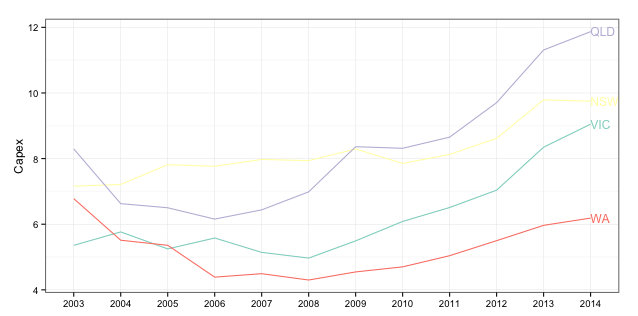
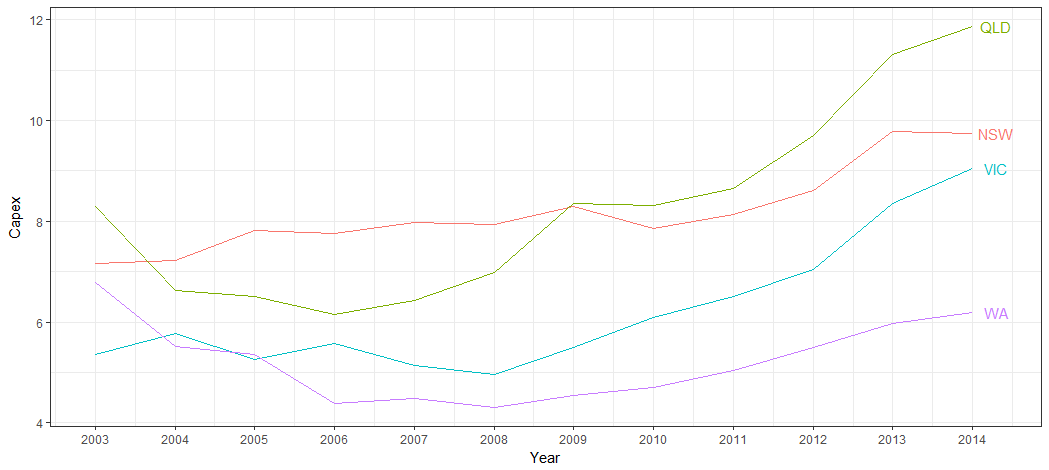
Чтобы использовать идею Батиста, вам нужно отключить отсечение. Но когда вы это сделаете, вы получите мусор. Кроме того, вам нужно подавить легенду, а для geom_textвыберите Capex на 2014 год и увеличьте поле, чтобы освободить место для меток. (Или вы можете настроить hjust параметр для перемещения надписей внутри панели графика.) Примерно так:
library(ggplot2)
library(grid)

p = ggplot(temp.dat) +
  geom_line(aes(x = Year, y = Capex, group = State, colour = State)) +
  geom_text(data = subset(temp.dat, Year == "2014"), aes(label = State, colour = State, x = Inf, y = Capex), hjust = -.1) +
  scale_colour_discrete(guide = 'none')  +
  theme(plot.margin = unit(c(1,3,1,1), "lines"))

# Code to turn off clipping
gt <- ggplotGrob(p)
gt$layout$clip[gt$layout$name == "panel"] <- "off"
grid.draw(gt)
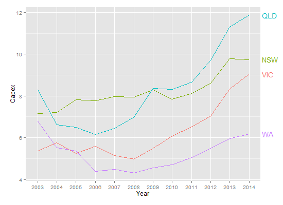
Но это такой сюжет, который идеально подходит для directlabels,
library(ggplot2)
library(directlabels)

ggplot(temp.dat, aes(x = Year, y = Capex, group = State, colour = State)) +
  geom_line() +
  scale_colour_discrete(guide = 'none') +
  scale_x_discrete(expand=c(0, 1)) +
  geom_dl(aes(label = State), method = list(dl.combine("first.points", "last.points"), cex = 0.8))
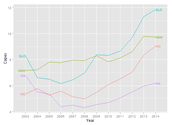
Изменить Чтобы увеличить расстояние между конечной точкой и метками:
ggplot(temp.dat, aes(x = Year, y = Capex, group = State, colour = State)) +
  geom_line() +
  scale_colour_discrete(guide = 'none') +
  scale_x_discrete(expand=c(0, 1)) +
  geom_dl(aes(label = State), method = list(dl.trans(x = x + 0.2), "last.points", cex = 0.8)) +
  geom_dl(aes(label = State), method = list(dl.trans(x = x - 0.2), "first.points", cex = 0.8))
Более новое решение заключается в использовании ggrepel:
library(ggplot2)
library(ggrepel)
library(dplyr)

temp.dat %>%
  mutate(label = if_else(Year == max(Year), as.character(State), NA_character_)) %>%
  ggplot(aes(x = Year, y = Capex, group = State, colour = State)) +
  geom_line() +
  geom_label_repel(aes(label = label),
                  nudge_x = 1,
                  na.rm = TRUE)

Этот вопрос старый, но золотой, и я даю другой ответ усталому народу ggplot.
Принцип этого решения может быть применен довольно широко.
Plot_df <-
  temp.dat %>% mutate_if(is.factor, as.character) %>%  # Who has time for factors..
  mutate(Year = as.numeric(Year))
И теперь мы можем подгруппировать наши данные
ggplot() +
geom_line(data = Plot_df, aes(Year, Capex, color = State)) +
geom_text(data = Plot_df %>% filter(Year == last(Year)), aes(label = State,
                                                           x = Year + 0.5,
                                                           y = Capex,
                                                           color = State)) +
          guides(color = FALSE) + theme_bw() +
          scale_x_continuous(breaks = scales::pretty_breaks(10))
Последняя часть pretty_breaks - это просто исправить ось ниже.
Существует новый пакет для решения этой очень популярной проблемы. {geomtextpath} дает несколько очень гибких опций для прямой маркировки, больше, чем "только" маркировка в конце...
Более того, этикетки будут следовать кривым! Это может быть не всем по вкусу, но я нахожу это очень аккуратным.
      library(geomtextpath)

## end of line
ggplot(temp.dat) +
  geom_textline(aes(
    x = Year, y = Capex, group = State, colour = State, label = State
  ),
  hjust = 1
  ) +
  theme(legend.position = "none")

      ## somewhere in the middle
ggplot(temp.dat) +
  geom_textline(aes(
    x = Year, y = Capex, group = State, colour = State, label = State
  ),
  hjust = .7
  ) +
  theme(legend.position = "none")

Существует множество геометрий, а также одна для прогнозных кривых на основе geom_smooth. (отвечая пользователю Марку Нилу)
      ggplot(temp.dat, aes(x = Year, y = Capex, group = State, colour = State)) +
  geom_line() +
## note you currently have to specify method argument, otherwise the disambiguation of some function fails. see also https://github.com/AllanCameron/geomtextpath/issues/79) +
  theme(legend.position = "none")
#> `geom_smooth()` using formula 'y ~ x'

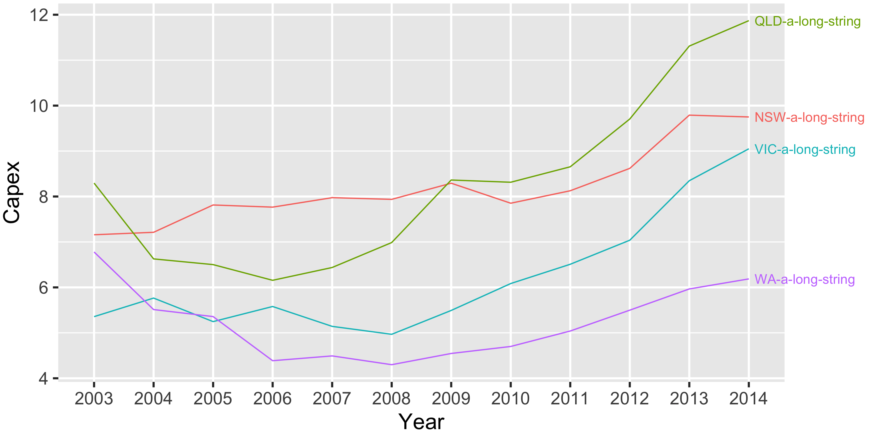
Хочу добавить решение для случаев, когда у вас более длинные названия меток. Во всех предоставленных решениях метки находятся в пределах холста графика, но если у вас есть более длинные имена, они будут обрезаны. Вот как я решил эту проблему:
library(tidyverse)

# Make the "State" variable have longer levels
temp.dat <- temp.dat %>%
    mutate(State = paste0(State, '-a-long-string'))

ggplot(temp.dat, aes(x = Year, y = Capex, color = State, group = State)) +
    geom_line() +
    # Add labels at the end of the line
    geom_text(data = filter(temp.dat, Year == max(Year)),
              aes(label = State),
              hjust = 0, nudge_x = 0.1) +
    # Allow labels to bleed past the canvas boundaries
    coord_cartesian(clip = 'off') +
    # Remove legend & adjust margins to give more space for labels
    # Remember, the margins are t-r-b-l
    theme(legend.position = 'none',
          plot.margin = margin(0.1, 2.6, 0.1, 0.1, "cm"))
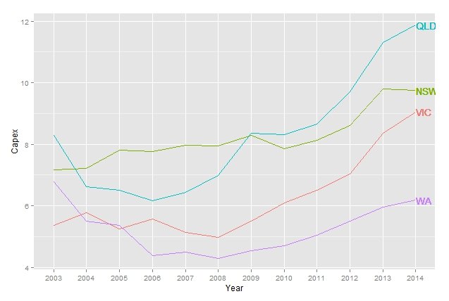
Не уверен, что это лучший способ, но вы можете попробовать следующее (поиграйте немного с xlim для правильной установки пределов):
library(dplyr)
lab <- tapply(temp.dat$Capex, temp.dat$State, last)
ggplot(temp.dat) +
    geom_line(aes(x = Year, y = Capex, group = State, colour = State)) +
    scale_color_discrete(guide = FALSE) +
    geom_text(aes(label = names(lab), x = 12, colour = names(lab), y = c(lab), hjust = -.02))
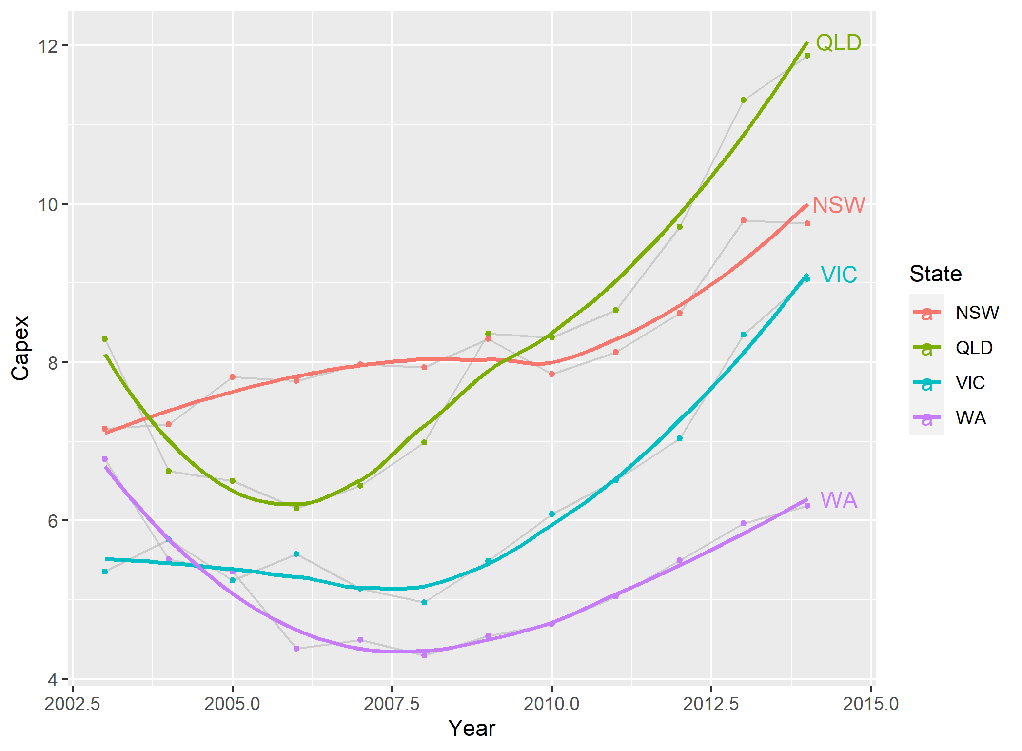
Я пришел к этому вопросу, чтобы напрямую пометить подходящую линию (например, loess()) в последней подобранной точке, а не в последней точке данных. В конце концов я разработал подход к этому, в значительной степени основанный на tidyverse. Он также должен работать для линейной регрессии с несколькими модами, поэтому я оставляю его здесь для потомков.
library(tidyverse)

temp.dat$Year <- as.numeric(temp.dat$Year)
temp.dat$State <- as.character(temp.dat$State)

#example of loess for multiple models
#https://stackru.com/a/55127487/4927395

models <- temp.dat %>%
  tidyr::nest(-State) %>%
  dplyr::mutate(
    # Perform loess calculation on each CpG group
    m = purrr::map(data, loess,
                   formula = Capex ~ Year, span = .75),
    # Retrieve the fitted values from each model
    fitted = purrr::map(m, `[[`, "fitted")
  )

# Apply fitted y's as a new column
results <- models %>%
  dplyr::select(-m) %>%
  tidyr::unnest()

#find final x values for each group
my_last_points <- results %>% group_by(State) %>% summarise(Year = max(Year, na.rm=TRUE))

#Join dataframe of predictions to group labels
my_last_points$pred_y <- left_join(my_last_points, results)

# Plot with loess line for each group
ggplot(results, aes(x = Year, y = Capex, group = State, colour = State)) +
  geom_line(alpha = I(7/10), color="grey", show.legend=F) +
  #stat_smooth(size=2, span=0.3, se=F, show_guide=F)
  geom_point(size=1) +
  geom_smooth(se=FALSE)+
  geom_text(data = my_last_points, aes(x=Year+0.5, y=pred_y$fitted, label = State))
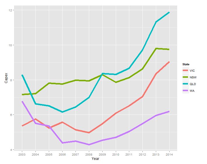
Вы не эмулировали решение @Baptiste 100%. Вам нужно использовать annotation_custom и перебрать все ваши Capex"S:
library(ggplot2)
library(dplyr)
library(grid)

temp.dat <- structure(list(Year = c("2003", "2004", "2005", "2006", "2007",
"2008", "2009", "2010", "2011", "2012", "2013", "2014", "2003",
"2004", "2005", "2006", "2007", "2008", "2009", "2010", "2011",
"2012", "2013", "2014", "2003", "2004", "2005", "2006", "2007",
"2008", "2009", "2010", "2011", "2012", "2013", "2014", "2003",
"2004", "2005", "2006", "2007", "2008", "2009", "2010", "2011",
"2012", "2013", "2014"), State = structure(c(1L, 1L, 1L, 1L,
1L, 1L, 1L, 1L, 1L, 1L, 1L, 1L, 2L, 2L, 2L, 2L, 2L, 2L, 2L, 2L,
2L, 2L, 2L, 2L, 3L, 3L, 3L, 3L, 3L, 3L, 3L, 3L, 3L, 3L, 3L, 3L,
4L, 4L, 4L, 4L, 4L, 4L, 4L, 4L, 4L, 4L, 4L, 4L), .Label = c("VIC",
"NSW", "QLD", "WA"), class = "factor"), Capex = c(5.35641472365348,
5.76523240652641, 5.24727577535625, 5.57988239709746, 5.14246402568366,
4.96786288162828, 5.493190785287, 6.08500616799372, 6.5092228474591,
7.03813541623157, 8.34736513875897, 9.04992300432169, 7.15830329914056,
7.21247045701994, 7.81373928617117, 7.76610217197542, 7.9744994967006,
7.93734452080786, 8.29289899132255, 7.85222269563982, 8.12683746325074,
8.61903784301649, 9.7904327253813, 9.75021175267288, 8.2950673974226,
6.6272705639724, 6.50170524635367, 6.15609626379471, 6.43799637295979,
6.9869551384028, 8.36305663640294, 8.31382617231745, 8.65409824343971,
9.70529678167458, 11.3102788081848, 11.8696420977237, 6.77937303542605,
5.51242844820827, 5.35789621712839, 4.38699327451101, 4.4925792218211,
4.29934654081527, 4.54639175257732, 4.70040615159951, 5.04056109514957,
5.49921208937735, 5.96590909090909, 6.18700407463007)), class = "data.frame", row.names = c(NA,
-48L), .Names = c("Year", "State", "Capex"))

temp.dat$Year <- factor(temp.dat$Year)

color <- c("#8DD3C7", "#FFFFB3", "#BEBADA", "#FB8072")

gg <- ggplot(temp.dat)
gg <- gg + geom_line(aes(x=Year, y=Capex, group=State, colour=State))
gg <- gg + scale_color_manual(values=color)
gg <- gg + labs(x=NULL)
gg <- gg + theme_bw()
gg <- gg + theme(legend.position="none")

states <- temp.dat %>% filter(Year==2014)

for (i in 1:nrow(states))  {
  print(states$Capex[i])
  print(states$Year[i])
  gg <- gg + annotation_custom(
    grob=textGrob(label=states$State[i],
                    hjust=0, gp=gpar(cex=0.75, col=color[i])),
    ymin=states$Capex[i],
    ymax=states$Capex[i],
    xmin=states$Year[i],
    xmax=states$Year[i])
}

gt <- ggplot_gtable(ggplot_build(gg))
gt$layout$clip[gt$layout$name == "panel"] <- "off"
grid.newpage()
grid.draw(gt)
(Вы можете изменить желтый, если сохраните белый фон.)